UX Design Process: Build Better User Experiences
The UX design process in 8 practical steps, from research to launch.
Table of contents
Free Website Audit
We'll personally review your website across 6 areas. UX, SEO, performance, mobile, conversion, and send you a detailed, actionable report within 48 hours. No cost. No catch.
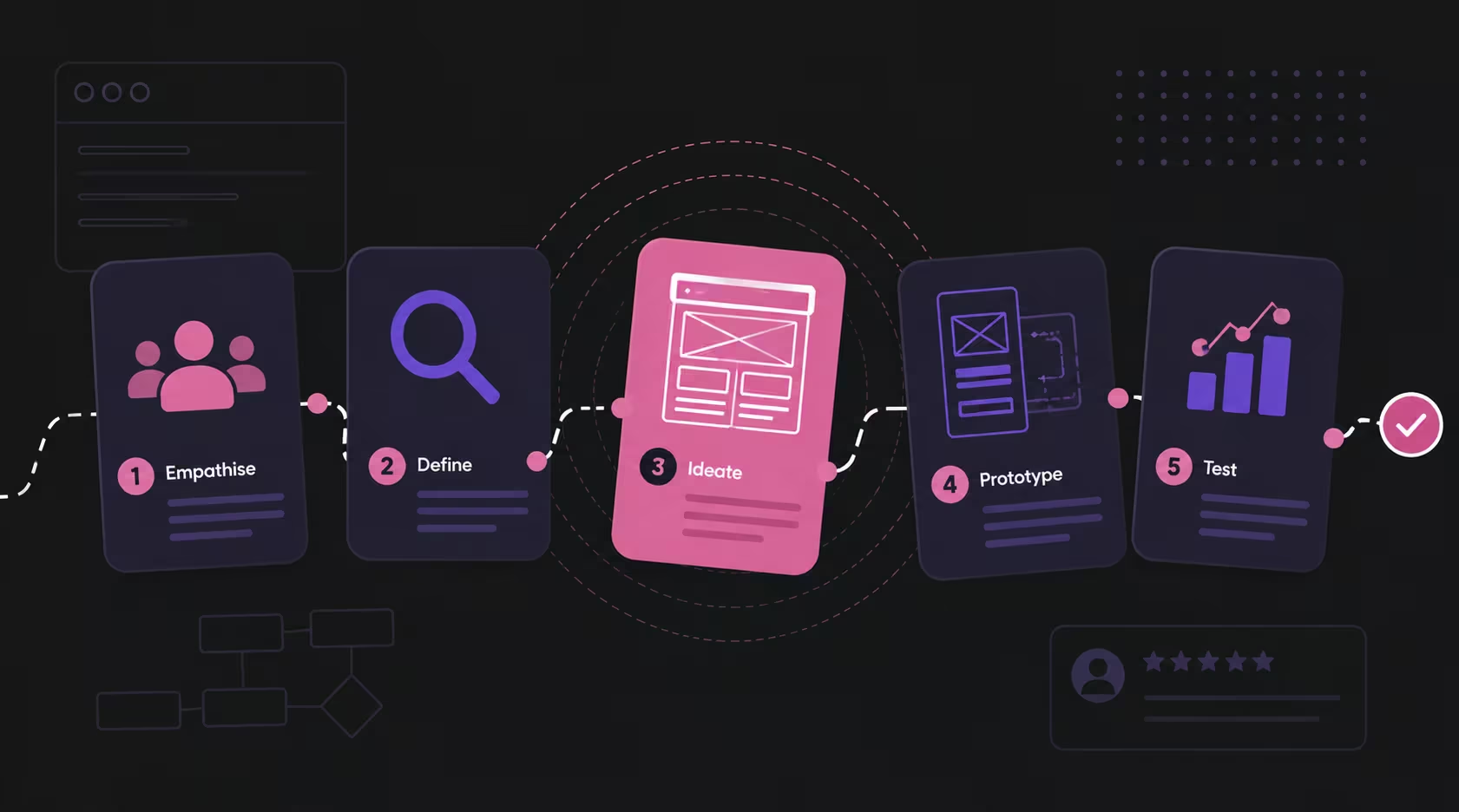
The UX design process is the structured sequence a design team follows to turn user needs and business goals into a website that is easy to use and drives results. At its core it runs through five phases that most frameworks agree on: research, define, ideate, prototype, and test. At ALF Design Group we run those phases as eight practical steps, from discovery and user research to wireframing, UI design, prototyping, testing, and developer handoff. Each step removes guesswork before a line of code is written, which is exactly where good UX saves the most money. Done properly, it is not a one-off project but a continuous loop of measuring real behaviour and improving on it.
What Is UX Design, and What It Is Not
UX design is the practice of shaping how a person feels and what they can accomplish when they use your website, from the first click to the final action. It is not the same as making a site look attractive. Visual design is the surface; UX design is the structure, flow, and logic underneath it that decides whether a visitor can actually find what they came for and do it without friction.
A useful way to hold the distinction: UI design is what the interface looks like, and UX design is how the whole experience works. A page can be beautiful and still fail if the navigation confuses people or the checkout hides a step. That gap between looking good and working well is where most conversions are quietly lost, and it is the reason the link between UX, UI, and website conversions matters so much to any business relying on its site to sell.
UX is also not a phase you finish. It is an ongoing practice: you research, you build, you measure how real people behave, and you refine. The process below is how that discipline is organised into steps you can actually plan and budget for.
The 5 Core Phases of the UX Design Process
The UX design process has five core phases that nearly every framework shares: empathise (research), define, ideate, prototype, and test. They come from design thinking, and whether a team calls its process five steps or ten, almost all of them map back to these five. The value of the model is that it puts understanding the user before drawing a single screen.
At ALF we work in eight steps rather than five, because a five-phase summary hides the practical decisions where projects actually succeed or stall, such as information architecture and developer handoff. The table below shows how our eight steps map onto the five canonical phases, so you can see both the textbook model and how it plays out on a real website build.
Macro UX vs Micro UX: Designing the Whole System
Macro UX is the design of the entire journey a person takes across your site, while micro UX is the design of the small, individual interactions along the way. Good UX needs both. Macro UX asks whether someone can move from a Google search to a completed enquiry without getting lost; micro UX asks whether a single button, form field, or error message behaves the way a person expects.
Teams that only think in screens tend to polish micro UX while the macro journey leaks visitors between pages. The process that follows deliberately works from the outside in: first the whole journey and its structure, then the individual screens and their details. Get the macro right and the micro has somewhere to live; get only the micro right and you have a set of pretty pages that do not add up to a path.
Why the UX Design Process Matters for Singapore Businesses
A structured UX process matters because it is one of the highest-return investments a business can make in its website. Forrester's widely cited research on the ROI of design found that every dollar invested in UX can return around one hundred dollars, and that better UX design can lift conversion rates by up to 400% (figures compiled by Maze). The reason is simple: design decides whether the traffic you already pay for turns into customers or bounces.
First impressions make the case sharper. Stanford's web credibility research found that around 75% of people judge a company's credibility on its website design, and users form that opinion in well under a second. In a 2025 PwC customer experience survey, 52% of customers said they stopped buying from a brand after a single bad experience. For a Singapore market where buyers are digitally sophisticated and compare options quickly, a confusing or dated experience is not a cosmetic problem. It is lost revenue.
We see this most clearly on high-consideration purchases. When we worked on the experience for BigFundr, a fintech investment platform, trust was the whole game: a visitor deciding where to place their money will not tolerate a flow that feels uncertain. Working through discovery and research before design meant the site was built around the questions real investors actually ask, not around what we assumed they wanted. That gap between assumption and evidence is what a good process closes, and it is worth understanding the state of UX design in Singapore before you commission a build.
Phase 1: Discovery
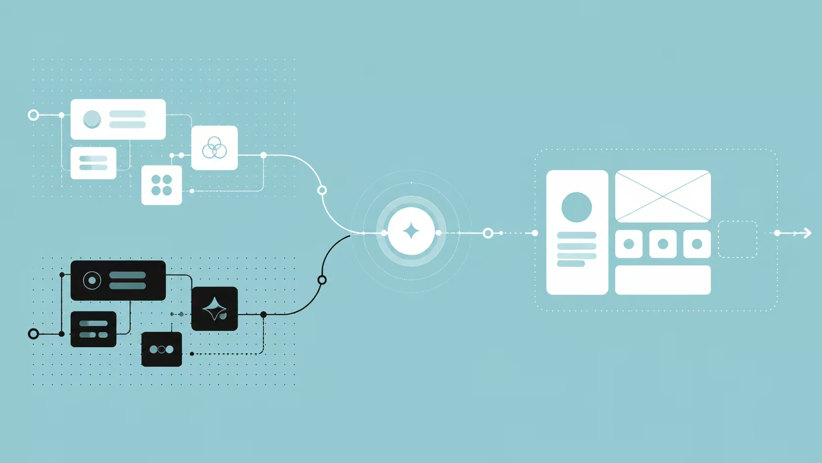
Discovery is the phase where you align on business goals and user goals before any design begins. It is a short, structured period of asking questions: what does the business need this website to achieve, who is it for, what has and has not worked before, and how will success be measured. Skip it and you risk designing a beautiful answer to the wrong question.
A typical discovery phase covers:
- Business objectives, from lead generation to online sales to credibility with investors.
- The target audience and the jobs they are trying to get done.
- Existing analytics, past campaigns, and known pain points.
- Constraints: budget, timeline, brand guidelines, and technical limits.
For BigFundr, discovery surfaced that the real conversion barrier was not visual polish but trust and clarity about how the product worked. That single insight shaped every phase that followed, which is the point of doing discovery first rather than treating it as paperwork.
Phase 2: User Research
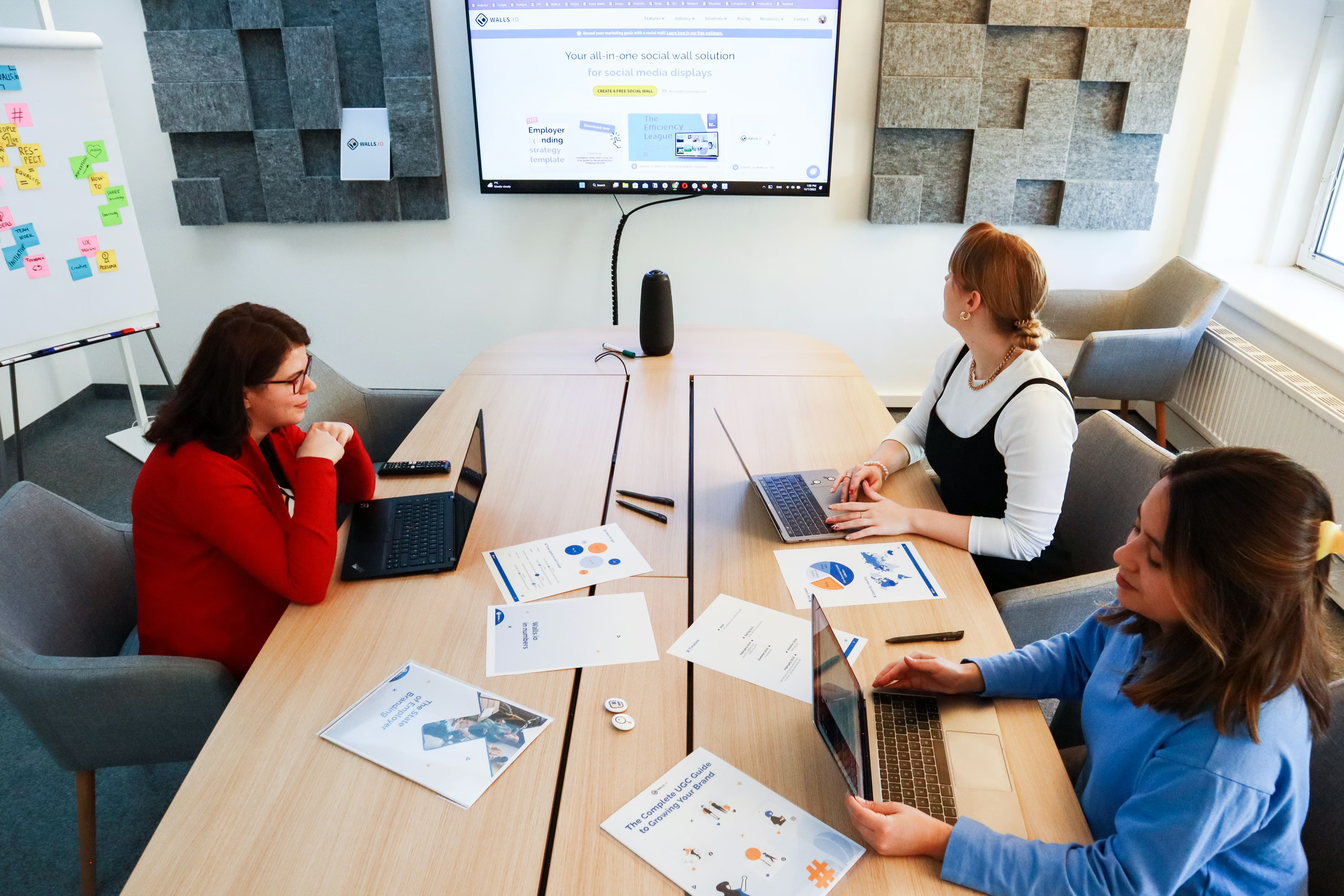
User research is how you replace assumptions about your visitors with evidence. It splits into two kinds, and a good process uses both at the right moments: exploratory research to understand people before you design, and evaluative research to check whether your design actually works once you have something to show them.
Exploratory research
Exploratory research happens before design and answers 'what do our users actually need?'. It includes interviews, surveys, and analysing how people currently behave. Done well, exploratory UX research methods stop a team from building for an imagined user and reveal the goals, doubts, and language of the real one.
Evaluative research
Evaluative research happens during and after design and answers 'does this actually work?'. It puts a wireframe, prototype, or live page in front of real people and watches where they succeed or struggle. Evaluative UX research and testing is what turns a confident design opinion into a validated decision.
Common tools at this stage include heatmap and session-recording platforms such as Hotjar and Microsoft Clarity, and remote usability testing tools such as Maze. The tool matters less than the habit: watch real behaviour rather than trusting internal opinion.
Phase 3: User Flows and Information Architecture
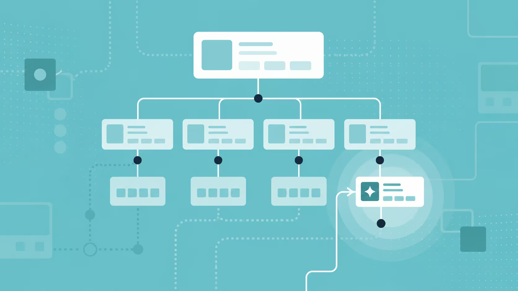
User flows and information architecture are where you decide how the experience is structured before you design how it looks. A user flow maps the path a person takes to complete a task; information architecture organises all the content so people can find things without thinking about it. Together they are the blueprint the rest of the design sits on.
User flows
A user flow is a step-by-step map of how someone moves from a starting point to a goal, such as from a landing page to a completed enquiry. Mapping it early exposes dead ends and unnecessary steps while they are still cheap to fix.
Information architecture
Information architecture is the practice of grouping and labelling content so it matches how users expect to find it. The core moves are to identify every piece of content, classify it into logical groups, and map those groups to a navigation people can scan in seconds. Strong architecture is what makes intuitive navigation feel effortless rather than accidental.
Phase 4: Wireframing
Wireframing is where you design structure before style, using low-fidelity layouts that show hierarchy and function without colour, imagery, or branding. A wireframe answers what goes where and why, so that layout decisions are made on the merits of the content rather than on how nice a mockup looks.
Keeping wireframes deliberately plain is a feature, not a limitation. When there is nothing pretty to react to, stakeholders focus on whether the page actually guides someone toward the goal. It is far cheaper to move a block in a wireframe than to rebuild a finished page, which is why this phase quietly protects the budget.
Phases 5 and 6: UI Design and Prototyping in Figma
UI design and prototyping are where the structure becomes a real, interactive experience. UI design adds the visual layer, colour, type, spacing, imagery, and brand, to the approved wireframes. Prototyping then links those screens into something a person can click through, so the design can be tested and felt before it is ever built in code.
We do both in Figma, because it lets design and prototype live in one place and share a single source of truth. There are good reasons Figma has become the default tool for UX designers: real-time collaboration, component systems that keep a design consistent, and interactive prototypes that behave enough like the finished product to test properly. A clickable prototype is also the clearest brief a developer can receive, which is why our prototyping work sits at the centre of the process rather than at its edge.
Phase 7: Testing and Iteration
Testing and iteration is where you validate the design with real users before committing it to build. You give people real tasks on the prototype, watch where they hesitate or fail, and refine. The encouraging part is how little it takes to learn a lot. The Nielsen Norman Group's well-established research shows that testing with just five users uncovers around 85% of usability problems, because the same issues recur quickly across participants.
The honest caveat is that five is a guide, not a law: a site serving several distinct audiences needs a few users from each group, and complex flows deserve more rounds. The principle holds either way. Small, frequent tests beat one large test at the end, because each round lets you improve before the next. If your site is already live, the same discipline applies in reverse: a usability audit finds the friction that is costing you conversions right now.
Phase 8: Handoff and Build
Handoff is where the validated design moves from designer to developer to be built, and it is where good work is often lost. A clean handoff means the developer receives more than a picture: organised Figma files, defined spacing and components, documented interactions, and clarity on how the design should behave across screen sizes.
The gap between design intent and built reality closes when the two sides work as one team rather than throwing files over a wall. Strong designer and developer partnerships are what keep the experience that tested well from quietly degrading during the build, and building that discipline into every handoff is part of how our UX design team works. Because we build in Webflow, much of what was designed in Figma carries across with high fidelity, so the site people use closely matches the prototype people approved.
The ALF Design Group UX Design Process at a Glance
Here is the full eight-step process in one view, from first question to launch and beyond.
How AI Is Changing the UX Process (and What It Can't Replace)
AI is changing how UX work gets done, not whether it is needed. It now speeds up specific tasks inside the process, drafting research questions, summarising interview notes, generating first-draft layouts, and producing copy variations to test. In Designlab's 2026 survey of over 200 designers, 83.5% reported using ChatGPT in their work, making it the most common tool in the field.
What AI does not replace is the judgment the process exists to apply. The same survey found that more than half of designers are concerned about AI's effect on design quality, and the reason is instructive: deciding which problem is worth solving, interpreting why a user hesitated, and choosing the trade-off that fits a specific business are still human work. AI can generate ten layouts in a minute; it cannot tell you which one earns a hesitant investor's trust. Used well, it removes grunt work so the team spends more time on research, strategy, and testing, which are the phases that actually move outcomes.
UX as a Continuous Practice
Launch is the start of UX work, not the end of it. Once a site is live you finally have real behaviour to learn from: where people click, where they drop off, and which pages quietly underperform. The teams that get the most from their sites treat this as a loop, measuring with analytics and heatmaps, forming a hypothesis, changing one thing, and checking the result.
This is also where the process connects to everything else you do online, because a site that is measured and improved compounds in value over time. If you are planning a build from scratch, the step-by-step process of designing a website sits neatly alongside this UX process, and both benefit from being run by a UX design agency in Singapore that stays involved after launch rather than disappearing at handoff.
Frequently Asked Questions
How long does the UX design process take?
It depends on scope, but a focused website project typically runs from three to six weeks for a small site to two to four months for a larger, research-heavy one. The biggest variables are the number of user groups to research, the number of unique page types to design, and how quickly stakeholders give feedback. Compressing the process rarely saves time overall, because skipped research usually surfaces later as expensive rework.
Do I need user research for a small website?
Yes, though the scale should match the project. Even a handful of short interviews or a review of your existing analytics will surface assumptions worth testing, and that is often enough for a small site. Research is not about sample size for its own sake; it is about not designing blind. A little evidence beats a lot of guessing, whatever the budget.
What is the difference between UX and UI design?
UX design is how the experience works; UI design is how it looks. UX covers the structure, flow, and logic that let a person achieve their goal, while UI covers the visual layer of colour, type, and imagery on top of it. A site needs both: strong UX with weak UI feels unfinished, and strong UI with weak UX is a good-looking dead end.
How does the UX design process affect SEO?
Good UX and good SEO increasingly pull in the same direction. Google's ranking systems reward pages that load quickly, work on mobile, and keep people engaged, which are all outcomes of a solid UX process. Clear information architecture also helps search engines understand and index your content. In practice, designing for users and designing for search have become largely the same job.
What should I look for when hiring a UX design agency in Singapore?
Look for a clear, staged process, real evidence of user research and testing rather than only attractive visuals, and case studies with outcomes you can check. Ask how they hand designs to developers and whether they stay involved after launch, since that is where quality is often lost. Choosing the right partner is worth its own homework, and there is practical guidance on how to choose the right UX designer in Singapore.
Conclusion
The most useful thing you can do with this process is hold your own website up against it. Walk the eight steps and ask where your site skipped one: was there real discovery, was the navigation ever tested, does anyone measure what happens after launch. The gaps you find are usually where your conversions are leaking.
Start with the cheapest, highest-value moves: write down the top three goals your visitors have, watch five people try to complete one of them, and fix the worst friction you see. If you would rather have a second pair of eyes on where your current site is losing people, a free website audit is a straightforward place to begin.
{{build-better-experience="/directory"}}
Categories
Written By
.webp)
Resources
Related Articles
Deep dive into our latest news and insights.