Landing Page Optimisation Mistakes to Avoid
The 10 landing page mistakes that kill conversions — and how to diagnose and fix each one for better results.
Table of contents
Most landing pages that underperform are not failing because of weak products, insufficient traffic, or poor targeting. They are failing because of design and UX decisions — many of them small, all of them correctable — that introduce friction at the exact moment a visitor is deciding whether to act. This guide covers the ten most common landing page optimisation mistakes that reduce conversion rates for Singapore businesses, with specific diagnostic indicators and corrective actions for each. If your landing page is generating traffic but not converting, one or more of these mistakes is almost certainly the cause.
There is a distinctive type of commercial frustration that comes from a landing page that does not convert. You know the traffic is there — the analytics confirm it. You know the product is right — your existing customers tell you so. But the page sits there, receiving visits and producing almost nothing. The problem is almost never the product or the audience. It is the page itself.
The mistakes that produce this outcome are well-documented and consistently repeated across the market. They are not exotic errors requiring specialist diagnosis — they are recognisable failure patterns that appear in the majority of underperforming landing pages, often in combination. The good news is that each of them is correctable, often without a full redesign.
This guide is written for businesses with existing landing pages that are not converting at the rate they should. If you are building a landing page from scratch, our guide on how to create a high-converting landing page is the better starting point. If you want the full optimisation framework — not just the mistakes — see our complete guide on landing page optimisation.
The 10 Landing Page Mistakes That Kill Conversions
Mistake 1 — No clear single conversion goal

The most fundamental landing page error is trying to accomplish too much with a single page. A page that asks users to sign up for a newsletter, book a consultation, download a guide, and follow the company on LinkedIn is not a landing page — it is a homepage with a narrow URL. Every additional goal competes with every other goal, and the result is that none of them convert well.
The principle of one page, one goal, one CTA is not a stylistic preference — it is the most reliably documented principle in landing page optimisation research. A visitor who arrives on a page with a single clear action to take has a binary decision: do this or leave. A visitor who arrives on a page with multiple options has a multi-step evaluation task that most people resolve by doing nothing.
Diagnostic: if your landing page has more than one primary CTA button, or if removing the navigation would reveal that users had multiple ways to leave without converting, the page has a goal clarity problem. The fix is to identify the single most valuable action the page should produce and remove or subordinate everything that competes with it.
Mistake 2 — Weak or generic CTA copy
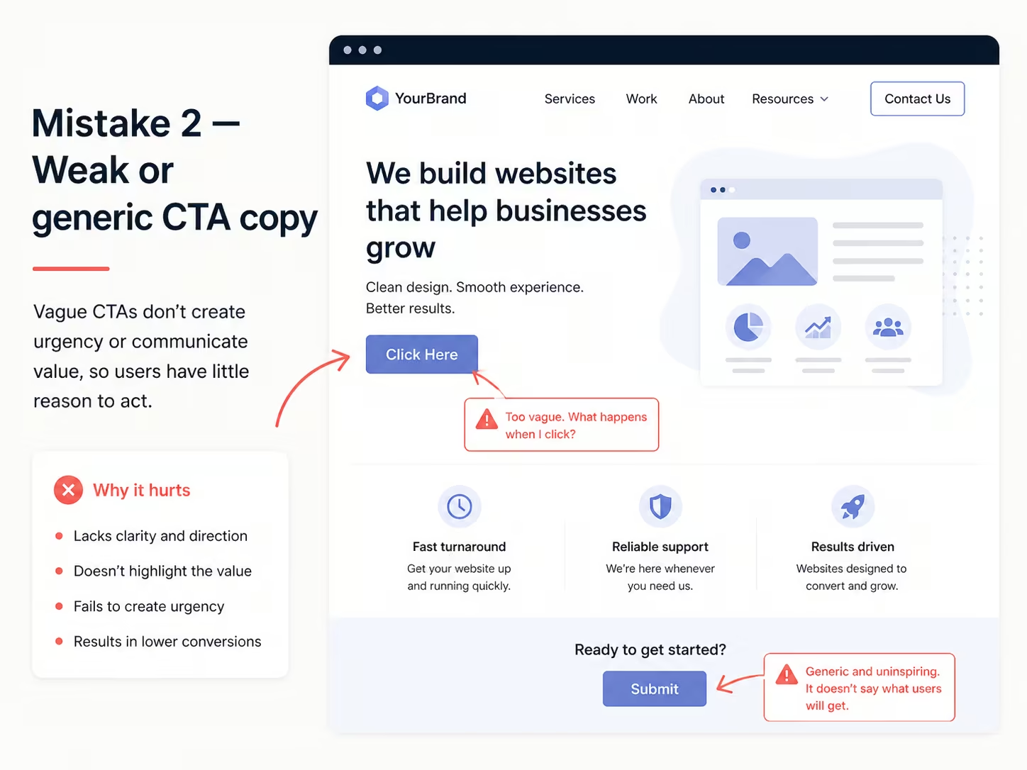
The call to action button is the conversion mechanism of a landing page — and the copy on it is more consequential than most businesses realise. Generic CTA labels ("Submit", "Click Here", "Learn More", "Send") are conversion friction in linguistic form. They describe the action the user is performing rather than the outcome they are receiving, which leaves the value of clicking unclear.
Outcome-specific CTA copy consistently outperforms generic alternatives. "Get My Free Audit", "Start My 14-Day Trial", "Book My Strategy Session", "Download the Singapore Market Report" — each of these tells the visitor what they will have after clicking, which reduces the uncertainty that prevents clicks. Personalisation amplifies this effect further: CTAs written in first person ("Show Me My Report", "Start My Free Trial") outperform equivalent second-person versions in the majority of A/B tests.
Diagnostic: read your CTA copy in isolation, without the surrounding page context. If it does not clearly communicate what the user receives by clicking, it needs rewriting. Test outcome-specific alternatives using a structured A/B testing approach — see our guide on landing page A/B testing for the methodology.
Mistake 3 — No clear value proposition above the fold

A visitor who lands on a page and cannot determine within five seconds what it is offering and why it is worth their attention will leave. This is not impatience — it is how information evaluation works. The above-the-fold section of a landing page (what is visible without scrolling, on the device the user is using) is the first and often only opportunity to answer the visitor's implicit question: is this relevant to me and worth my time?
The most common above-the-fold failure: the headline communicates the business's name or tagline rather than the specific value the visitor will receive. "Award-Winning Digital Marketing Agency" tells the visitor nothing about what they will get. "Double your lead volume in 90 days or we refund the difference" tells them exactly what they will get and frames a specific, credible claim around it. The stronger the above-the-fold value proposition, the further users scroll — and the more they scroll, the more likely they are to convert.
Diagnostic: run a five-second test — show the page to someone unfamiliar with the business for five seconds, then ask them to describe what the page offers. If they cannot answer specifically, the value proposition is not clear enough. For the copywriting principles behind effective landing page headlines and subheadings, see our guide on landing page copywriting tips that convert.
Mistake 4 — Ignoring mobile responsiveness
In Singapore, where smartphone penetration exceeds 90% according to Statista, a landing page that delivers a poor mobile experience is failing the majority of its audience before they engage with the content. The specific mobile failures that most reliably destroy conversion: text that requires zooming to read, CTA buttons that are too small to tap comfortably (below 44px height), forms that require switching keyboard modes because input types are not specified, and page layouts that require horizontal scrolling.
The mobile experience should be designed first, not adapted from desktop. A desktop-designed page compressed into a smaller viewport is not a mobile experience — it is a legibility problem. For most Singapore landing pages serving paid traffic, mobile is where the majority of clicks arrive. If the mobile experience is not given the same design care as the desktop version, the campaign is partially wasted by design. For the full mobile optimisation framework, see our guide on mobile landing page optimisation for Singapore businesses.
Mistake 5 — Slow page load speed
Every additional second of loading time beyond two seconds is associated with measurable conversion rate decline. For Singapore users on 4G and 5G connections with high expectations of digital performance, a page that takes four or five seconds to become usable is a page that many users will abandon before it loads — particularly when they arrive from a paid ad with high intent but limited patience.
The most common causes of slow landing pages: hero images that are oversized and uncompressed (desktop-resolution images served to mobile users), JavaScript that loads synchronously and blocks rendering, web fonts that delay text display (Flash of Invisible Text), and video backgrounds that load full-resolution files without compression. All of these are diagnosable in Google PageSpeed Insights, which provides specific recommendations for each. For the full performance optimisation guide, see how to optimise your website's speed.
Mistake 6 — Insufficient or unconvincing social proof
Social proof reduces the perceived risk of converting. A visitor who has never heard of a business is making a trust decision alongside a conversion decision — and without evidence that other people have made this decision and were satisfied, the risk calculation often resolves in favour of doing nothing. Social proof elements — testimonials, client logos, review ratings, case study outcomes, usage statistics — address that calculation directly.
The social proof failures that most commonly reduce its effectiveness: generic testimonials without names, photos, or company attribution ("Great service!" — J.S.); numerical claims without sources or context ("10,000 satisfied customers" with no verification); and social proof placed only at the bottom of the page, after the conversion point, rather than adjacent to the CTA where it reduces hesitation at the moment of decision.
For Singapore businesses, local credibility signals carry particular weight: testimonials from named individuals at recognisable Singapore companies, references to local clients, and certifications relevant to Singapore's regulatory environment all reinforce trust more effectively with local audiences than generic international social proof.
Mistake 7 — Forms that ask for too much too soon
Form field count is one of the most directly measurable conversion variables on a landing page. Each additional field is a tax on the user's time and attention — and a request for personal information that many users prefer not to share until they have established trust with the business. The standard landing page form for most lead generation purposes requires a name, an email address, and optionally one qualifying question. A form asking for phone number, company name, job title, company size, and budget range before the business has demonstrated any value will consistently convert at lower rates than a shorter alternative.
The corrective approach is not to collect less information — it is to sequence information collection appropriately. Capture the minimum required for first contact, then collect additional qualifying information through the follow-up conversation. This is sometimes called progressive profiling, and it consistently produces higher initial conversion rates without sacrificing lead quality at the qualification stage. For the full framework of form design for conversion, see our guide on form UX best practices.
Mistake 8 — No analytics or heatmap tracking
A landing page without analytics configured is a conversion machine without feedback. You cannot diagnose what is failing — or confirm what is working — without data on how users are actually behaving on the page. The minimum analytics configuration for any landing page: a conversion event that fires when the goal action is completed (form submission, button click, purchase), a scroll depth measure that shows how far users are getting down the page, and a traffic source breakdown that attributes conversions to specific campaigns or channels.
Heatmaps and session recordings add a qualitative layer that aggregate analytics cannot provide. They show where users click (and where they click but expect interactivity that is not there), how far they scroll, and at what point they abandon the page. A landing page with a scroll depth that shows 60% of users leaving before the form is a fundamentally different problem from one where users reach the form but do not complete it — and heatmap data is what surfaces that distinction.
Mistake 9 — Navigation links that let users leave
A landing page with full site navigation — header nav, footer links, related content recommendations — is a page with multiple exits. Every link that takes a user away from the page before they convert is a conversion lost. The purpose of a landing page is to eliminate every option except the conversion action and the exit button.
This is a specific distinction between a landing page and a regular website page. Website pages should have comprehensive navigation — they serve users who are exploring. Landing pages should not have navigation — they serve users who have already received enough context from the ad or email that sent them, and who are being asked to make a specific decision. Removing navigation from a landing page and testing it against the navigation-included version will, in most cases, show a measurable conversion improvement.
Mistake 10 — Mismatched message between ad and landing page
Message match is the alignment between the copy and promise in an ad or email and the content on the landing page it links to. When a user clicks an ad that says "Get a free Webflow audit" and arrives on a generic agency services page, there is a message mismatch — the specific promise of the ad has not been fulfilled by the landing page, which undermines trust and produces immediate abandonment.
This is one of the most common and most consequential landing page errors in paid campaigns, particularly for businesses that run multiple ad variants pointing to a single generic landing page. Each distinct ad promise should ideally have a corresponding landing page that fulfils it specifically. For campaigns where this is not feasible, the minimum requirement is that the headline and above-the-fold content of the landing page directly echoes the key claim or offer in the ad.
How to Audit Your Landing Page for These Mistakes
A structured audit catches problems before they compound. Run through this process quarterly for active landing pages, and before launching any new paid campaign.
- Check message match — verify that your landing page headline directly reflects the primary promise of the ad or email that sends traffic to it. If you run multiple ad variants, check each one.
- Run a speed test — use Google PageSpeed Insights to check mobile and desktop Core Web Vitals. A score below 50 on mobile is a conversion risk. Note every specific recommendation it flags.
- Test mobile on a real device — open the page on an actual smartphone (not a browser resize tool). Check CTA tap target size, form keyboard types, image scaling, and whether the value proposition is visible without scrolling.
- Verify analytics firing — use GA4's real-time view to confirm that your conversion event fires correctly when the goal action is completed. If it is not firing, conversion data is silent.
- Review form field count — for each field, ask: is this strictly necessary for first contact? Remove or defer to post-conversion any field that is not.
- Check social proof placement — confirm that at least one social proof element is within view of the primary CTA. If all social proof is below the fold, move the strongest element up.
- Remove unnecessary navigation — confirm that the page has no header nav or footer links that would take users away from the conversion action. If it does, test a navigation-free version.
Pre-Launch and Ongoing Checklist
Frequently Asked Questions
Which landing page mistake has the biggest impact on conversion rate?
The answer varies by page, but the highest-impact single change across most underperforming landing pages is clarifying the value proposition. A page whose headline communicates clearly what the visitor will receive — specific, benefit-led, and matched to the ad that sent the traffic — consistently outperforms one where users have to infer the offer. If you can only fix one thing, start with the above-the-fold clarity. The second highest-impact change is typically the CTA: replacing generic labels with outcome-specific copy produces measurable improvements in most A/B tests.
How do I know if my landing page is underperforming?
Benchmark your conversion rate against industry norms for your context. B2B lead generation landing pages typically convert at 2–5%; e-commerce product pages at 1–3%; webinar or event registration pages at 20–40%. If your rate is below the low end of the relevant benchmark, the page has a measurable problem. Within that, the diagnostic is in the data: high bounce rates suggest a message match or above-the-fold clarity problem; users reaching the form but not completing it suggests a form friction or trust problem; low scroll depth suggests an above-the-fold failure. Session recordings and heatmaps are the most direct diagnostic tools available.
Should a landing page have navigation?
No — a dedicated landing page serving paid or campaign traffic should not have full site navigation. Navigation links create exit paths that take users away from the conversion action before they complete it. Remove the header navigation and footer links from landing pages used in paid campaigns, and replace them with only the logo (linked to the homepage, if at all) and the conversion-focused content. This is sometimes called a 'squeeze page' structure and consistently produces higher conversion rates than navigation-included alternatives for focused campaign traffic.
How often should I test and update my landing pages?
Active landing pages serving significant paid traffic should be in continuous testing — running A/B tests on one variable at a time, with a testing cadence determined by the traffic volume needed to reach statistical significance. For lower-traffic pages, a quarterly structured audit (as outlined above) is the minimum. Significant changes to the offer, the audience, or the competitive context should trigger an immediate review regardless of the testing schedule. A landing page that is not being actively tested is a page that is probably underperforming and will continue to do so until something changes.
What is message match and why does it matter?
Message match is the alignment between the copy and promise in the ad, email, or link that sent a visitor to the landing page and the content on the page itself. When a user clicks an ad promising a specific offer and arrives at a page that does not immediately reflect that offer, the implicit contract of the click is broken — trust is reduced and abandonment follows. Strong message match means that the landing page headline directly echoes or expands the ad's primary promise, and that the specific offer, incentive, or value stated in the ad is visible above the fold without scrolling.
Can a slow landing page really kill conversions?
Yes — and the data is unambiguous on this. Each additional second of load time above two seconds is associated with measurable conversion rate decline, with the steepest drop occurring between two and four seconds. For Singapore users on modern mobile connections with high performance expectations, a four-second landing page is a page that many users will never see because they will have closed the tab before it finishes loading. This is particularly costly for paid campaigns where every click has a cost. Google PageSpeed Insights identifies the specific elements causing slow loading and prioritises them by impact.
How many fields should a landing page form have?
As few as the downstream process strictly requires — typically three to four for a standard lead generation form (name, email, and one qualifying question). Each additional field reduces completion rate. The correction is not to collect less information permanently, but to sequence it: capture the minimum for first contact, then gather additional detail through the follow-up conversation. This approach consistently produces higher initial conversion rates without degrading lead quality. For the full form design framework, see our guide on form UX best practices.
Conclusion
Landing page mistakes are not random — they follow recognisable patterns, they compound in predictable ways, and they are correctable with targeted interventions. The ten mistakes covered in this guide — goal ambiguity, weak CTAs, unclear value propositions, poor mobile experience, slow loading, insufficient social proof, form overload, missing analytics, navigational leaks, and message mismatch — account for the majority of conversion rate underperformance across the market.
The most effective approach is diagnostic before corrective: use the audit framework and checklist above to identify which specific mistakes are present on your landing page, then address them in order of likely impact. One well-targeted fix will consistently outperform a general redesign that touches everything without prioritising anything.
At ALF Design Group, we design landing pages in Webflow that are built to convert from the first version — with message match, mobile-first design, and performance optimisation applied before launch. If your current landing pages are not converting at the rate your paid traffic deserves, speak to our team — a structured landing page review is often the fastest way to identify where conversions are being lost.
{{build-better-experience="/directory"}}
First Published On
September 18, 2025
Categories
Written By
.webp)
Resources
Related Articles
Deep dive into our latest news and insights.