Evaluative UX Research: Testing & Feedback for Smarter Web Design
Learn UX testing methods that elevate web design, with localised Singapore examples and tools.
Table of contents
User experience is not built on assumptions — it is validated through evidence. Evaluative UX research is the practice of testing design decisions against real user behaviour after something has been built or prototyped, to confirm whether it works as intended. It is the counterpart to exploratory research: where exploratory methods ask 'what problem should we solve?', evaluative methods ask 'does our solution actually solve it?'. This guide covers the six core evaluative UX research methods — usability testing, A/B testing, card sorting, tree testing, eye tracking and heatmaps, and click testing — explaining what each method reveals, when to use it, how to conduct it practically, and which tools support it. For Singapore businesses investing in Webflow websites or digital products, these methods are the difference between launching with confidence and launching with hope.
Good UX design begins with research and ends with validation. The exploratory phase — user interviews, contextual inquiry, diary studies — defines the problem. The evaluative phase confirms whether the design solution addresses it. Without evaluative research, even the most thoughtfully designed product is a hypothesis.
This guide covers the validation side of the UX research cycle. For the exploratory methods that precede design, see our guide on how exploratory UX research shapes better design decisions. For how evaluative research fits within the complete UX design process, see that dedicated guide.
What Is Evaluative UX Research?
Evaluative UX research refers to the structured methods used to test and validate design decisions based on real user interaction and feedback. It answers the questions that assumptions cannot: Is the design intuitive for users who are not already familiar with it? Can users complete their intended goals without friction? Does version A convert better than version B? Where are users looking — and where are they not?
The defining characteristic of evaluative research is that it happens after something exists — a prototype, a wireframe, a live page, or a live product — and tests that thing against real user behaviour. This distinguishes it from exploratory research, which is conducted before design begins to understand user needs and contexts.
Why Evaluative Research Matters for Singapore Businesses
In Singapore's multicultural, tech-savvy market, small UX missteps create disproportionate drop-offs. Users navigate websites in multiple languages — English, Mandarin, Malay, Tamil — and bring different digital literacy levels, different cultural expectations about information hierarchy, and different trust signals to every interaction. What reads as intuitive to a designer in a controlled context may read as confusing to a 55-year-old Mandarin-speaking business owner completing a financial transaction on his phone at Changi Airport.
Evaluative research closes this gap. It reveals whether the design assumptions made during the build phase hold up against the reality of diverse users in real contexts. For Singapore businesses investing in Webflow development and UX design services, evaluative testing is what converts a well-designed website into a well-performing one. The business case: fixing usability issues discovered in testing before launch costs a fraction of fixing them after launch, when the cost includes lost revenue, development rework, and brand trust erosion.
The Six Evaluative UX Research Methods
1. Usability Testing
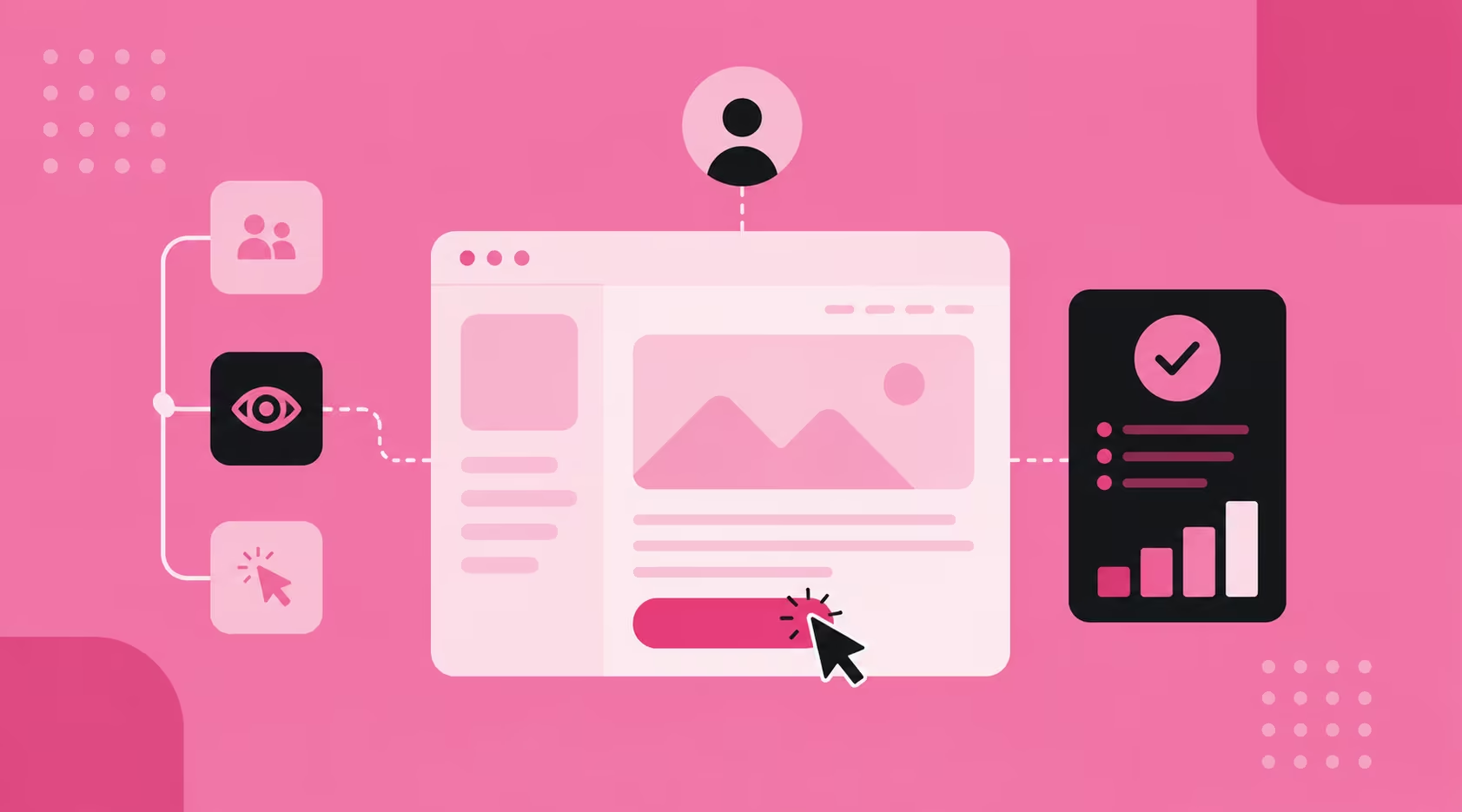
Usability testing is the most direct form of evaluative UX research: real users, given realistic tasks to complete, observed as they interact with your product. The goal is to identify where users get stuck, what confuses them, what they expect and do not find, and what delights them — evidence that cannot be obtained from analytics data alone because analytics show what happened, not why.
Usability testing can be conducted at prototype stage (before anything is built in production), during development (to validate work in progress), or post-launch (to identify friction on a live product). Moderated testing involves a researcher observing the session in real time and asking follow-up questions. Unmoderated testing uses recorded sessions where participants complete tasks independently without researcher involvement — faster and cheaper to run at scale.
For Singapore contexts: recruit participants who represent your actual user base, including older users, less digitally confident users, and multilingual users where relevant. The most common failure mode in Singapore usability testing is recruiting participants who are too similar to the design team — digitally fluent, English-dominant, and already familiar with the product category. The insights that drive the most impactful design changes almost always come from users at the edges of your audience, not the centre. For a structured approach to the audit framework that builds on usability testing findings, see our guide on how to conduct a usability audit.
How to conduct: define the tasks users will attempt (specific, realistic, not leading), recruit 5-8 participants per round (sufficient to identify the majority of usability issues), record both screen and verbal commentary, note where users hesitate, backtrack, or ask questions, and synthesise findings into a prioritised list of friction points by severity and frequency. Tools: Maze, Lookback, Figma with screen recording, or in-person sessions with screen capture. Webflow prototypes connect directly to Maze for unmoderated testing without any additional setup.
Don't just observe what users do — pay close attention to what they say as they do it. Verbal commentary ("I'm not sure what this button does" or "I expected to find this under services") reveals the mental model gap that behaviour data alone cannot expose.
2. A/B Testing
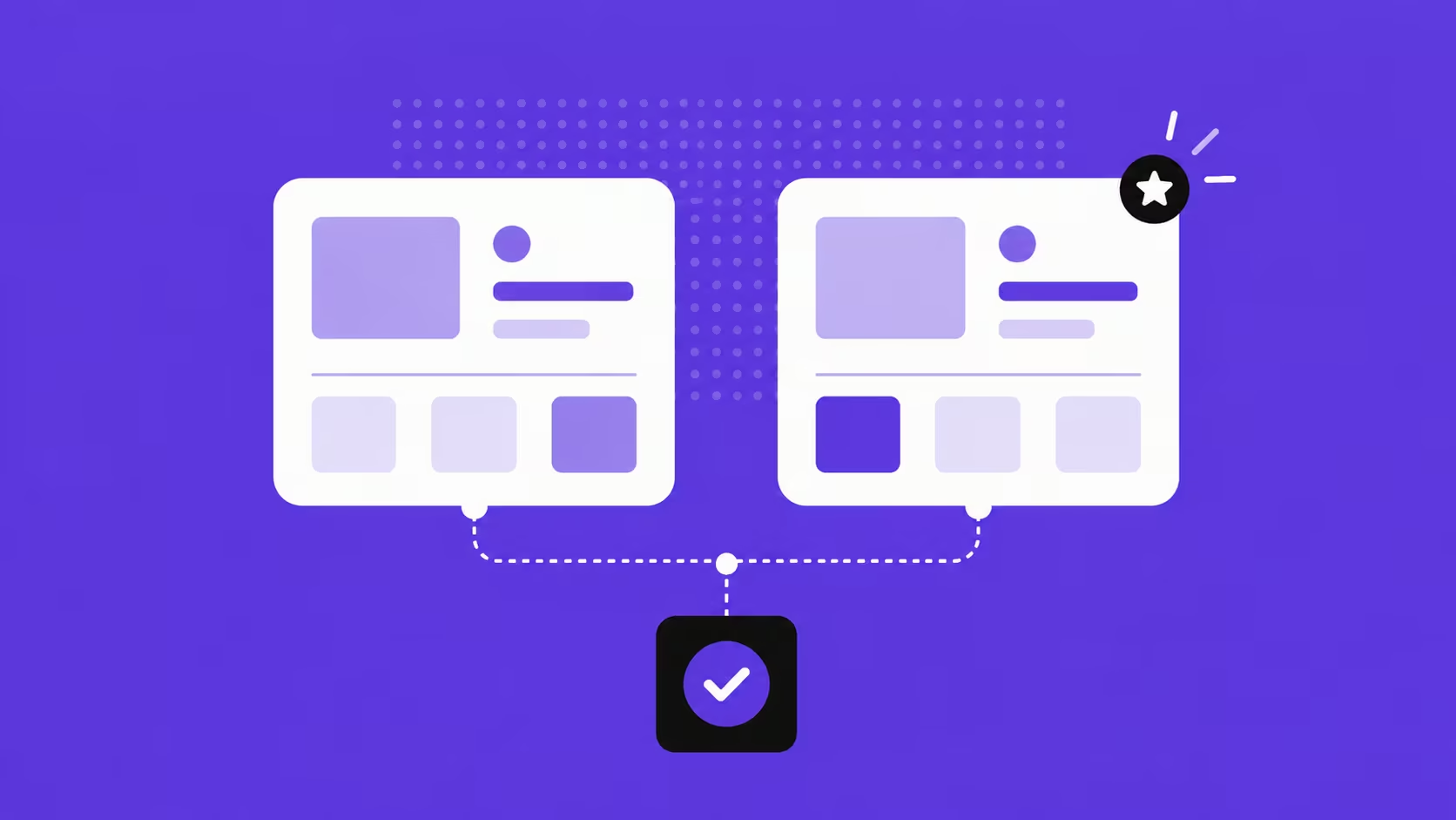
A/B testing (also called split testing) is a quantitative evaluative method that compares two versions of a design element — a headline, a CTA button colour, a form layout, a page structure — by serving each version to a randomly split audience and measuring which produces better outcomes. Unlike usability testing, which reveals why something is not working, A/B testing measures which of two options performs better — making it a data-driven tool for optimising specific elements after the broader design direction has been validated.
The discipline is in the hypothesis. Effective A/B testing isolates one variable at a time: changing the CTA copy and the button colour in the same test makes it impossible to determine which change drove the result. The hypothesis should be specific: "Changing the CTA from 'Submit' to 'Get My Free Consultation' will increase form completions by 15%" is testable. "Making the page better" is not.
For Singapore businesses, A/B testing is most valuable on high-traffic pages where small conversion rate improvements produce significant commercial outcomes. A landing page receiving 5,000 visitors per month at a 2% conversion rate generates 100 leads; a 3% conversion rate generates 150. A 50-lead-per-month improvement at an average client value of S$5,000 represents S$250,000 in annual pipeline impact from a single A/B test. For the full A/B testing framework specifically for landing pages, see our guide on landing page A/B testing.
Tools: VWO and Optibase (Webflow-native) are the recommended starting points for Singapore SMEs. Statistical significance is critical — a test should run until it reaches at least 95% confidence before conclusions are drawn. Under-powered tests (ended too early, insufficient traffic) produce unreliable results that can lead to worse design decisions than no test at all.
Run one test at a time on any given page, and do not end tests prematurely because an early result looks good. Early data is almost always unrepresentative. Statistical significance requires sufficient sample size — most testing platforms calculate this automatically.
3. Card Sorting
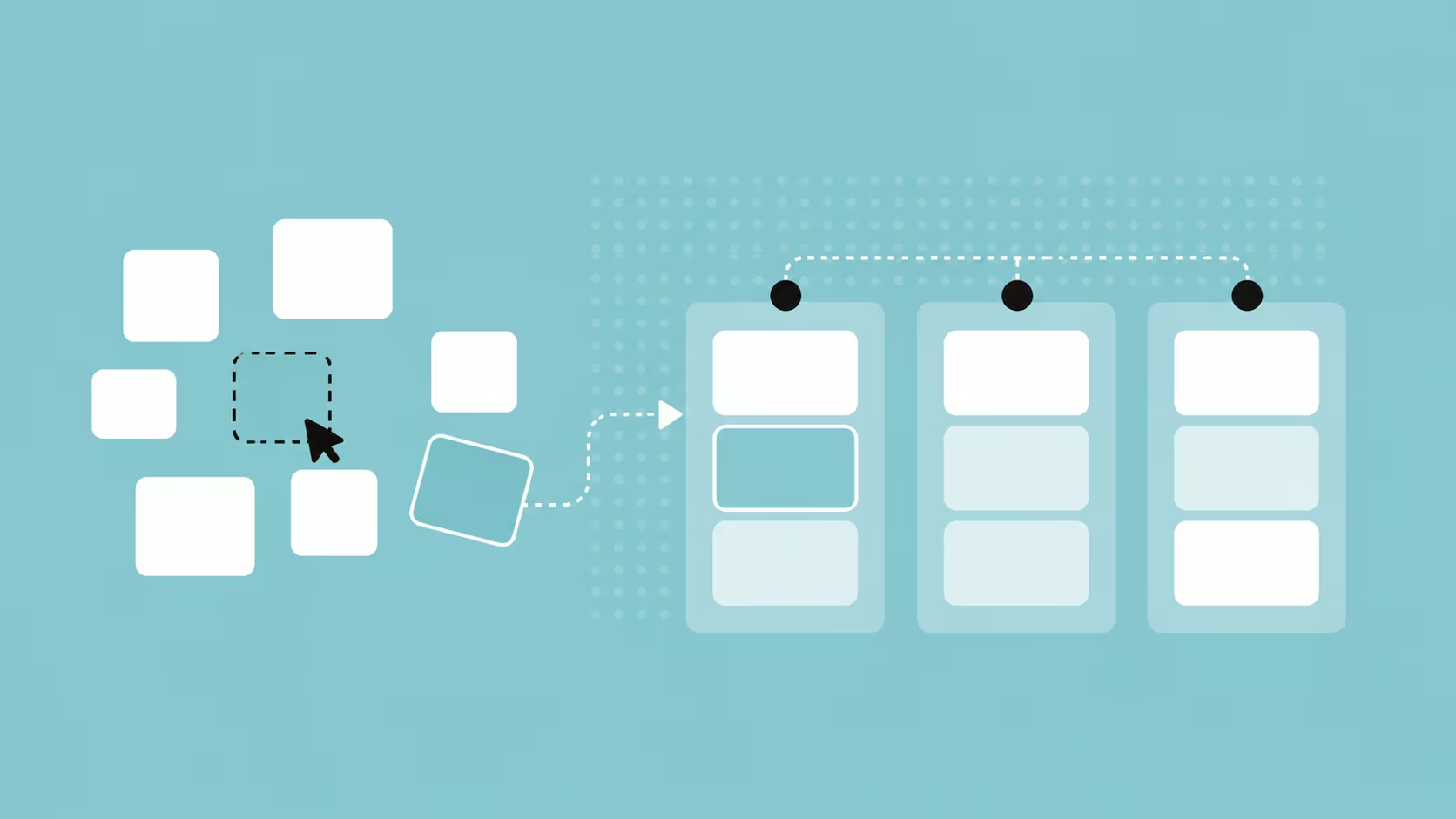
Card sorting is a generative and evaluative method for designing and testing information architecture. Participants are given a set of content items — written on physical or digital cards — and asked to group them in ways that make intuitive sense to them. The results reveal how users mentally categorise information, which directly informs navigation structure, content hierarchy, and menu organisation.
There are two forms. Open card sorting asks participants to create their own category names — revealing how users conceptualise the content landscape. Closed card sorting provides predefined category labels and asks participants to sort items into them — testing whether a proposed navigation structure aligns with user mental models. Open sorting is used when the navigation structure is still being designed; closed sorting is used when a proposed structure needs validation before it is built. Combining both in sequence — open to discover categories, closed to validate them — produces the most reliable information architecture foundation.
For Singapore e-commerce and professional services websites, card sorting is particularly revealing. What an internal team categorises as "Services" may read to users as "What We Do". What the design team calls "Resources" may be searched for as "Blog" or "Articles". These naming mismatches are invisible to the team that created them and immediately apparent in card sorting. The intuitive navigation that users expect is built on how they categorise information, not how the organisation categorises its own content.
Tools: Optimal Workshop's Optimal Sort, Maze (which includes card sorting), or physical card sets for in-person sessions with 15-20 participants. Remote card sorting with Singapore participants is fully viable — most tools support asynchronous, self-directed sessions that participants complete at their own pace.
4. Tree Testing
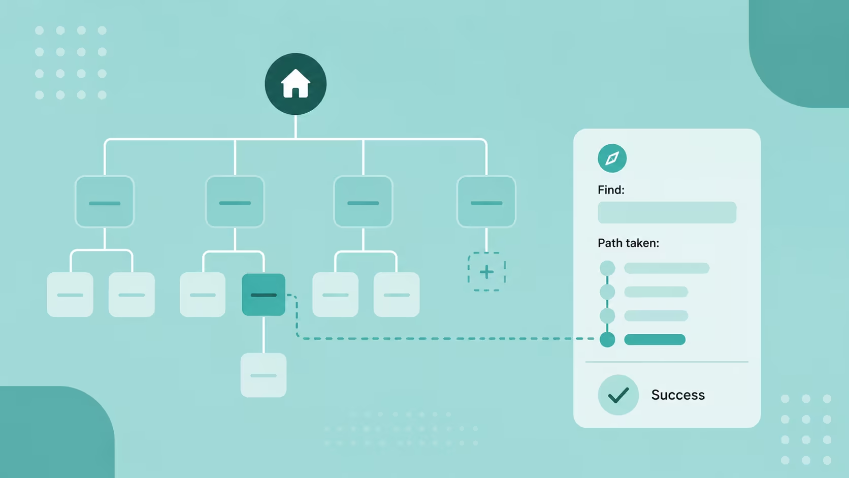
Tree testing is the validation counterpart to card sorting. Where card sorting builds the navigation structure from user mental models, tree testing evaluates whether an existing or proposed structure actually works for navigation tasks. Participants are given a text-based representation of the site hierarchy — no visual design, no imagery, just the menu structure — and asked to find specific items within it. The absence of visual design is deliberate: it isolates the navigation logic from the visual execution, revealing whether the structure itself is intuitive rather than whether the design makes it look intuitive.
A tree test session might ask: "Where would you go to find the return policy?" or "Where would you look to find pricing for the enterprise plan?" Participants click through the text hierarchy to locate their answer. Success rates (correct destination found), time taken, and the paths users took before finding (or not finding) the answer all reveal specific points where the navigation structure breaks down. The data identifies whether the problem is a naming issue (the right category has the wrong label), a structural issue (the item is in a logical category that users do not check), or a depth issue (the item is too many clicks from the homepage)
Tree testing is most valuable early in the design process — after card sorting has produced an initial structure — but can also be used post-launch to diagnose a navigation that is producing high exit rates from interior pages. Tools: Optimal Workshop's Treejack is the most purpose-built tool for tree testing. Maze also supports tree testing within its research platform.
5. Eye Tracking and Heatmaps
Heatmaps and eye tracking tools analyse where users look, scroll, click, and hover on your pages, producing visual representations of engagement patterns that reveal what users actually notice versus what you designed them to notice. Heatmaps aggregate behaviour data across many sessions; eye tracking (using hardware or AI-based gaze estimation) tracks individual gaze patterns with higher precision.
Three types of heatmap are most useful for UX evaluation: click maps (where users click — including rage clicks, which indicate frustrated repeated clicking on non-interactive elements), scroll maps (how far users scroll down the page — revealing whether important content is being reached), and move maps (where users' cursors travel — on desktop, cursor movement correlates reasonably well with visual attention).
For Singapore websites with above-the-fold content strategies — where the most important conversion information and trust signals are placed in the first visible screen — scroll maps are particularly revealing. If scroll depth data shows that 70% of users are not scrolling past the hero section, the content hierarchy needs reconsidering: either the above-fold content is not compelling enough to draw users further, or the page signals completion before the conversion goal is reached. For how visual attention connects to the UX signals that influence search rankings, see that dedicated guide.
Tools: Microsoft Clarity (free, no session limit — the recommended starting point for Singapore SMEs), Hotjar (paid, with additional survey and recording features), and Crazy Egg. All three integrate with Webflow sites via a script embed in the project's custom code section. Eye tracking at clinical precision requires specialist hardware; AI-based gaze estimation tools like EyeQuant provide reasonable heatmap prediction from static images without hardware.
Combine heatmaps with session recordings for maximum insight. Heatmaps show aggregate patterns across many users; session recordings show individual journeys in sequence. The heatmap reveals what is happening; the recording reveals why — showing the specific user behaviours that produce the aggregate pattern.
6. Click Testing
Click testing captures where users click on a design — or where they expect to be able to click — before a page goes live. Participants are shown a static design image (no interactive elements) and asked to click where they would go to complete a specific task: "Where would you click to contact customer support?" or "Where would you click to see pricing?". The aggregate of click locations reveals whether CTAs, navigation elements, and interactive affordances are positioned where users expect to find them.
Click testing is most valuable at the prototype or high-fidelity mockup stage, before development investment is made. If click testing reveals that 40% of users click on a decorative element that does not link anywhere, or that the primary CTA is consistently missed in favour of a secondary element, those findings can inform layout adjustments before a single line of code is written. It is one of the highest-return-on-investment evaluative methods precisely because the cost of making changes at the design stage is a fraction of the cost of reworking a built page.
For Singapore landing pages and service pages where the primary CTA is the commercial conversion point — "Get a Free Quote", "Book a Consultation", "View Our Work" — click testing validates that the CTA placement, size, and visual prominence are driving the intended behaviour. This is particularly valuable for improving website UX on pages where conversion rate data suggests a problem but session recordings do not clearly reveal the cause. Tools: Maze, UsabilityHub (which has a dedicated First Click test format), and Figma with recorded click sessions.
Method Quick Reference
How to Combine Evaluative Research Methods
No single evaluative method provides a complete picture of UX quality. The most reliable UX validation programmes combine methods strategically — each method addressing a different dimension of the user experience and compensating for the blind spots of the others.
A practical combination for a Singapore SME launching a new Webflow website:
- Card sorting → Tree testing — before any navigation is built. Card sorting produces the navigation structure; tree testing validates it before development begins
- Click testing — on high-fidelity Figma mockups. Validates CTA placement, button prominence, and interactive affordances before the Webflow build begins
- Usability testing — on a Webflow prototype or staging environment. Five to eight sessions revealing friction points before launch, when changes are still low-cost
- Heatmaps + session recordings — deployed at launch and reviewed at two weeks, four weeks, and eight weeks post-launch. Reveals actual user behaviour patterns on live traffic
- A/B testing — once there is sufficient traffic (typically 500+ visitors per month per variation) to run statistically valid tests. Optimises specific high-impact elements after the broader UX is validated
The sequence matters. Structural decisions (navigation, information architecture) should be validated before visual decisions, and both should be validated before conversion optimisation. Running A/B tests on a page with a fundamental navigation problem will produce misleading results because the conversion barrier is upstream of the element being tested. For the complete UX design process that this validation sequence fits within, see our guide on the UX design process.
Evaluative Research in Singapore's Specific Context
Singapore's market creates three specific evaluative research considerations worth addressing explicitly.
Multilingual UX validation
If your website serves both English and Mandarin-speaking audiences — as many Singapore professional services, healthcare, and F&B businesses do — evaluate each language version separately. Navigation labels that work in English may have different cognitive associations in Mandarin. Content hierarchy that reads clearly in English left-to-right may need adjustment for a Mandarin-preferring audience. Card sorting and usability testing conducted in each language with participants from each community will reveal whether the localised experience is genuinely equivalent or merely translated.
Mobile-first validation for Singapore audiences
Over 85% of Singapore users access websites on mobile, and usability testing that evaluates only desktop behaviour misses the majority of the actual user experience. All six evaluative methods should be conducted primarily on mobile: recruit participants to complete usability testing tasks on their own phones (not the researcher's), run heatmaps with mobile filtering active in the analytics tool, and conduct click testing on mobile-scaled designs. For the full mobile UX framework, see our guide on how to make your website mobile-ready.
Compliance-sensitive UX testing
For Singapore businesses in regulated sectors — financial services under MAS, healthcare under MOH, government-adjacent services — evaluative testing must account for compliance requirements that constrain design choices. Usability issues that would be fixed by removing a required disclosure or simplifying a mandatory consent flow need to be addressed through design creativity within the compliance constraints, not by removing the compliance element. Briefing usability test participants on the regulatory context ("this confirmation screen is required by MAS regulations — we're testing how clearly it communicates, not whether it should exist") prevents test sessions from producing the technically-correct-but-impractical feedback of "remove this step".
Frequently Asked Questions
What is the difference between formative and evaluative UX research?
Formative (or exploratory) research happens before design, to discover user needs, behaviours, and contexts that should shape what you build. Methods include user interviews, contextual inquiry, diary studies, and ethnographic observation. Evaluative research happens after something has been built or prototyped, to test whether the design solution works as intended. Methods include usability testing, A/B testing, card sorting, tree testing, eye tracking, and click testing. Both are essential: formative research ensures you build the right thing; evaluative research ensures you build it right. For the formative methods, see our guide on how exploratory UX research shapes better design decisions.
How much does usability testing cost in Singapore?
The cost range is wide: from near-zero for self-run unmoderated testing using free tools, to S$500–S$5,000+ for moderated sessions with professional participant recruitment and researcher facilitation. Unmoderated remote testing through Maze costs the tool subscription fee (from USD $99/month) plus any participant recruitment costs if using a paid panel. Moderated testing with professional recruitment for 6 sessions in Singapore typically costs S$1,500–S$3,000 for recruitment alone, plus researcher time. For most Singapore SMEs, starting with 5 unmoderated Maze sessions using your own network as participants is the most accessible entry point — and generates actionable findings at minimal cost.
Can I conduct evaluative UX research on a Webflow site?
Yes — Webflow is well-suited for all six evaluative methods. Figma prototypes linked from Webflow designs support click testing and unmoderated usability testing via Maze. Webflow's staging environment can be used for moderated usability testing before launch. Heatmaps and session recording tools (Hotjar, Microsoft Clarity) integrate via a single script embed in Webflow's project settings — no developer involvement required. A/B testing works through Optibase (Webflow-native, no code required) or VWO (external script embed). Card sorting and tree testing use external tools (Optimal Workshop, Maze) that are platform-agnostic.
How many participants do I need for usability testing?
The widely cited Nielsen Norman Group research suggests that five participants reveal approximately 85% of usability issues in a product — making five sessions the practical minimum for a focused usability test. For broader evaluation across multiple user segments (for example, testing with both younger investors and mature investors for a Singapore fintech platform), five participants per segment is the starting point. Beyond fifteen to twenty participants in a single round, you encounter diminishing returns — you begin confirming issues you already know about rather than discovering new ones. Run smaller rounds frequently (five to eight participants per round) with iteration between rounds rather than one large round at the end of the project.
Is A/B testing legal for government or healthcare sites in Singapore?
A/B testing is legal for Singapore government and healthcare sites, but must comply with the Personal Data Protection Act (PDPA) if personal data is collected or processed as part of the test. Specifically: if A/B test variants collect different types of personal data, or if personalisation is based on profiling that involves personal data, PDPA consent requirements apply. For most A/B tests that compare design elements (headline copy, CTA colour, layout) without collecting additional personal data, PDPA compliance is straightforward. The requirement is transparency — participants should be made aware that A/B testing occurs, typically through the site's privacy policy. Government-facing digital services should also consult GovTech's Digital Service Standards for any additional constraints.
What is the best first evaluative method for a new Singapore business website?
Start with heatmaps and session recordings — they require no participant recruitment, no sessions to facilitate, and no scheduling. Install Microsoft Clarity (free) the day the site launches and review the data after two weeks of live traffic. The scroll maps will immediately reveal whether key content is being seen, the click maps will show whether CTAs are being engaged with, and the session recordings will show individual user journeys through the site. This data will tell you whether there are fundamental UX problems worth investigating further with usability testing, or whether the site is performing broadly as designed. Usability testing is the highest-insight method, but heatmaps and recordings give you the evidence to target your usability testing sessions at the right pages and the right tasks. For the diagnostic framework, see our guide on how to improve your website's UX.
How does evaluative research connect to conversion rate improvement?
Evaluative research is the mechanism through which UX improvements translate into conversion rate improvements. Usability testing identifies the specific friction points preventing users from completing conversion actions. A/B testing validates whether proposed fixes actually improve conversion rates. Click testing confirms that CTA placement is driving the intended behaviour. Heatmaps reveal whether users are reaching the conversion point at all. Each method provides a different layer of evidence for the same underlying question: why are visitors not converting, and what should we change? For the conversion framework that this evidence supports, see our guide on how UX/UI can improve your website's conversions.
Conclusion
Evaluative UX research is not a one-time checkpoint before launch — it is an ongoing practice that reflects the reality that users change, expectations evolve, and the competitive landscape shifts. A website that performed well in usability testing in 2024 may be underperforming against current user expectations in 2026. The businesses that maintain strong UX quality over time are those that treat evaluation as a programme rather than a project: regular heatmap reviews, periodic usability testing rounds, and structured A/B testing on high-impact pages.
The six methods in this guide — usability testing, A/B testing, card sorting, tree testing, eye tracking and heatmaps, and click testing — cover the full range of evaluative UX questions. Not every project requires all six; the method quick-reference table is a starting point for selecting the right combination for your specific validation need. What matters is that design decisions are validated against real user evidence rather than internal assumptions — because the gap between what designers expect users to do and what users actually do is where most UX problems live.
At ALF Design Group, our UX research service integrates evaluative research into every engagement — from pre-launch usability testing to post-launch heatmap analysis and A/B testing. If you want to understand what research-validated UX looks like in practice for your Singapore website or digital product, get in touch.
{{build-better-experience="/directory"}}
First Published On
March 9, 2025
Categories
Written By
.webp)
Resources
Related Articles
Deep dive into our latest news and insights.