Improve Website Accessibility Without Compromising Design
An in-depth guide to accessible web design that blends form, function, and compliance.
Table of contents
Website accessibility ensures everyone — including users with visual, auditory, motor, and cognitive disabilities — can use and interact with your site. But the most persistent misconception in web design is that accessible websites must sacrifice visual appeal. At ALF Design Group, we believe accessibility and great design are not in tension — they are the same discipline approached with greater care. This guide covers the full implementation picture: visual design considerations (colour, typography, layout), interactive and navigation accessibility (keyboard, focus states, skip links, menus), content accessibility (alt text, forms, ARIA, multimedia), the testing tools that surface compliance gaps, Singapore's IMDA digital inclusion context, and how Webflow's architecture supports accessible builds from day one.
Website accessibility is not a compliance checkbox or a niche concern for disability specialists. It is a design quality standard — one that, when applied properly, produces websites that are cleaner, clearer, faster, and better for every user, not just those with disabilities.
In Singapore, where 575,000 residents are aged 65 and above and that number is growing, and where the government's Digital Access for All initiative is driving digital inclusion across all demographics, accessibility is also increasingly a commercial and reputational expectation. Businesses that build accessible websites reach a larger audience, earn better organic rankings, and demonstrate the kind of inclusive brand values that matter to a growing segment of Singapore's consumer and enterprise market.
Why Website Accessibility Matters
Accessibility improvements produce benefits that extend far beyond the users who need them most.
15% of the world's population — over 1.3 billion people — lives with some form of disability. — World Health Organization
In a Singapore context, this means approximately 800,000 potential users whose ability to access your website is determined by the design decisions you make. But the commercial argument for accessibility extends well beyond this group. Many accessibility improvements — larger text, higher contrast, keyboard navigation, clearer labels — improve the experience for all users, regardless of disability status.
The five core business reasons Singapore businesses should invest in accessibility:
- SEO improvement: accessible sites are better structured for search engines. Semantic HTML heading structure, descriptive alt text, and meaningful link labels all contribute to how Google understands and ranks your content. According to Google, UX signals including accessibility are increasingly incorporated into AI-powered ranking evaluations
- Wider audience reach: accessible design serves users with permanent disabilities, situational limitations (bright sunlight, one-handed phone use), and age-related changes to vision and motor ability — collectively a far larger user group than the strict disability definition implies
- Regulatory future-proofing: Singapore's IMDA Digital Service Standards mandate WCAG 2.1 AA compliance for public sector websites. Private sector businesses in regulated industries (financial services, healthcare) increasingly face the same expectations from enterprise clients and government procurement processes
- Conversion improvement: accessible forms convert better — clearer labels, specific error messages, and keyboard navigation directly reduce abandonment rates. For how accessibility improvements connect to broader conversion mechanics, see our guide on how UX/UI can improve your website's conversions
- Brand credibility: inclusive design signals that a business considers the full range of its users — a brand value that resonates with Singapore's multicultural, multi-generational audience
Understanding WCAG 2.1 Guidelines
WCAG (Web Content Accessibility Guidelines) is the international standard for digital accessibility, published by the W3C. The WCAG 2.1 AA level is the benchmark widely adopted for compliance — it is the standard Singapore's IMDA recommends for public sector digital services and the level most enterprise clients specify in procurement requirements.
The WCAG framework is built on four principles — often abbreviated as POUR:
- Perceivable: all users can perceive the content — it is not invisible to any of their senses. Images have text alternatives, videos have captions, and content is not communicated by colour alone
- Operable: all users can navigate and interact with the interface. The site is fully functional via keyboard, there are no keyboard traps, and timed content can be paused or extended
- Understandable: information and the operation of the user interface is clear and predictable. Language is identified in HTML, error messages are specific and constructive, and the site behaves consistently
- Robust: content works reliably across devices, browsers, and assistive technologies. HTML is valid and well-structured, and custom UI components use ARIA correctly to communicate their behaviour to screen readers
WCAG 2.2, released in October 2023, added new success criteria primarily focused on cognitive accessibility and mobile interaction — including minimum focus target size (24×24px), consistent help features, and accessible authentication without cognitive function tests. For Singapore businesses building new websites in 2026, designing to WCAG 2.2 AA is advisable. For an existing site built to WCAG 2.1 AA, a targeted gap assessment against the new 2.2 criteria is a sensible next step.
Design Considerations for Accessibility
Colour Contrast
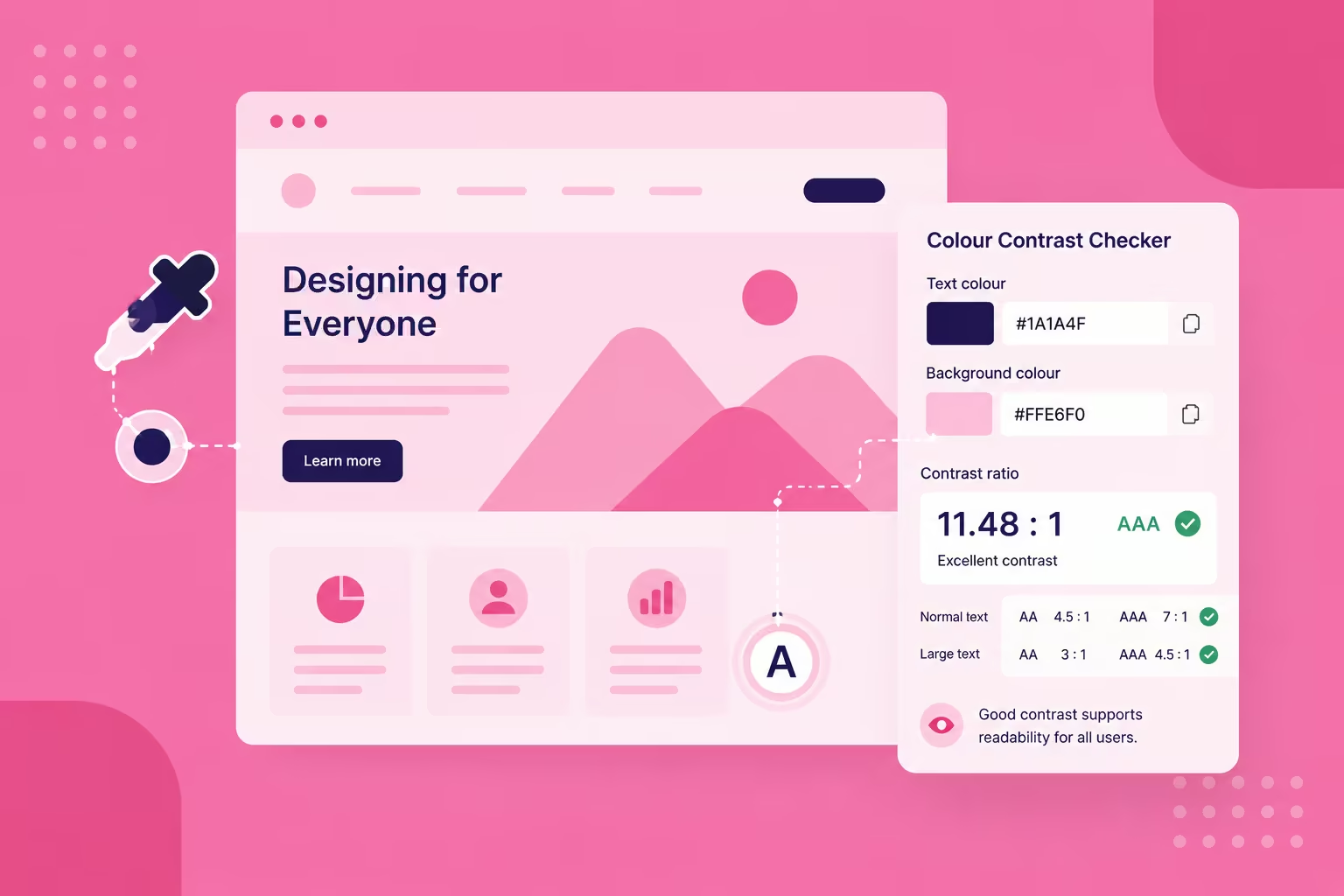
Colour contrast is the most commonly failed accessibility criterion on Singapore business websites — and one of the most impactful to fix. The WCAG 2.1 AA minimum requires a 4.5:1 contrast ratio between text and background for standard body text, and 3:1 for large text (18pt or 14pt bold). This applies to all text — body copy, buttons, links, form labels, error messages, and placeholder text.
The misconception: that high-contrast design means ugly, utilitarian design. In practice, many of the most beautiful and commercially successful websites use bold, high-contrast colour choices precisely because contrast clarity is a fundamental principle of visual design. Sufficient contrast makes text more readable on mobile screens in variable lighting — the exact scenario that describes most Singapore users most of the time.
Tools: Stark Plugin for Figma checks contrast ratios directly in your design files before development begins. WebAIM Contrast Checker validates hex codes against WCAG thresholds. Lighthouse in Chrome DevTools flags contrast failures on live pages.
Typography

Typography accessibility is not just about font size — it is about the complete reading experience across all users and all screen sizes. Three rules that apply to every Singapore business website:
- Minimum body text size: 16px for desktop, and never below 14px for any legible text. Below these thresholds, mobile users will zoom — and a site that requires zooming to read is failing its audience
- Typeface selection: sans-serif typefaces (Inter, Roboto, DM Sans, Plus Jakarta Sans) are generally more legible at smaller sizes and on screen than serif faces. Avoid condensed or display typefaces for body text. For the full recommendations, see our guide on best Google Fonts for readability
- Line height and spacing: body text should have a line height of at least 1.5 times the font size. Letter spacing should not be negative. Sufficient white space between paragraphs makes content scannable for users with cognitive disabilities and everyone else
Responsive Layouts
Responsive design and accessibility are closely related. A layout that breaks on mobile is not just a UX failure — it is an accessibility failure for the majority of Singapore users who browse on smartphones. Specific accessibility requirements for responsive layouts:
- Use relative units — em, rem, and percentage-based widths scale with user preferences and browser zoom settings. Fixed-pixel widths break when users increase browser text size in their accessibility settings
- Avoid horizontal scrolling — content that requires horizontal scrolling at standard viewport widths is a WCAG failure (1.4.10 Reflow)
- Ensure content reflows properly — when users zoom to 400% (the WCAG 2.1 requirement), content should still be readable in a single column without loss of information or functionality
- Sufficient touch target size — interactive elements should have a minimum touch target of 44×44px on mobile, with adequate spacing between adjacent targets to prevent accidental taps
Visual Hierarchy
Semantic heading structure (H1 → H2 → H3) is both an accessibility requirement and an SEO foundation. Screen readers use heading hierarchy to build a document outline that allows users to navigate by section — jumping to H2s to find the section they want, then drilling into H3s for detail. A page where heading levels are chosen for visual size rather than document structure breaks this navigation entirely.
Practical rule: there should be one H1 per page (the page title), H2s for major sections, and H3s for subsections within those. Never skip heading levels (H1 → H3 without H2), and never use heading tags purely for styling — use CSS classes instead. This structure also helps search engines understand the information hierarchy of the page, which contributes to web design best practices more broadly.
Interactive & Navigation Accessibility
Keyboard Navigation
Full keyboard navigation means every action on the website — clicking links, opening menus, submitting forms, closing modals, interacting with carousels — can be accomplished without a mouse or trackpad. This is a WCAG 2.1 Level A requirement, not an AA enhancement. Users who rely on keyboard navigation include those with motor disabilities, users of switch controls, and power users who prefer keyboard shortcuts.
The practical implementation: every interactive element must receive keyboard focus in a logical order that follows the visual layout of the page (or the reading order). Avoid creating keyboard traps where focus enters a component but cannot be escaped. Tab order should be predictable — in Webflow, the DOM order of elements determines tab order, so visual positioning should match the logical document structure wherever possible.
Test keyboard accessibility by unplugging your mouse and navigating your entire website using only Tab, Shift+Tab, Enter, Space, and arrow keys. If you cannot complete every key user flow, your site has keyboard accessibility failures.
Focus States
Focus states are the visible indicators that tell keyboard users which element is currently active. Removing focus outlines — outline: none or outline: 0 in CSS — is one of the most common accessibility failures on visually-polished websites. Designers remove these outlines because the browser default (a thin blue ring) clashes with the visual design. The solution is not to remove the focus indicator but to replace it with a custom one that is visible and on-brand.
WCAG 2.2 (Success Criterion 2.4.11) requires that focus indicators have a minimum size and contrast. The practical standard: a 2px solid outline in a high-contrast colour, or a background colour change sufficient to provide 3:1 contrast between the focused and unfocused states. In Webflow, focus styles are set using the :focus-visible selector — visible only to keyboard users, not mouse users — which eliminates the visual clutter concern that leads designers to remove focus states.
Skip Links
Skip links allow keyboard and screen reader users to jump directly to the main content area, bypassing the navigation menu that would otherwise require tabbing through every navigation item on every page load. They are typically hidden visually but revealed on keyboard focus — a small "Skip to main content" link that appears at the top of the page when the first Tab press is made.
Skip links are a WCAG 2.4.1 requirement. In Webflow, implementing them requires adding a visually hidden link as the first element in the page, with a CSS class that uses position: absolute; left: -9999px for the hidden state and position: static on the :focus state to reveal it. This is a one-time setup that improves the experience for screen reader and keyboard users across every page on the site.
Accessible Menus
Navigation menus are among the most common sources of keyboard and screen reader accessibility failures on Singapore websites. The most frequent issues: dropdown menus that require mouse hover to open (keyboard users cannot trigger hover events), submenus that trap keyboard focus, and icon-only navigation items without text labels.
- Use semantic HTML: navigation should use
<nav>elements with aria-label attributes distinguishing multiple navigation regions (e.g., 'Main navigation', 'Footer navigation') - Keyboard-operable dropdowns: dropdown menus must open on Enter or Space keypress and close on Escape. Arrow keys should navigate between dropdown items
- Visible labels: icon-only navigation buttons must have visible text or an aria-label that screen readers can announce
For sidebar navigation design and the UX principles behind effective navigation structure, see our guide on sidebar navigation design for web apps.
Content Accessibility
Alt Text for Images

Alternative text (alt text) is the text description assigned to images via the alt attribute. Screen readers read this text aloud to users who cannot see the image. Every non-decorative image on your website must have descriptive alt text that conveys the same information or purpose as the image. Decorative images (purely visual elements that convey no information) should have an empty alt attribute (alt="") — this tells screen readers to skip the image rather than announcing 'image' or reading the file name.
Alt text best practices: describe what the image shows and why it is relevant to the content, not just what it depicts. A photo of a team working around a whiteboard in a UX workshop might have alt text of 'ALF Design Group team conducting a UX workshop session with client stakeholders' — not 'team photo' or 'people standing'. Keep alt text under 125 characters where possible. For complex images like charts, infographics, or data visualisations, provide a detailed description either in the alt attribute or as adjacent body text.
Form Accessibility
Forms are the highest-stakes accessibility challenge on most business websites — they are where conversion actions happen, and form accessibility failures directly suppress conversion rates. The foundational requirements:
- Explicit labels: every input field requires a <label> element associated with it via the for attribute matching the input's id. Placeholder text is not a label substitute — it disappears on focus and is not reliably announced by all screen readers
- Error messages: errors must be identified in text (not colour alone), associated with the specific field that caused them (using aria-describedby), and specific enough to tell the user how to correct the issue
- Required field indication: required fields must be identified in text or with an icon that has a text alternative — not by colour alone
- Focused field visibility: the currently focused form field should have a clear visual indicator distinguishable from its unfocused state

Form accessibility is a deep topic that intersects with conversion rate optimisation, mobile UX, and PDPA compliance for Singapore businesses. For a comprehensive guide covering WCAG 2.2 form requirements, ARIA patterns for complex form components, and the accessibility-conversion connection, see our dedicated guide on form accessibility best practices for Singapore websites.
ARIA Labels and Roles
ARIA (Accessible Rich Internet Applications) is a set of HTML attributes that communicate the role, state, and properties of custom UI components to assistive technologies. ARIA is most commonly needed for components that HTML does not have native equivalents for: custom dropdown menus, modal dialogs, tab panels, accordions, carousels, and date pickers.
The most important ARIA principle: use ARIA to supplement HTML semantics, not to replace them. A native HTML <button> element has keyboard access and role announcement built in by the browser. A <div> styled as a button requires role="button", tabindex="0", and JavaScript keyboard event handling to replicate the same behaviour — and is more likely to be implemented incorrectly. When HTML provides a semantic element for the component you need, use it.
Common ARIA patterns for Singapore business websites: aria-expanded on accordion and dropdown triggers; aria-label on icon buttons and navigation landmarks; role="dialog" and aria-modal="true" on modal overlays; aria-live regions for dynamically updated content such as search results or form validation messages.
Multimedia: Captions and Transcripts
Video and audio content on your website requires text alternatives that convey the same information to users who cannot hear or see the media. The WCAG requirements are specific:
- Captions: all pre-recorded video with audio must have synchronised captions — text that appears in time with the audio. Auto-generated captions (YouTube, Otter.ai) require human review for accuracy before publication, particularly for technical content, brand names, and proper nouns
- Transcripts: audio-only content (podcasts, voice notes) requires a full text transcript. Video content benefits from transcripts as well — they improve SEO and make content accessible to users who prefer to read
- Audio descriptions: video content that conveys information visually (diagrams, demonstrations, text on screen) requires audio descriptions for users who cannot see the video
- No autoplay: media that plays automatically is both an accessibility barrier (it interferes with screen reader audio) and a significant UX failure for all users
Testing Tools and Best Practices
Accessibility testing requires a combination of automated scanning and manual evaluation. Automated tools catch approximately 30–40% of accessibility issues — the remainder require human testing, particularly with screen readers and keyboard navigation.
The recommended testing stack for Singapore business websites:
- Google Lighthouse — built into Chrome DevTools, provides an accessibility score alongside performance and SEO scores. Run on every key page, not just the homepage. Free, available in every project
- axe DevTools by Deque Systems — a more comprehensive browser extension that identifies a broader range of accessibility issues with specific fix guidance. The free version covers most use cases; the Pro version adds workflow integration
- WAVE (Web Accessibility Evaluation Tool) — visual overlay on any live page showing accessibility errors, alerts, and structural elements (including heading hierarchy and landmark regions). Excellent for non-technical stakeholders who need to understand accessibility issues visually
- Screen reader testing: NVDA (Windows, free) and JAWS (Windows, paid) for Windows, VoiceOver (Mac, built in) for Apple devices. Test the complete key user flows — homepage to enquiry submission, product page to checkout — with screen reader active
- Keyboard-only testing: navigate your entire site using only Tab, Shift+Tab, Enter, Space, and arrow keys. Document every point where navigation becomes impossible or unclear

Conduct automated scanning on every deployment and incorporate manual testing into your quarterly UX audit cycle. For the structured audit process that incorporates accessibility testing as Step 4 of a 7-step framework, see our guide on how to conduct a usability audit. For the evaluative research methods that surface accessibility failures with real user evidence, see our guide on evaluative UX research methods.
Local Accessibility Context: Singapore and IMDA Guidelines
Singapore's Infocomm Media Development Authority (IMDA) leads the government's digital inclusion agenda through its Digital Access for All programme, which aims to ensure that Singapore's digital ecosystem is accessible to all residents regardless of age, ability, or digital literacy.
The IMDA's Digital Service Standards mandate WCAG 2.1 AA compliance for all Singapore government digital services — a baseline that increasingly flows into procurement requirements for private sector businesses providing services to government agencies. For private sector businesses generally, while full WCAG compliance is not currently legally mandated, the practical pressures are real:
- Enterprise procurement: large Singapore companies increasingly include accessibility requirements in their supplier and vendor digital standards. Not meeting them can exclude your business from tenders
- MAS-regulated financial services: MAS has issued guidance on technology risk and digital service quality that encompasses accessibility considerations for customer-facing digital channels
- Healthcare: MOH-regulated healthcare providers face specific expectations around digital accessibility for patient portals and appointment booking systems
- Future legislation: Singapore is watching the EU Accessibility Act (effective June 2025 for EU businesses) and the US ADA web accessibility developments. Legislation that mandates private sector web accessibility is widely expected to follow in Asia-Pacific markets within the next five to ten years
The most prudent approach for Singapore SMEs: build to WCAG 2.1 AA now, as if it were already required. The cost of retrofitting accessibility into an existing website is significantly higher than building it in from the start.
Implementing Accessibility in Webflow
Webflow's architecture provides strong accessibility foundations that make WCAG compliance achievable without custom code in most scenarios. As a Webflow-first design and development agency, ALF Design Group builds accessibility into every project from the design phase. Key Webflow-specific implementation points:
- Semantic HTML output: Webflow generates clean, semantic HTML. Using the correct Webflow element for each component (heading elements for headings, button elements for buttons, nav elements for navigation) produces the correct accessibility semantics automatically
- Alt text in the CMS: Webflow's image upload interface includes an alt text field. CMS collection images support dynamic alt text fields that content editors can populate — making alt text maintainable at scale
- Custom attributes for ARIA: Webflow's Custom Attributes panel allows designers to add ARIA attributes to any element without code — enabling aria-label, aria-expanded, aria-describedby, and role attributes to be added visually
- Focus styles: Webflow supports :focus-visible styling through Custom CSS, allowing branded focus indicators that appear only for keyboard users
- Skip link implementation: achievable through Webflow's embed element and Custom CSS, typically set up once in the project's Global Styles and applied across all pages
Our web design service includes an accessibility audit and remediation as a standard component of every Webflow build. If your existing Webflow site has not been audited for accessibility, contact us to discuss a targeted accessibility review.
Frequently Asked Questions
What is WCAG compliance?
WCAG stands for Web Content Accessibility Guidelines — the international standard for digital accessibility published by the W3C's Web Accessibility Initiative. Compliance at the AA level means your website meets the minimum standards required to be accessible to users with visual, auditory, motor, and cognitive disabilities. WCAG 2.1 AA is the currently recommended standard; WCAG 2.2 (released October 2023) adds additional criteria primarily focused on cognitive accessibility and mobile interaction. For Singapore businesses, WCAG 2.1 AA is the baseline mandated by IMDA for public sector digital services and increasingly expected in private sector enterprise procurement. The full WCAG documentation is available on the W3C website.
How do I check my website's accessibility?
Start with automated scanning: run Google Lighthouse on your five highest-traffic pages (accessible via Chrome DevTools → Lighthouse → Accessibility) and install the WAVE browser extension for a visual overlay of accessibility issues. These tools are free and will identify approximately 30–40% of accessibility issues, including the most common failures (missing alt text, insufficient contrast, missing form labels). The remaining issues require manual testing: navigate your site with keyboard only (Tab, Shift+Tab, Enter, Space, arrow keys), and test at least one full user flow with a screen reader (VoiceOver on Mac, NVDA on Windows — both free). For a structured methodology, see our guide on how to conduct a usability audit.
Can I make my Webflow site accessible?
Yes — Webflow's architecture supports full WCAG 2.1 AA compliance. The platform outputs semantic HTML, supports custom ARIA attributes through the Custom Attributes panel, allows custom focus styles via Custom CSS, and includes alt text fields for all images and CMS media. The most common accessibility gaps on Webflow sites are not platform limitations — they are design decisions: missing focus styles, placeholder text used as labels, heading levels chosen for visual size rather than document structure, and custom components built without ARIA markup. ALF Design Group specialises in accessible Webflow builds and can audit existing sites for compliance gaps and implement fixes. For how Webflow's technical architecture supports accessible development, see our guide on why businesses prefer Webflow for website design.
Is accessibility legally required in Singapore?
WCAG 2.1 AA compliance is currently mandated for Singapore government digital services under IMDA's Digital Service Standards. For private sector businesses, it is not yet legally required in general — but the practical pressures are real and growing. Enterprise procurement increasingly requires vendor websites to meet accessibility standards. MAS-regulated financial services providers face specific digital service quality expectations that encompass accessibility. And Singapore is expected to follow the EU and US in introducing broader private sector accessibility legislation within the next five to ten years. The most cost-effective approach: build to WCAG 2.1 AA now, before it is mandated, when making changes is less expensive than retrofitting. Visit the IMDA Digital Access for All programme for the government's current guidance on digital inclusion requirements.
Will accessibility affect my SEO?
Positively and directly. The mechanisms connecting accessibility to SEO are multiple: semantic HTML heading structure (an accessibility requirement) helps search engines understand page hierarchy. Descriptive alt text (an accessibility requirement) contributes to image search indexing and provides text context for crawlers. Keyboard-navigable, fast-loading, mobile-responsive sites — all accessibility-adjacent properties — produce better Core Web Vitals scores, which are direct Google ranking factors. And accessible sites typically have better engagement metrics (lower bounce rates, longer session duration) because they serve more users more effectively — which are positive signals to Google's AI-powered ranking evaluation. For the full framework of how these signals connect, see our guide on UX signals that influence AI search rankings.
How long does it take to make a website fully accessible?
For a new build: incorporating accessibility from the design stage adds approximately 10–15% to the design and development timeline — primarily the additional work of creating focus styles, testing keyboard navigation, implementing ARIA for custom components, and auditing all pages. For an existing website: the time depends entirely on the current accessibility gap. A site with mostly semantic HTML and good visual design may need only targeted fixes over one to two weeks. A site built on a non-semantic template with no alt text, no focus styles, and custom components without ARIA may require a more comprehensive remediation over four to eight weeks. An accessibility audit — typically two to three days — will produce a prioritised issue list and time estimate before any remediation begins. Contact our web design team to discuss an accessibility audit for your site.
What is the difference between accessibility and inclusive design?
Accessibility refers specifically to meeting defined standards (WCAG) so that people with disabilities can use your website. Inclusive design is a broader design philosophy that considers the full range of human diversity — ability, age, language, culture, digital literacy — from the start of the design process, rather than retrofitting access as an afterthought. The distinction matters in practice: an accessible website meets the minimum WCAG AA threshold and is usable by people with disabilities. An inclusively designed website goes further — it is easier for everyone to use, in more contexts, with more varied devices and cognitive loads. In Singapore, where the population spans languages, generations, and digital literacy levels, the inclusive design approach produces better commercial outcomes than the minimum accessibility compliance approach.
Conclusion
Accessibility is not just about compliance — it is about inclusion, usability, and better design for everyone. The misconception that accessible design must look clinical or unattractive persists because designers conflate accessibility with a specific aesthetic that has nothing to do with the underlying requirements. High contrast, readable typography, clear navigation, and well-labelled forms are beautiful design principles. They are also WCAG requirements. The two are the same thing.
At ALF Design Group, accessible design is a core component of every UX and Webflow project we deliver — not a checkbox we apply at the end. If you want to improve your website's accessibility while maintaining or elevating its visual quality, contact us for a free accessibility audit or consultation.
{{build-better-experience="/directory"}}
First Published On
December 18, 2024
Categories
Written By
.webp)
Resources
Related Articles
Deep dive into our latest news and insights.