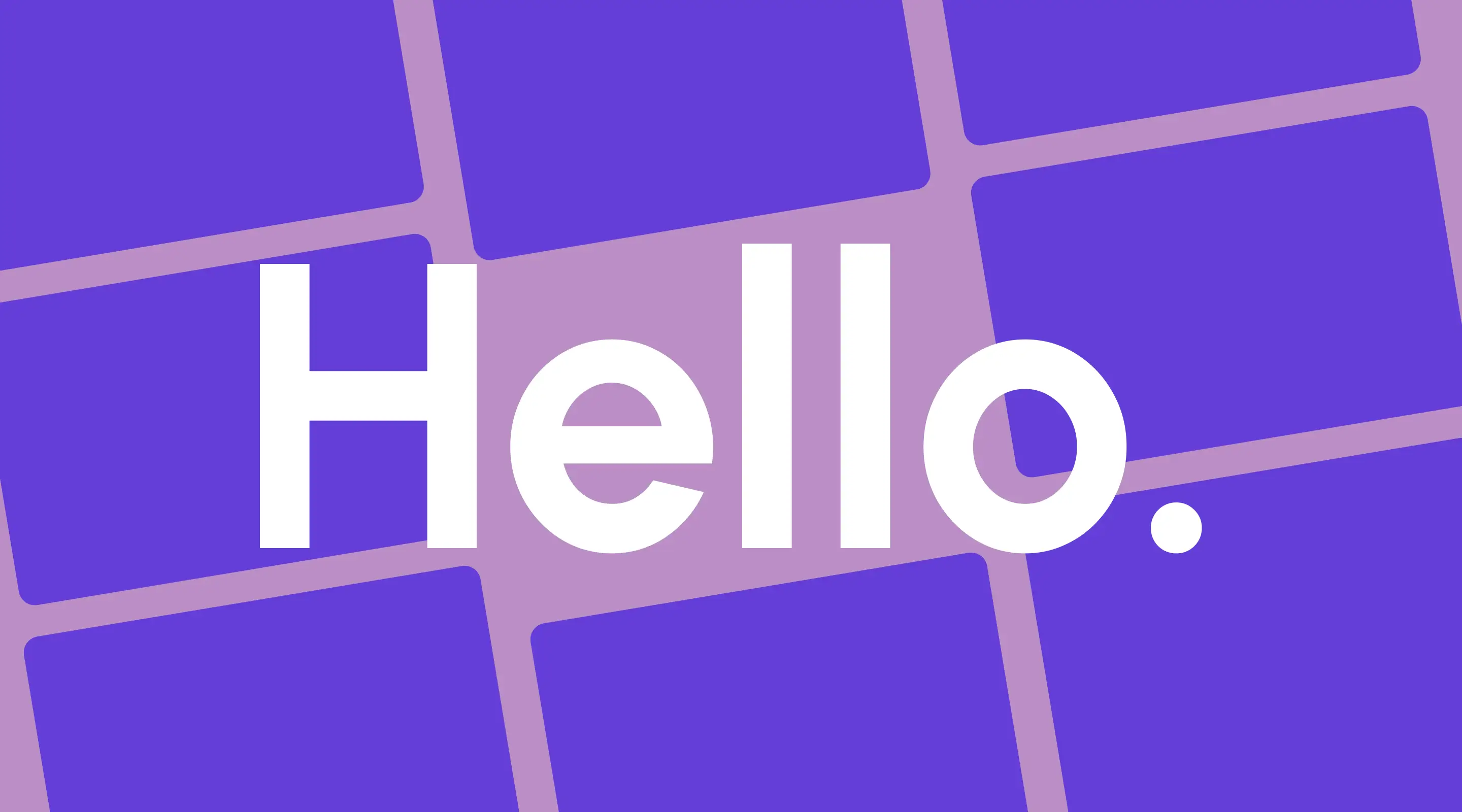
15 Best Google Fonts for Your Website in 2026 (And How to Use Them Well)
The 15 best Google Fonts for 2026 — with pairing tips, performance advice, and picks for Singapore businesses.
Table of contents
Executive Summary
Typography is one of the most consequential decisions in web design — and Google Fonts makes it more accessible than ever. In this guide, we cover the 15 best Google Fonts for websites in 2026, split into two clear categories: sans-serif fonts for modern, functional design, and serif fonts for editorial authority and brand elegance. For each font, we go beyond the basics to explain why it works for web, what type of website it suits best, and how to pair it effectively. We also cover performance considerations, multilingual support for Singapore-based businesses, and the font pairing combinations we use most at ALF Design Group.
Your choice of typeface communicates more than words ever can on their own. Before a visitor reads a single sentence on your website, the font you have chosen has already told them something about who you are — whether you are contemporary or traditional, approachable or authoritative, minimal or expressive.
Typography is not decoration. It is a functional design decision that shapes how users experience your website, how long they stay, how much they trust your brand, and whether they convert. And yet, font selection is one of the areas where many businesses — particularly those building their first website — default to whatever feels familiar rather than what is strategically right.
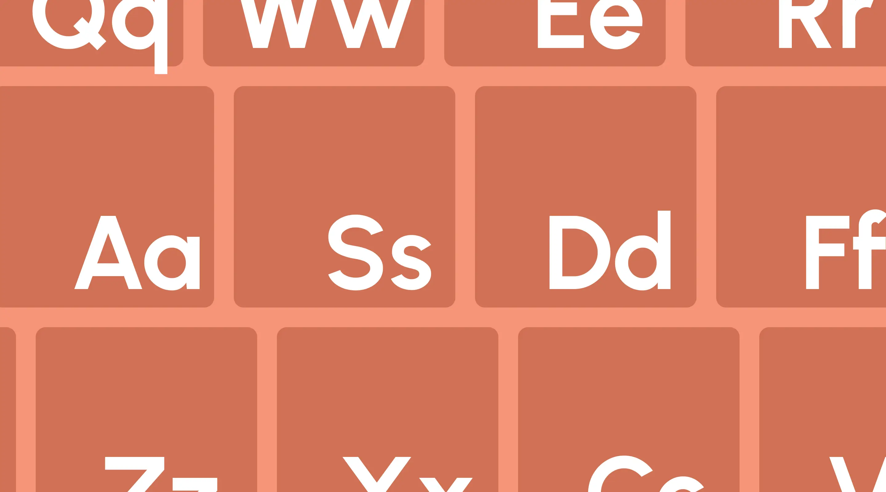
Google Fonts solves the access problem beautifully. With over 1,500 font families available, all open-source, all free for commercial use, and all optimised for web delivery, it is one of the most valuable resources in a web designer's toolkit. The challenge is not finding fonts — it is knowing which ones to choose and, crucially, how to use them well.
In this guide, we cover the 15 best Google Fonts for websites in 2026. We have divided them into two sections — sans-serif and serif — and for each font, we explain what makes it work for web, which industries and use cases it is best suited to, and how to pair it for maximum impact. We also cover performance, multilingual considerations for Singapore businesses, and our recommended font stacks for Webflow projects.
Why Typography Matters More Than You Think
Before the list, it is worth grounding the conversation in why this decision matters at a practical level.
Typography directly influences how users read and interact with your content. Research consistently shows that well-set type improves comprehension, reduces cognitive load, and increases time on page. Poor typography — whether through bad font choice, insufficient line height, or low contrast — does the opposite, causing visitors to disengage before your content has had a chance to do its job.
Beyond readability, typography contributes to:
Brand perception. A geometric sans-serif like Poppins reads as modern and approachable. A humanist serif like Lora reads as considered and trustworthy. These associations are not accidental — they are the product of decades of design convention that visitors absorb without even realising it.
SEO and Core Web Vitals. Fonts that are poorly loaded can negatively impact Largest Contentful Paint (LCP), one of Google's Core Web Vitals metrics. Choosing web-optimised fonts and loading only the weights you need is a direct technical SEO consideration, particularly relevant if you are building or maintaining a Webflow website.
Accessibility. Fonts with sufficient x-height, open apertures, and good letter spacing are more readable for users with dyslexia, low vision, or cognitive differences. This is increasingly important as accessibility standards become more central to professional web design practice.
Mobile performance. With the majority of web traffic now on mobile, fonts need to perform across small screens and variable pixel densities. Not all fonts hold up equally at body text sizes on a 375px-wide display — and your font choice will be tested there just as much as on a desktop.
What to Consider Before Choosing a Google Font
Legibility at All Sizes
The most important quality of a web font is that it can be read comfortably. Look for fonts with a generous x-height (the height of lowercase letters relative to capitals), open apertures (the openings in letters like 'c', 'e', and 'a'), and consistent stroke width. These qualities keep text legible at small sizes and across varying screen conditions.
Font Weights Available
A font family with only two or three weights limits your design flexibility. For a complete website, you typically need at minimum: a regular weight (400) for body text, a medium or semibold (500–600) for UI labels and captions, and a bold (700) for headings. Always check weight availability before committing to a font.
Performance Impact
Every font weight you load adds to your page's total asset size. Limit yourself to two font families and no more than three weights per family. On Webflow, this is straightforward to manage in the font settings panel — but it requires discipline. Unused weights loaded in the background are one of the most common causes of unnecessary page weight that impacts website speed.
Multilingual Support
For businesses based in Singapore, multilingual font coverage is a practical consideration. Singapore's population communicates in English, Mandarin Chinese, Malay, and Tamil. If your website serves audiences who may switch between languages, or if you maintain content in multiple scripts, your font choice needs to support that without fallback rendering issues. We address this specifically in the Singapore section below.
Pairing Compatibility
Most professional websites use two typefaces: one for headings and display use, one for body copy. These two fonts need to work together — complementing each other in tone without competing visually. As a general rule, pair a font with more personality (for headings) with a more neutral, functional font (for body text).
Part 1: Best Sans-Serif Google Fonts
Sans-serif fonts are the workhorse of modern web design. Clean, functional, and highly legible on screen, they dominate digital interfaces for good reason. Here are the best sans-serif Google Fonts for websites in 2026.
1. Inter
Style: Humanist sans-serif
Designed by: Rasmus Andersson
Inter was designed specifically for computer screens, and it shows. Every detail — the x-height, the apertures, the spacing — is calibrated for on-screen readability across different pixel densities and sizes. It is now one of the most widely used fonts on the web and the default typeface for a number of major design systems.
Why it works for web: Inter supports variable font technology, meaning a single font file can serve all weights, reducing HTTP requests. Its large x-height makes it highly legible at small body text sizes, and its slightly wider letterforms hold up well across mobile screens.
Best for: SaaS platforms, product interfaces, fintech dashboards, web applications, and any context where clarity of information is the primary objective.
Pair with: Playfair Display for editorial contrast, or use Inter across both headings and body for a clean, unified system.
2. Poppins
Style: Geometric sans-serif
Designed by: Jonny Pinhorn & Nikhil Klepeis
Poppins is built on perfectly circular geometry — its letters are constructed from precise curves and angles that give it a distinctly modern, friendly character. It has become one of the most popular fonts for startups, tech brands, and creative businesses.
Why it works for web: Poppins is available in nine weights, giving designers significant flexibility across headings, subheadings, body text, and UI elements. Its rounded forms make it approachable without being informal, and it scales well from display sizes down to small captions.
Best for: Startups, creative agencies, e-commerce brands, and Singapore businesses targeting a younger, digitally-native audience.
Pair with: Lora for editorial warmth, or Source Sans 3 for a more neutral body text counterpart.
🔗 View Poppins on Google Fonts
3. Urbanist
Style: Geometric sans-serif
Designed by: Corey Hu
Urbanist is one of the strongest emerging fonts of the past few years. It shares Poppins' geometric foundations but with a more neutral, refined character — less playful, more polished. It has found particularly strong traction in portfolio sites, design agencies, and premium brand websites.
Why it works for web: Urbanist's low contrast strokes and open letterforms make it highly versatile. It works as both a heading font and a body font, making it a strong candidate for single-font websites where consistency is the goal. Its variable font version keeps file sizes lean.
Best for: Design agencies, architecture firms, luxury brands, and modern professional services businesses.
Pair with: Inter for a clean, contemporary system, or DM Serif Display for a high-contrast editorial pairing.
🔗 View Urbanist on Google Fonts
4. DM Sans
Style: Geometric sans-serifDesigned by: Colophon Foundry
DM Sans was commissioned by DeepMind and designed to be a clean, highly functional geometric sans-serif. It has a slightly low contrast and generous proportions that make it exceptionally readable at body text sizes, whilst retaining enough personality to work well as a display font at larger scales.
Why it works for web: DM Sans is compact without feeling cramped, which makes it well-suited to information-dense layouts like pricing pages, comparison tables, and dashboards. Its variable font support means you can dial in precise weights between the standard increments.
Best for: Technology businesses, healthcare platforms, B2B websites, and any site requiring a professional, precise typographic voice.
Pair with: DM Serif Display for a cohesive same-family system, or Playfair Display for a strong editorial contrast.
🔗 View DM Sans on Google Fonts
5. Plus Jakarta Sans
Style: Humanist geometric sans-serif
Designed by: Gumpita Rahayu
Plus Jakarta Sans has quickly established itself as a favourite among web designers who want something more distinctive than Inter or DM Sans without sacrificing readability. Its slightly quirky details — subtly flared terminals, optical adjustments at key letterforms — give it a personality that stands out on screen.
Why it works for web: Plus Jakarta Sans performs beautifully at heading sizes where its character details can breathe, and remains clean and functional at body text sizes. It is available in six weights and a variable version, making it a practical choice for full website implementation.
Best for: Creative technology companies, product startups, modern professional services, and Webflow agency sites.
Pair with: Lora or Merriweather for a strong serif-sans contrast pairing.
🔗 View Plus Jakarta Sans on Google Fonts
6. Work Sans
Style: Grotesque sans-serif
Designed by: Wei Huang
Work Sans sits between geometric and grotesque — it has the functionality of a grotesque (think Helvetica) with the approachability of a geometric. Originally designed for medium-sized text on screens, it has genuine utility across a wide range of website types.
Why it works for web: Work Sans is optimised specifically for on-screen text at medium sizes, making it particularly effective for body copy on content-heavy websites. It reads naturally without drawing attention to itself — which is exactly what good body text should do.
Best for: Blogs, informational websites, editorial platforms, content-led business sites, and any site where readability of long-form text is a priority.
Pair with: Space Grotesk for a contemporary dual-sans system, or Playfair Display for editorial contrast.
🔗 View Work Sans on Google Fonts
7. Space Grotesk
Style: Grotesque sans-serif
Designed by: Florian Karsten
Space Grotesk is a display-forward grotesque with deliberately distinctive details — quirky terminals, a slightly compressed form — that give it strong personality at large sizes. It was designed as a companion to Space Mono but has since developed a strong following of its own.
Why it works for web: Space Grotesk works best as a heading or display font where its character can be appreciated. At body sizes it can feel slightly too distinctive, making it most effective when paired with a more neutral body font. It is a strong choice for brands that want to stand out typographically.
Best for: Creative agencies, tech startups, portfolio sites, and brands where typographic personality is a deliberate part of the identity.
Pair with: Inter or Source Sans 3 for body text to let the heading font take the lead.
🔗 View Space Grotesk on Google Fonts
8. Roboto
Style: Neo-grotesque sans-serif
Designed by: Christian Robertson (Google)
Roboto is Google's own typeface and one of the most downloaded fonts in the world. Designed originally for Android, it combines mechanical skeleton proportions with natural, friendly curves. Its ubiquity is both its strength and its weakness — it is trusted and highly legible, but also extremely common.
Why it works for web: Roboto is available in twelve styles, making it one of the most flexible font families on Google Fonts. It renders consistently across browsers and operating systems, loads efficiently, and is familiar enough to never distract readers. For businesses prioritising reliability and legibility above typographic distinction, it remains a solid choice.
Best for: Corporate websites, government or institutional platforms, enterprise software, and any context where convention and reliability matter more than typographic personality.
Pair with: Roboto Slab for a unified serif-sans system within the same family.
9. Nunito
Style: Rounded sans-serif
Designed by: Vernon Adams
Nunito is distinguished by its fully rounded terminals — every stroke ends in a perfect curve rather than a flat cut. This gives it a distinctly warm, friendly character that feels approachable and human. It is particularly effective for consumer-facing products and services where emotional warmth is a brand priority.
Why it works for web: Nunito's rounded forms hold up well at both display and body sizes, and its generous spacing makes it comfortable to read in longer passages. It is available in multiple weights including a condensed variant, giving designers good flexibility across different layout contexts.
Best for: Consumer apps, wellness brands, food and lifestyle businesses, education platforms, and any brand where warmth and approachability are central to the identity.
Pair with: Merriweather for a warm serif contrast, or use Nunito consistently across the site for a cohesive, friendly system.
10. Source Sans 3
Style: Humanist sans-serif
Designed by: Paul D. Hunt (Adobe)
Source Sans was Adobe's first open-source typeface, and Source Sans 3 is its latest and most refined iteration. Designed specifically for user interface and body text contexts, it is neutral, functional, and exceptionally readable — particularly in dense, information-heavy layouts.
Why it works for web: Source Sans 3 is one of the most practically reliable body text fonts available. Its neutral character makes it compatible with almost any heading font, its wide language support makes it suitable for multilingual websites, and its open-source origins mean it is well-maintained and consistently updated.
Best for: Government websites, financial services platforms, enterprise software, healthcare, and any professional context where information clarity takes priority over typographic expression.
Pair with: Almost anything — Source Sans 3 is deliberately neutral enough to support nearly any heading font.
🔗 View Source Sans 3 on Google Fonts
Part 2: Best Serif Google Fonts
Serif fonts carry associations of authority, tradition, and considered thought — associations that are genuinely useful for certain types of businesses and content. They also provide strong typographic contrast when paired with sans-serif heading fonts, giving a website a more editorial, layered feel. Here are the best serif Google Fonts for websites in 2026.
11. Playfair Display
Style: Transitional serif
Designed by: Claus Eggers Sørensen
Playfair Display is one of the most visually striking fonts on Google Fonts. Its high contrast between thick and thin strokes, elegant curves, and sophisticated character make it an immediate signal of quality and craftsmanship. It is a display font first — meaning it is designed to make a statement at large sizes.
Why it works for web: Playfair Display commands attention at heading sizes, making it ideal for hero sections, article titles, and section headers where impact matters. It should generally be reserved for display use and paired with a more functional body font — using it for body text at small sizes sacrifices the contrast detail that makes it distinctive.
Best for: Luxury brands, professional services (law, finance, consulting), editorial websites, lifestyle blogs, and any brand positioning itself as premium or authoritative.
Pair with: Source Sans 3 or Inter for a classic high-contrast pairing between display and body.
🔗 View Playfair Display on Google Fonts
12. Lora
Style: Contemporary serif
Designed by: Cyreal
Lora occupies a valuable middle ground — it is a serif font with genuine elegance and warmth, but designed and optimised specifically for screen reading rather than print. Its moderate contrast and slightly condensed form make it more practical for body text than most display serifs.
Why it works for web: Lora works as both a heading font and a body text font, which is relatively rare for a serif on Google Fonts. Its calligraphic roots give headings personality and warmth, whilst its screen optimisation keeps body paragraphs readable at sizes as small as 16px. This versatility makes it one of the most useful serif options available.
Best for: Blogs, editorial websites, professional services, boutique hospitality, and creative businesses that want warmth without sacrificing professionalism.
Pair with: Poppins or Plus Jakarta Sans for a contemporary serif-sans pairing with clear visual contrast.
13. Merriweather
Style: Slab serif
Designed by: Sorkin Type
Merriweather was designed with a singular purpose: to be read comfortably on screens for extended periods. Its low contrast, large x-height, slightly condensed proportions, and generous line spacing make it one of the most practically readable serif fonts available for web use.
Why it works for web: Where many serifs were designed for print and adapted for screen, Merriweather was designed for screen from the start. This distinction shows in how it performs at body text sizes — it is consistently clear, comfortable, and fatigue-free even across long articles. It is one of the few serif fonts we would confidently recommend for body copy.
Best for: Long-form content websites, news and media platforms, professional blogs, and any site where visitors will be reading substantial amounts of text.
Pair with: Montserrat or Work Sans for a clean, functional sans-serif heading contrast.
🔗 View Merriweather on Google Fonts
14. DM Serif Display
Style: High-contrast serif
Designed by: Colophon Foundry
DM Serif Display is the editorial counterpart to DM Sans, designed to pair seamlessly within the same DM type system. It features high contrast strokes, refined proportions, and an elegant character that makes it a powerful heading font — particularly for brands in the premium, professional, or financial space.
Why it works for web: DM Serif Display is a pure display font — use it for H1s, H2s, and prominent pull quotes, and pair it with DM Sans or another neutral sans-serif for body text. The combination of the two DM fonts creates a cohesive, polished typographic system that requires very little additional styling to look professional.
Best for: Financial services, investment platforms, premium professional services, and fintech websites in Singapore where sophistication and trustworthiness are brand priorities.
Pair with: DM Sans for a cohesive same-family system, or Inter for a slightly more neutral body counterpart.
🔗 View DM Serif Display on Google Fonts
15. Noto Sans (and Noto Serif)
Style: Humanist sans-serif / Humanist serif
Designed by: Google
Noto is Google's answer to a universal typographic challenge: how do you design a single font family that can render every language on Earth without fallback characters? The result is the Noto (No Tofu — "tofu" referring to the blank rectangles that appear when a font cannot render a character) font super-family.
Why it works for web: For Singapore-based businesses, Noto is practically essential. If your website serves audiences across English, Simplified Chinese, Tamil, or Malay — or if you host content in multiple scripts — Noto provides consistent rendering without fallback failures. Noto Sans CJK covers Chinese, Japanese, and Korean, whilst Noto Sans Tamil covers Tamil script. For multilingual businesses, this is the most important font on this entire list.
Best for: Singapore government agencies, multilingual business websites, e-commerce platforms serving diverse audiences, educational institutions, and any organisation whose content spans multiple languages or scripts.
Pair with: Noto Serif for a unified multilingual typographic system, or Inter for a cleaner sans-to-sans approach.
🔗 View Noto Sans on Google Fonts
Google Font Pairing Guide for 2026
Good font pairing is one of the clearest markers of design quality on any website. Here are seven pairing combinations we recommend — each one tested across a range of real web contexts.
Classic Pairings (Reliable and Versatile)
Poppins + Lora
A contemporary geometric sans-serif heading paired with a warm, screen-optimised serif for body text. This combination works across a broad range of industries — professional but not corporate, modern but not cold. It is one of the most versatile pairings on this list.
Inter + Playfair Display
Flip the conventional hierarchy — use Inter for body text and Playfair Display for headings. The contrast between the highly functional Inter and the expressive Playfair creates a strong editorial quality, particularly effective for service businesses, consultancies, and premium B2B brands.
Work Sans + Merriweather
A clean grotesque for headings paired with a purpose-built screen serif for long-form body text. This is an excellent combination for content-heavy websites — blogs, news platforms, and knowledge bases — where readability across extended reading sessions is the priority.
Modern Pairings (Contemporary and Distinctive)
Plus Jakarta Sans + Lora
Plus Jakarta Sans brings personality and modernity to headings, whilst Lora grounds the body text with warmth and elegance. This is a strong pairing for creative businesses, design agencies, and modern professional services firms.
DM Sans + DM Serif Display
Using the same type family across both display and body creates a cohesive, considered typographic system. The contrast between the two DM fonts is visually strong without feeling designed — it just works. Particularly well-suited to financial, legal, and healthcare websites where professionalism is non-negotiable.
Urbanist + Inter
A dual-sans pairing for brands that want a completely modern, screen-native typographic system without any serif influences. Urbanist handles headings with clean geometric precision; Inter handles body text with functional clarity. This combination works exceptionally well on Webflow websites built around minimal, whitespace-led layouts.
Singapore-Specific Pairing
Noto Sans + Inter
For multilingual Singapore websites, this pairing covers the broadest script range whilst maintaining a clean, contemporary visual system. Noto Sans carries content in Chinese, Tamil, Malay, and English script without fallback rendering issues; Inter provides a clean, professional body text experience in Latin script contexts.
Typography in Webflow: Practical Considerations
If you are building your website on Webflow, Google Fonts integration is native and straightforward — but there are a few practical considerations worth knowing.
Load only what you use. Webflow's font panel allows you to select individual weights for each font family. Resist the temptation to load all weights "just in case." Every weight you add is an additional network request that affects page load performance, which in turn affects Core Web Vitals and SEO rankings.
Use font-display: swap. This CSS property tells the browser to display a fallback font whilst the web font loads, preventing invisible text during the load phase. In Webflow, this is controlled at the project level in custom code — it is worth confirming it is set correctly, particularly if page speed is a priority.
Set a system font fallback stack. Even with Google Fonts, there is always a small window where the web font has not yet loaded. Define a fallback font stack (e.g., -apple-system, BlinkMacSystemFont, 'Segoe UI', sans-serif) that is visually close to your chosen font to prevent jarring layout shifts during load.
Define your type scale in Webflow's global styles. Rather than setting font sizes element by element, establish a consistent typographic scale at the global style level. This connects directly to responsive web design best practices — a properly defined type scale responds predictably across breakpoints without manual adjustment at every screen size.
Typography for Singapore Businesses: What to Consider
Singapore's digital landscape has particular typographic requirements that are worth addressing directly. As a multilingual, multicultural city-state, many businesses here communicate across multiple languages — and the fonts you choose need to support that without compromise.
English and Latin script is well-supported across all fonts on this list. Any of the fifteen recommendations above will serve English-language content reliably.
Simplified and Traditional Chinese require CJK (Chinese-Japanese-Korean) font support. Not all Google Fonts include CJK character sets, and defaulting to system fonts for Chinese content whilst using a web font for English creates inconsistent rendering. Noto Sans CJK and Noto Serif CJK are the most complete solution for Chinese-English bilingual websites.
Tamil script is supported by Noto Sans Tamil, which aligns with the broader Noto family system and can be loaded alongside the Latin Noto Sans for a unified multilingual approach.
Malay in Latin script is supported by all the fonts on this list, as it uses the same Latin alphabet as English — this requires no special consideration beyond ensuring your chosen font supports the specific diacritical characters used in written Bahasa Melayu.
For businesses designing a web presence for Singapore's diverse market, getting multilingual typography right is not just an aesthetic concern — it is a signal of respect to the audiences you are trying to reach, and it affects whether your content is accessible at a foundational level.
Frequently Asked Questions
Are Google Fonts free for commercial use?
Yes. Every font on Google Fonts is released under an open-source licence (typically SIL Open Font Licence or Apache Licence), which permits free use in commercial projects — including client websites — without attribution requirements.
How many Google Fonts should I use on my website?
Two font families maximum. More than two creates visual noise and increases page load time. Within those two families, load no more than two to three weights each. A common effective system is one bold weight and one regular weight for the heading font, and one regular weight for the body font.
Do Google Fonts affect website speed?
They can, if managed poorly. Loading too many weights, too many families, or failing to set font-display: swap can all contribute to slower load times and poorer Core Web Vitals scores. Used correctly — with minimal weights and proper loading strategy — Google Fonts add negligible performance overhead.
What is the best Google Font for body text?
For pure readability, Inter, Merriweather, and Source Sans 3 are our top three recommendations for body text. Each was designed with extended on-screen reading in mind, and all three perform consistently across devices and browsers.
Can I use Google Fonts in Webflow?
Yes. Webflow has native Google Fonts integration built in — you can browse and apply any Google Font directly from the Webflow designer without any custom code. You can also manage which weights are loaded to keep performance optimal.
What is the best font for a Singapore business website?
For English-language content, Inter, Poppins, or DM Sans paired with a complementary display or serif font work well for most industries. For multilingual businesses, Noto Sans is the most practically important font on this list — it is the only option that reliably covers Chinese, Tamil, and Malay scripts alongside Latin text.
What is the difference between a display font and a body font?
Display fonts are designed to be used at large sizes — headings, hero text, pull quotes — where their distinctive character can be appreciated. Body fonts are designed for extended reading at small sizes (typically 15–18px on web), prioritising legibility and comfort over personality. Most well-designed websites use one of each.
Final Thoughts
Choosing the right font is not a minor decision — it is a foundational one. Your typeface communicates your brand's personality before a single word is read, and it determines whether your content is comfortable to engage with or effortful to consume. The fifteen fonts on this list represent the best of what Google Fonts has to offer in 2026 — each chosen not just for aesthetics, but for real-world web performance, readability, and practical versatility.
The right choice ultimately depends on your brand, your audience, and your content. But whether you are building a Webflow website for a Singapore SME, launching a fintech platform, or refreshing a professional services firm's digital presence, a thoughtful typographic foundation will make every other design decision easier and every page more effective.
At ALF Design Group, typography is one of the first things we establish in every project — before colours, before layouts, before anything else. If you would like help choosing the right typographic system for your website, or if you are ready to build something that performs as well as it looks, speak to our team.
Further reading:
- Why Typography Is Important for Your Website
- Web Design Best Practices: A UX-Centric Guide for Modern Websites
- 10 Responsive Web Design Best Practices Every Designer Should Know
- How to Improve Your Website's UX
- Installing Adobe Fonts in Webflow
{{build-better-experience="/directory"}}
First Published On
February 12, 2024
Categories
Written By

Resources
Related Articles
Deep dive into our latest news and insights.
.webp)