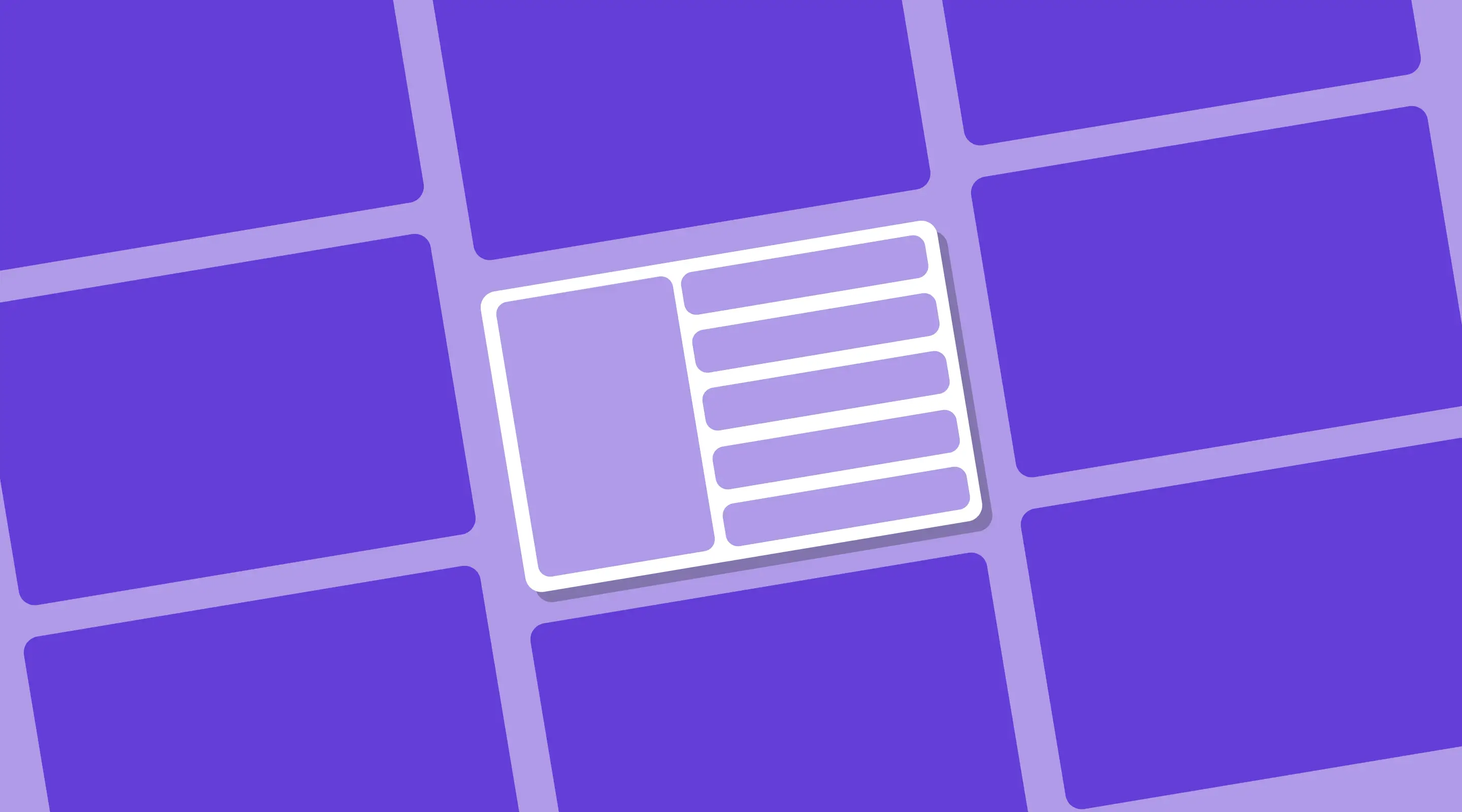
Sidebar Navigation Design: The Complete UX Guide for Web Apps & SaaS (2026)
A practical guide to designing sidebar navigation that improves UX, usability, and visual clarity for web apps.
Table of contents
EXECUTIVE SUMMARY A well-designed sidebar is one of the most impactful UX decisions you can make for a web app or SaaS product. Done well, it gives users constant spatial orientation, reduces cognitive load, and keeps core actions within reach. Done poorly, it becomes a cluttered obstacle that pushes users to abandon tasks. This guide covers the essential principles of sidebar navigation design — from visual hierarchy and sizing to interactive states and collapsible patterns — with actionable steps you can apply directly in Figma or Webflow.
Sidebar navigation has been a foundational pattern in web app design for over a decade. Open any SaaS dashboard — from Notion to Figma to Slack — and you will find a sidebar anchoring the layout. It is persistent, predictable, and powerful when designed with intent.
But most sidebars are not designed with intent. They are assembled incrementally as features are added, growing into a long list of links with no hierarchy, no breathing room, and no logical grouping. Users end up scanning every item on every visit, burning mental energy before they have even started their actual task.
This guide walks through the complete UX process for designing or redesigning a sidebar navigation for a web app. Whether you are starting from scratch in Figma or auditing an existing SaaS product, these principles apply directly.
What Makes a Good Sidebar Navigation? (Quick Reference)
Before diving into each principle in depth, here is a summary of the core sidebar UX criteria and what to look for in your own audit:
1. Understanding the Role of Your Sidebar
The sidebar is not just a navigation container — it is a wayfinding system. It tells users where they are, where they can go, and implicitly, how the product is organised. Every design decision in the sidebar communicates something about the logic of the product.
Before redesigning a sidebar, ask three questions:
- What are the five most common actions a user takes in this product?
- What is the mental model users have for how this product is organised?
- How does the sidebar need to behave across different screen sizes and user roles?
If you are unsure of the answers, that is a signal to run UX research before touching the visual design. A redesigned sidebar based on assumptions risks moving problems rather than solving them. Consider a usability audit or card sorting exercise with real users before finalising the structure.

Related: Intuitive Navigation: Best Practices for Seamless UX Design
2. Visual Hierarchy: The Most Common Sidebar Failure
Visual hierarchy is the single most common weakness in sidebar design. When every item receives the same typographic weight, the same icon size, the same spacing, and the same colour, the user's eye has no guidance. They must read every item every time.
Effective visual hierarchy in a sidebar works across three levels:

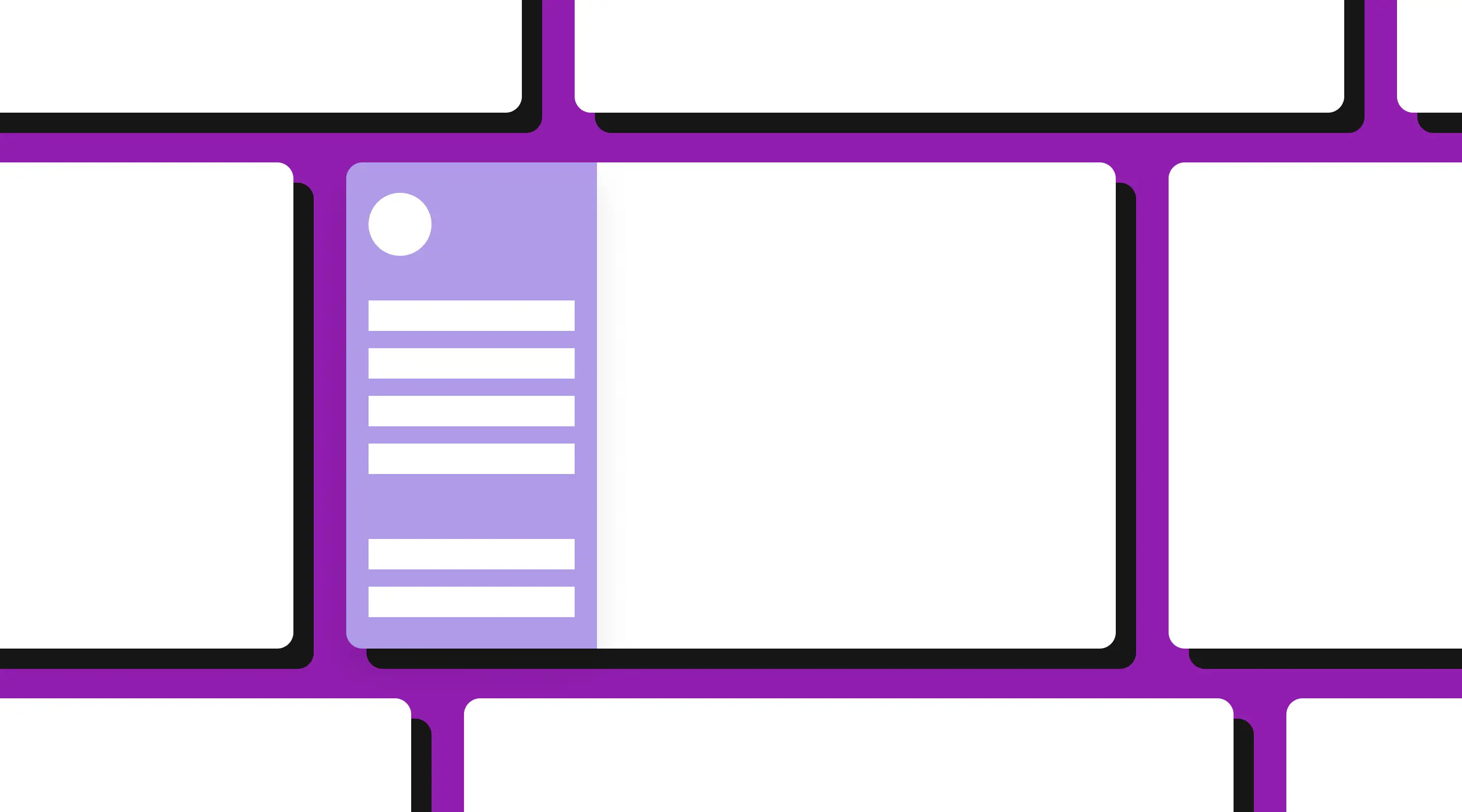
Primary Navigation (Level 1)
These are the top-level sections of your product — the destinations a user visits most frequently. They should be the most visually prominent items in the sidebar: larger type (15–16px), bolder weight, and clear active states. Limit primary navigation to five to seven items maximum. If you have more, you have an information architecture problem, not a design problem.
Secondary Navigation (Level 2)
Sub-items that expand under a primary section. These should be visually subordinate — slightly smaller type (13–14px), lighter weight, and indented 16–24px from the parent. They should only be visible when the parent section is active or expanded, to avoid overwhelming the user with the full navigation tree at all times.
Utility Items (Level 3)
Settings, help, account, and logout items typically live at the bottom of the sidebar. These are accessed infrequently and should be visually de-emphasised — smaller, greyer, and separated from the main navigation by a divider or generous whitespace.
Design principle: A user should be able to glance at your sidebar for two seconds and immediately identify where they are and where the three most important sections are. If that is not possible, the hierarchy needs work.
Related: Common UX Mistakes and How to Avoid Them
3. Sizing and Proportions
The sidebar should complement the main content area, not compete with it. A sidebar that is too wide dominates the layout; one that is too narrow forces text to wrap awkwardly or truncates navigation labels.

Recommended sidebar widths by context:
Typography within the sidebar should default to 14–16px for navigation labels. Anything smaller reduces legibility, particularly for users on lower-resolution displays or with accessibility needs. Line height of 1.4–1.5 ensures adequate spacing between stacked items.
Related: How to Improve Website Accessibility Without Compromising Design
4. Spacing, Padding, and Alignment
Spacing is doing more work in a sidebar than in almost any other UI component. Because navigation items are stacked vertically in close proximity, the spacing between them directly affects how scannable the list feels.
Key spacing rules for sidebar navigation:
- Item height: 40–48px per navigation item ensures sufficient touch target size for mouse and touch.
- Internal padding: 16px horizontal padding on each side of the label. Icons should be 20–24px and aligned to the left edge of the text column.
- Group spacing: Add 16–24px of additional vertical space before a new category group header to visually separate clusters of items.
- Category headers: Use 11–12px uppercase labels with 1.5–2px letter spacing for group labels. These should be clearly distinct from navigation items — they are organisational markers, not clickable links.
Use a grid. Every element in the sidebar should be snapped to a consistent 8px grid. Misaligned items — even by a few pixels — create visual noise that users register subconsciously as an unpolished product.
5. Interactive States: Hover, Active, and Focus
Interactive states are the feedback layer of your sidebar. They tell users that something is clickable, that they are hovering over it, and that they are currently on a given page. Without well-designed states, navigation feels unresponsive and disorienting.
Active State
The most important state in sidebar design. The currently active page should be unmistakably highlighted — typically via a filled background in your primary brand colour, a left border indicator, or a combination of both. The active state should be persistent and immediately visible when the sidebar is first rendered.
Hover State
A subtle background shift (5–10% opacity of your brand colour, or a light grey) on hover is sufficient. Avoid heavy animations or dramatic colour changes — the hover state should feel like a gentle confirmation, not a distraction.
Focus State
Critical for keyboard navigation and accessibility compliance. Use a visible focus ring (2–3px outline in a high-contrast colour) that does not rely solely on colour to communicate focus. This is required for WCAG 2.1 AA compliance.
Related: How UX/UI Can Improve Your Website's Conversions
6. Icons in Sidebar Navigation
Icons are a powerful visual shorthand — but only when used correctly. The most common mistake in sidebar design is replacing text labels with icons entirely, assuming that users will learn the iconography over time. In practice, this creates a learning tax that makes the product feel harder to use, particularly for new users.

Best practice for sidebar iconography:
- Always pair icons with text labels for primary navigation items.
- Use a consistent icon set throughout — mixing styles (outline vs filled, different line weights) creates visual inconsistency.
- Keep icons at 20–24px. Smaller icons lose legibility; larger icons feel heavy and dominant.
- Use a filled variant for the active state of an icon to visually reinforce which item is selected.
- Icon-only sidebars are acceptable only in the collapsed state — and must be accompanied by tooltips on hover to reveal the label.
Related: Best Practices to Design UI Cards For Your Website
7. Collapsible Sidebars: When and How

Collapsible sidebars — those that can be toggled between a full expanded state and an icon-only collapsed state — are increasingly standard in SaaS product design. They respect the user's screen real estate while keeping navigation accessible.
When to implement collapsibility:
- When your main content area is data-dense (tables, charts, dashboards) and users benefit from maximum horizontal space.
- When users work within a single section for extended periods and do not need constant access to the full navigation.
- When targeting users who may work on smaller screens (13–14 inch laptops) where every pixel of content width matters.
Implementation considerations:
- The collapse toggle should be persistent and clearly visible — typically a chevron or hamburger icon at the top or bottom of the sidebar.
- Collapsed state should show icons only, with tooltips on hover revealing the full label.
- Preserve the user's collapse preference across sessions using localStorage — do not reset it on every page load.
- Ensure the transition animation is smooth (200–300ms ease) but not slow enough to feel sluggish.
Related: How Responsive Web Design Improves SEO and User Experience
8. Sidebar Design for Singapore Web Apps: What to Consider
For Singapore-based SaaS products and web applications, sidebar design often needs to accommodate a few additional considerations that may not appear in generic UX guidelines.
Multilingual content: Singapore's enterprise software market regularly requires interfaces that function in English, Simplified Chinese, and Malay. Navigation labels that are perfectly proportioned in English may overflow their container in Chinese. Design your sidebar width and label truncation behaviour with longer strings in mind, and test with translated content before finalising dimensions.
User role complexity: Many Singapore-based B2B products serve users with different permission levels — administrators, managers, and end users may all see different sidebar items. A well-structured sidebar information architecture accommodates role-based navigation without requiring multiple separate design templates. Use conditional rendering at the navigation level, not the page level.
Regulatory and compliance links: In regulated sectors such as fintech and healthtech, compliance-related sections (audit logs, reporting, regulatory submissions) may need to be surfaced in the sidebar for certain user roles. Design these as a distinct group within the utility section — visible but de-emphasised for users who rarely need them.
9. How to Audit Your Existing Sidebar
Before redesigning, audit what you have. A structured sidebar audit takes less than two hours and will surface the issues most worth addressing. Here is a simple framework:
Related: How to Conduct a Usability Audit
Frequently Asked Questions
What is the ideal width for a sidebar navigation?
For most web app dashboards, 220–260px is the standard range. This accommodates icon-and-label pairs comfortably without consuming too much horizontal space. Content-heavy products with long navigation labels may need up to 300px. The collapsed icon-only state should be 56–72px.
Should sidebar navigation items use icons or text labels?
Both. Icons alone create a learning barrier for new users. Always pair icons with text labels in the expanded sidebar state. Icon-only display is acceptable in the collapsed state, provided tooltips reveal the label on hover.
How many items should a sidebar navigation have?
Five to seven primary navigation items is the recommended maximum for the top level. Beyond that, users begin to struggle with scanning and recall. If you have more than seven primary destinations, the issue is information architecture — consider grouping, nesting, or removing items before increasing the sidebar length.
How do you handle sidebar navigation on mobile?
The sidebar pattern generally does not translate well to mobile screens. For responsive web apps, consider replacing the sidebar with a bottom tab bar for mobile (up to five items) or a full-screen slide-over navigation drawer. The sidebar should be hidden by default on screens below 768px.
What is the difference between sidebar navigation and top navigation?
Sidebar navigation is better suited to products with many sections and complex hierarchy — dashboards, SaaS tools, admin interfaces. Top navigation works better for content sites and marketing pages where the hierarchy is shallow and users navigate horizontally between sections. Many enterprise products use both: a top bar for global context (account, notifications, search) and a sidebar for primary navigation.
How do I improve an existing sidebar that has grown too complex?
Start with an information architecture audit — list every item and group them by how users think about the product, not how it was built. Identify items that can be nested, removed, or moved to a settings page. Then apply visual hierarchy to the restructured list before touching the visual design. A sidebar with 20 items redesigned without restructuring will still have 20 items — the problem is the architecture, not the aesthetics.
Conclusion
Sidebar navigation design is one of those UX decisions that users rarely notice when it is done well — and immediately feel when it is done poorly. The principles covered in this guide — hierarchy, sizing, spacing, interactive states, iconography, and collapsibility — are not complex in isolation. The challenge is applying them consistently across a product that has grown organically over time.
If your web app's sidebar has grown into a sprawling list with no clear structure, the most valuable investment is not a visual refresh — it is an information architecture review followed by a structured redesign. The visual improvements follow naturally once the structure is right.
If you are ready to redesign your web app's navigation, book a UX audit with the ALF Design Group team and we will review your current sidebar structure and recommend a clear path forward.
{{build-better-experience="/directory"}}
First Published On
June 28, 2024
Categories
Written By
.webp)
Resources
Related Articles
Deep dive into our latest news and insights.