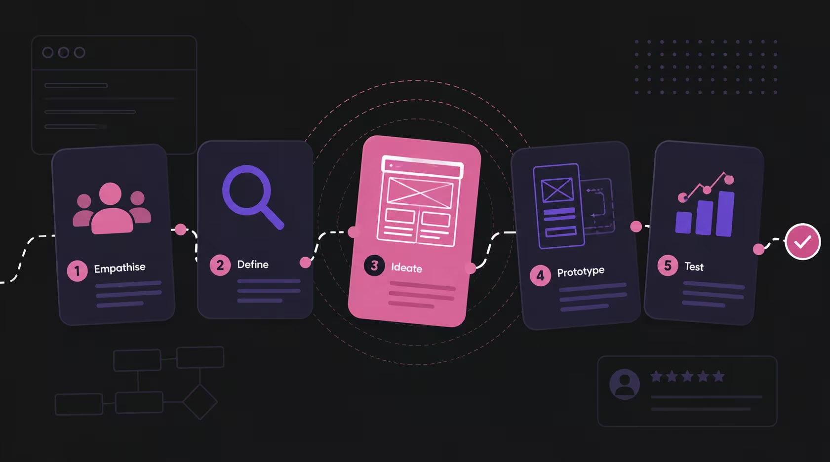
Why Is My Website Not Generating Leads?
Your website needs the right traffic, clear messaging, trust signals and a low-friction enquiry path.
Table of contents
If your website is not generating leads, the problem is not always the design. It may be a traffic problem. It may be a messaging problem. It may be a trust problem. It may be a conversion path problem. It may also be a mismatch between the audience your website attracts and the audience your business actually wants to convert. This is why the first question should not be "Should we redesign the website?" The better question is "Where is the journey breaking?" At ALF Design Group, when we diagnose a website that is not generating enquiries, we start with data before making design assumptions. We check whether the website is getting traffic, look at impressions, clicks, traffic behaviour, landing pages, drop-offs, and whether users are moving towards enquiry pages. If the website has low traffic, the issue may be discoverability. If it has traffic but no leads, the issue may be intent, messaging, trust, pricing anxiety, CTA placement, or friction in the enquiry journey. A website does not generate leads just because it exists. It needs the right traffic, a clear proposition, strong trust signals, and a low-friction path to enquiry. This article breaks down the most common reasons a website fails to generate leads, how to diagnose the problem, and what to improve before rushing into a full redesign.
A Website Does Not Generate Leads Just Because It Gets Traffic
One of the biggest misconceptions about websites is that more traffic automatically means more leads. It does not. Traffic is only useful if it brings the right people to the right pages with the right intent. A website can receive thousands of visitors every month and still generate very few enquiries if those visitors are not ready to buy, if they land on the wrong content, or if the website does not guide them towards a meaningful next step.
This is especially common when a website's blog attracts mainly informational traffic. A business may have a blog post that ranks well and brings in visitors — on the surface, this looks like a win. But if most of those visitors are simply looking for general information and the article does not connect them to relevant services, the traffic may not turn into leads. For how SEO and UX work together to turn traffic into enquiries, see our guide on building a website that ranks and converts.
That is why a lead generation problem should be diagnosed properly. The question is not only "Are people visiting the website?" The better questions are:
- Who is visiting the website?
- What are they searching for?
- Which pages are they landing on?
- Are they moving to service or contact pages?
- Are they dropping off after reading a blog post?
- Are they the right audience for the business?
- Is the website giving them a reason to enquire?
Until you understand these questions, redesigning the website may only fix the surface.
Start by Checking Whether Your Website Has Traffic
Before reviewing colours, layouts, animations, or button styles, start with the basics. Is the website getting traffic? If there is little to no traffic, the website may not be generating leads because not enough people are discovering it in the first place. In that case, the problem may be SEO, content strategy, paid traffic, brand awareness, or lack of distribution.
If the website is getting traffic but still not generating enquiries, then the problem is more likely related to intent, UX, messaging, trust, or conversion. This is why tools such as Google Search Console and GA4 are useful — they help separate a visibility problem from a conversion problem.
What to Look For in Google Search Console
In Google Search Console, look at impressions and clicks over the last 12 months. Impressions show how often your website appears in Google search results. Clicks show how many people actually click through. A page with many impressions but very few clicks may have a search snippet problem — the meta title may not be compelling, the meta description may be weak, or the page may be ranking for a query that does not match what the user wants.
A page with clicks but no conversions requires a different diagnosis. That means users are reaching the website, but something after the click is not working hard enough.
What to Look For in GA4
GA4 helps you understand what users do after they land. You can look at which pages users land on, how they move through the website, where they drop off, and whether they reach important pages such as Contact, Pricing, Services, or Sign Up.
If users land on a blog post and leave immediately, the content may not be guiding them anywhere useful. If users visit a service page but never click the CTA, the page may not be persuasive enough. If users reach the contact page but do not submit the form, the form may be too long or not aligned with how users prefer to contact the business. For how to properly audit this journey, see our guide on how to conduct a usability audit.
Reason 1: You Are Attracting the Wrong Traffic
Sometimes a website is not generating leads because the wrong people are visiting it. This often happens when blog content brings in traffic that is not closely connected to the business's commercial goals. For example, if you are a website designer and your highest-performing blog article is about branding agencies, that may tell you something important — the website may be visible, but not necessarily for the service you want to sell.
Google Search Console can show what users are actually searching before they land on your website. If the queries do not match your services, your content strategy may be attracting the wrong audience. This does not mean the article should be deleted immediately — it may still have value. But you need to understand its role. Can it be connected to a relevant service page? Can it be repositioned to support your main offering? Does it need stronger internal links, better CTAs, or a clearer transition into commercial content?
Traffic alone is not the goal. Relevant traffic is the goal. For ongoing monitoring of which content is working, see our guide on SEO maintenance for Singapore businesses.
Reason 2: Your Content Is Too Informational and Not Commercial Enough
Many websites publish blog content to improve SEO — that is a good strategy when done properly. But if most of the content is purely informational, it may attract readers who are still far from making a buying decision. A blog article that explains "what is web design" may attract beginners. An article explaining "how much does website design cost in Singapore" may attract people closer to a decision. A service page for "web design services in Singapore" attracts users with direct commercial intent. All three are useful, but they do not have the same lead generation value.
This is where TOFU, MOFU, and BOFU thinking matters. TOFU content educates people just becoming aware of a problem. MOFU content helps them compare options and evaluate solutions. BOFU content helps them take action. If your website has many TOFU articles but weak MOFU and BOFU pages, users may read your content and leave without taking action.
A healthy content ecosystem should help users move from information to consideration to enquiry. Blog posts should not exist in isolation — they should connect to service pages, case studies, pricing explanations, and contact options. For how UX and SEO work together to create this kind of journey, see how UX and SEO build a website that ranks and converts.
Reason 3: Your Homepage Has an Unclear Proposition
One of the most common website-level issues is an unclear proposition. When users land on your homepage, they should be able to answer three questions quickly: What do you offer? Who is it for? Why should they trust you? If they cannot answer these within the first few seconds, the website is creating friction.
Many websites use generic H1 headings that sound polished but say very little — "Building Digital Experiences That Inspire", "Your Partner in Innovation", "Transforming Ideas into Reality". These may sound professional, but they do not clearly explain the business, audience, or outcome. A stronger H1 is often more specific. If a web designer specialises in helping Singapore SMEs launch quickly, the heading should communicate that directly.
The goal of the homepage is not to impress everyone. The goal is to make the right people feel "this is for me." For a practical guide to improving homepage performance, see our article on how to optimise your website homepage in Singapore.
Reason 4: Your Service Pages Do Not Answer the User's Real Questions
A service page should not simply describe what the service is. It should help a potential customer decide whether the service is right for them. That means answering practical questions:
- What problem does this service solve?
- Who is it for?
- What is included?
- How does the process work?
- What kind of outcome can the client expect?
- What makes this provider credible?
- How much might it cost?
- What happens after enquiry?
- What should the user do next?
Many service pages fail because they talk too much about the company and not enough about the user's decision-making process. They may describe capabilities but not the pain points. They may list features but not explain outcomes. They may include a CTA but not create enough confidence for the user to click.
For lead generation, a service page should create clarity. If a user lands on the page with a problem, the page should help them understand the solution and reduce uncertainty. This is where UX and SEO work together — SEO helps the user find the page, UX helps the user move through it with less friction. For how to improve your service page UX, see our guide on improving your website UX.
Reason 5: Your Website Lacks Trust Signals
Trust signals are critical for lead generation — especially for services where the client is making a high-consideration decision. Web design, UX design, SEO, software, finance, consulting, education, and B2B services all require trust before enquiry.
For many Singapore businesses, trust signals such as case studies and client logos are especially powerful. If a website design agency has worked with MNCs, government agencies, established brands, or recognisable organisations, that instantly changes perception. Even if the pricing is not shown yet, the user may be more willing to enquire because the agency appears credible.
Trust signals can include:
- Client logos
- Case studies with outcomes
- Testimonials
- Before-and-after examples
- Recognised brands
- Government or institutional partnerships
- MNC experience
- Industry-specific credentials
- Google reviews
- Clear process documentation
- Portfolio examples
The mistake many websites make is hiding proof too deep in the site. If the user has to dig to find your credibility, you may be losing them too early. Trust should appear at important decision points: the homepage, service pages, case study sections, CTA areas, and contact page. For the common UX mistakes that erode trust, see common UX mistakes and how to avoid them.
Reason 6: Your CTA Is Not the Only Problem
Many articles about lead generation focus heavily on CTAs. They suggest changing your button copy or making the CTA more visible. That can help, but it is not always the main issue.
In the Singapore context, conversion behaviour can be significantly influenced by pricing anxiety. Many users are trying to understand whether a service is within their budget before they enquire. If your website gives no pricing signal at all, some users may not bother reaching out. For competitive services like web design, showing pricing clarity can make a real difference. This does not mean publishing a fixed price list — custom services can still provide starting prices, package tiers, typical project ranges, or a guide to what affects the cost.
For more on how to approach pricing on a web design project website, see our guide on website design cost in Singapore. Pricing transparency does not mean competing on price. In a crowded market, a clear pricing signal helps users understand whether they should take the next step — and qualifies enquiries at the same time.
Reason 7: Your Contact Method Does Not Match User Behaviour
A website may have a contact form, but that does not mean users want to fill it in. In Singapore, many users prefer WhatsApp because it feels faster, more direct, and less formal than submitting a form. Research on form abandonment consistently shows that unnecessary friction in enquiry paths leads to significant drop-off — and long, complex forms are among the most common culprits.
This does not mean contact forms are useless. Forms are still valuable for structured enquiries, especially when you need project details, budgets, timelines, or specific requirements. But if a form is the only contact option, some users may drop off. A better approach is to match the conversion path to user behaviour:
- WhatsApp enquiry buttons for fast, direct contact
- Short contact forms focused on one clear goal
- Book a consultation buttons for service businesses
- Pricing enquiry CTAs near pricing sections
- Call buttons on mobile for immediate action
The key is to reduce friction. If a user is ready to ask a question, do not make the next step unnecessarily difficult. For the full framework on form UX and how it affects lead generation, see our guide on form UX best practices.
Reason 8: Your Navigation Does Not Guide Users Towards Conversion
Navigation is not just a menu — it is part of the user journey. If your navigation is unclear, users may not know where to go next. If important pages are buried, they may never reach them. If the labels are vague, users may hesitate or click away.
For lead generation, the navigation should help users move from awareness to decision. One example from our experience is TrafficGuard. A shift in navigational structure helped users move more easily from the homepage to service pages, then to the pricing page where they could sign up or contact the team for enterprise enquiries. This was not simply a visual change — it was a journey change.
For many businesses, improving navigation can be more valuable than adding more pages. A clearer path often performs better than a larger but confusing website. For how UX improvements directly affect conversion performance, see our article on how UX and UI can improve your website's conversions.
Reason 9: Your Blog Does Not Connect to Your Sales Journey
A blog can bring traffic, but it needs to connect to the rest of the website. If users land on a blog article, read it, and leave, the article may have done its educational job but failed its business job. This does not mean every blog article needs to be aggressively sales-driven — but it should have a clear next step.
For example:
- Link to a related service page
- Suggest a relevant case study
- Add a contextual CTA that matches the article intent
- Point users to a pricing article
- Invite users to request an audit
- Recommend a consultation when the user is close to a decision
The CTA should match the article intent. A top-of-funnel article may not need a hard "Contact us now" CTA — it may need a softer next step such as reading a related guide or exploring a service overview. A bottom-of-funnel article can have a stronger CTA because the user is closer to making a decision.
This is where content architecture matters. Your blog should not be a random library of articles — it should support user journeys. For landing page conversion as a specific spoke in this strategy, see our guide on landing page optimisation.
Reason 10: Your Website Looks Good, But Does Not Reduce Hesitation
A website can look professional and still fail to generate leads. This happens when the website has good visuals but does not answer enough decision-making questions. Users may be thinking:
- Can I trust this company?
- Have they done work like mine before?
- Is this within my budget?
- What happens after I enquire?
- How long will the process take?
- Will they understand my industry?
- Will I be locked into a system?
- What if I need support after launch?
If the website does not address these concerns, users may leave even if they like the design. Good design is not only about aesthetics — good design reduces uncertainty. This is where sections such as process documentation, case studies, FAQs, pricing guidance, client logos, testimonials, and clear CTAs become important. They help users feel more confident about taking the next step. For a comprehensive audit of UX issues that might be causing this, see our guide on improving your website UX.
Case Example: TrafficGuard and Navigation-Led Conversion
TrafficGuard is a useful example of how website structure can influence lead generation. Improving the navigation helped users move more easily from the homepage to relevant service pages, and then towards the pricing page where they could sign up or contact the team for enterprise enquiries.
This matters because users rarely convert from one isolated page. They often need a journey — starting on the homepage, exploring what the product does, understanding the use cases, comparing options, reviewing pricing, and then deciding whether to sign up or speak to sales. If the navigation does not support that journey, users may get stuck.
By making the structure clearer, the website gave users a better path towards action. That is what lead generation design should do. It should make the next step feel obvious.
Case Example: BigFundr and Trust-Led Conversion
BigFundr shows another side of lead generation: trust. For a finance-related platform, users need confidence before signing up. They are not only evaluating the design — they are evaluating whether the platform feels credible, safe, and legitimate.
A key part of improving the experience was making trust signals more visible, including showing that BigFundr was backed by proper government agencies and providing a clearer CTA to sign up. When users understand who is behind the platform, why it is credible, and what action to take next, the website becomes more effective.
This is especially important in industries where trust is a major barrier to conversion — finance, investment, healthcare, education, B2B technology, and professional services. In these contexts, trust signals are not decoration. They are part of the conversion strategy.
How to Diagnose Why Your Website Is Not Generating Leads
Before redesigning your website, run a proper diagnosis. Here is a practical sequence.
Step 1: Check Whether the Website Has Traffic
Use GA4 and Google Search Console to see whether users are actually visiting the website. If traffic is too low, focus on visibility, SEO, distribution, campaigns, or content strategy.
Step 2: Review Search Queries
Look at what users are searching before they arrive. Are those queries relevant to your services? Are they informational, commercial, or transactional? Are they attracting the right audience?
Step 3: Identify Top Landing Pages
Find out which pages users land on most often. If most users land on blog posts and leave, your content may not be connected to the sales journey.
Step 4: Review Homepage and Service Page Messaging
Check whether the H1, supporting copy, and CTA clearly explain the proposition. Can users quickly understand what you offer, who it is for, and why it matters? For a structured approach, see our homepage optimisation guide.
Step 5: Check Trust Signals
Review whether the website shows enough proof at the right points — client logos, case studies, testimonials, outcomes, credentials, and recognised brands visible on the homepage, service pages, and near CTAs.
Step 6: Review the Enquiry Path
Check how easy it is to enquire. Is the contact form too long? Is WhatsApp available if that suits your audience? Is the CTA visible? Are users guided from blog posts to service pages? See our form UX best practices guide for specific improvements.
Step 7: Review Pricing or Value Clarity
If the service is competitive or commonly compared on price, consider adding pricing guidance — starting prices, ranges, packages, or an explanation of what affects cost. See our guide on website design cost in Singapore for how to frame pricing without being locked into a fixed price list.
Step 8: Improve Before Rebuilding Everything
Not every lead problem requires a full redesign. Sometimes the better first step is to improve messaging, restructure navigation, add trust signals, strengthen service pages, or connect blog content to commercial pages. Diagnose before rebuilding.
What a Lead-Generating Website Needs
A lead-generating website needs more than a good-looking design. It needs the right combination of strategy, UX, SEO, content, and conversion thinking. At minimum, it should have:
- Relevant traffic from the right audience
- Clear homepage proposition answering who, what, and why
- Strong service pages that answer decision-making questions
- Specific audience targeting
- Trust signals at key decision points
- Clear, intuitive navigation
- Useful blog-to-service journeys
- Pricing or value clarity where appropriate
- Low-friction contact options matching user behaviour
- Mobile-friendly experience
- Strong, contextually appropriate CTAs
- Proper analytics tracking
The most important thing is alignment. The audience, message, content, proof, and conversion path must work together. If one of these parts is weak, the website may struggle to generate leads even if the design looks polished.
Frequently Asked Questions
Why is my website getting traffic but no leads?
Your website may be attracting the wrong audience, bringing in mostly informational traffic, lacking clear messaging, missing trust signals, or making it too difficult for users to enquire. Traffic only becomes valuable when it connects to a clear user journey that guides visitors towards a meaningful next step. For the full diagnosis framework, see our guide on improving your website UX.
How do I know if my website has a traffic problem or conversion problem?
Check Google Search Console and GA4. If your website has low impressions and clicks, it may have a visibility problem — focus on SEO, content strategy, and distribution. If it has traffic but users drop off without enquiring, it is more likely a conversion, messaging, UX, or trust problem — focus on page quality, trust signals, and the enquiry path.
Why do users read my blog but not enquire?
Your blog content may be too informational and not connected to commercial pages. Users may read the article, get the answer they need, and leave if there is no relevant next step, service link, case study, or CTA. Every blog article should have a clear next step that matches the reader's likely intent at that point in their journey.
Do CTAs improve website leads?
Yes, but CTA wording alone is rarely enough. A CTA works best when the page has already created clarity, trust, and motivation. If users do not understand the value or trust the business, changing the button text will not solve the problem. CTA improvements should come after addressing messaging, trust, and page structure.
Should I put pricing on my website?
It depends on your service and market. For competitive services such as web design in Singapore, showing starting prices, packages, or pricing ranges can reduce hesitation and qualify enquiries. If exact pricing is custom, you can still explain what affects the cost, what is typically included, and what the typical investment range looks like. For context on how Singapore businesses approach this, see our website design cost guide.
Is WhatsApp better than a contact form?
For many Singapore businesses, WhatsApp can reduce friction because users may prefer fast, direct communication. However, contact forms are still useful for structured enquiries where you need specific project information upfront. The best approach depends on your audience and sales process — and ideally you offer both. The goal is to match the contact method to how your audience naturally wants to communicate.
What are the most important trust signals for lead generation?
Case studies and client logos are among the strongest trust signals for Singapore businesses, particularly when they feature recognisable brands, MNC clients, government-backed work, or institutional partnerships. Testimonials, proven outcomes, clear process documentation, portfolio examples, and Google reviews all contribute. The key is placing these signals at the right decision points — not buried at the bottom of the about page.
Should I redesign my website if it is not getting leads?
Not immediately. First, diagnose the issue using the eight-step framework in this article. The problem may be traffic, messaging, audience targeting, trust, navigation, pricing clarity, or enquiry friction. Some websites need a full redesign, but others may improve significantly through targeted changes to specific pages, messaging, or conversion paths. Diagnose before redesigning.
How does UX affect lead generation?
UX affects how easily users understand your website, move between pages, find relevant information, and take action. Poor UX creates friction that stops users from progressing towards enquiry. Good UX reduces uncertainty and helps users move naturally from interest to action. For practical UX improvements that affect conversion, see our guide on how UX and UI improve website conversions.
What should I fix first if my website has no leads?
Start by checking traffic and search queries to determine whether you have a visibility problem or a conversion problem. Then review your homepage proposition, service page clarity, trust signals, navigation, blog-to-service connections, pricing clarity, and contact options. Fix the biggest journey break first — the point where the most users are dropping off before reaching the enquiry step.
Conclusion
If your website is not generating leads, do not assume the answer is simply a new design. A redesign may help, but only if it solves the real problem. The issue could be that your website is not getting enough traffic, is attracting the wrong audience, has a generic homepage message, lacks trust signals, offers unclear pricing, has poor navigation, or uses a contact method that does not match how your audience prefers to enquire.
A website needs more than traffic. It needs the right traffic, clear messaging, strong trust signals, pricing or value clarity, and a low-friction path to enquiry. For Singapore businesses, this means being more intentional about case studies, client logos, pricing guidance, WhatsApp enquiry paths, and service pages that speak clearly to the user's specific problem.
At ALF Design Group, we approach lead generation through UX, SEO, and user journey thinking. We look at how people find the website, where they land, what they understand, what they trust, and what stops them from taking action. Because a website should not only look good — it should help the right people move forward.
If your website is getting traffic but not enquiries, or if you are not sure where the journey is breaking, speak to ALF Design Group. We can help you review your website structure, UX, messaging, and conversion path so your website works harder for your business.
Explore our web design services, UX/UI design services, SEO services, or website maintenance services to see how we help businesses improve their websites beyond the surface.
{{build-better-experience="/directory"}}
First Published On
May 28, 2026
Categories
Written By
.webp)
Resources
Related Articles
Deep dive into our latest news and insights.