
Common UX Mistakes Business Owners Make Without Knowing It
The UX mistakes quietly costing Singapore businesses leads, and how to spot them on your own site.
Table of contents
Free Website Audit
We'll personally review your website across 6 areas. UX, SEO, performance, mobile, conversion, and send you a detailed, actionable report within 48 hours. No cost. No catch.
Business owners usually make the same handful of UX mistakes without realising it: competing or missing calls to action, confusing navigation, cluttered homepages, overloaded contact forms, slow load times, weak mobile experiences, and sites nobody revisits after launch. These show up most often on DIY-built websites, where the owner handles copy, design, and technical setup alone, with no second pair of eyes to catch what confuses a first-time visitor. None of them need a full redesign. Most take a focused afternoon once you know exactly what to look for.
Why DIY Websites Are Especially Prone to These Mistakes
DIY websites are usually built by someone too close to the business to see it clearly. A business owner building their own site is juggling copy, design, and technical setup at the same time, usually to save money in the early stages. If you are still weighing up whether that trade-off is worth it, we have broken down what the DIY route typically costs in time and effort.
The problem is not that DIY websites look bad. Most page builders produce something perfectly presentable. The problem is that the person who built the site already knows the business inside out: where the contact page is, what each service means, why a particular button matters. A first-time visitor has none of that context, and DIY sites rarely get tested by someone unfamiliar with the business. That is how UX mistakes slip through, not from lack of effort, but from lack of an outside perspective before launch.
Mistake 1: Calls to Action That Compete With Each Other (or Don't Exist at All)

Too many calls to action is one of the most common UX mistakes on DIY sites. Open your homepage and count how many buttons ask the visitor to do something. If you count more than two or three distinct actions, such as "Get a Quote," "Book a Call," "Download Our Brochure," "Follow Us," and "Sign Up for Updates," all fighting for attention above the fold, that is a UX mistake, not a marketing strategy. A visitor given five choices usually makes none of them.
The opposite mistake is just as common: no clear call to action at all. Some DIY sites focus so much on looking professional that they forget to ask for the sale or the enquiry. The homepage explains what the business does, then simply ends, with a footer and social icons as the only next step.
How to Fix It: Give One Action the Spotlight
Pick one primary action per page. Decide the single thing you most want that visitor to do, then make everything else secondary in both visuals and copy. On a services homepage, that is usually "Enquire" or "Get a Quote," styled as the one button that stands out. Secondary actions, such as a newsletter sign-up or portfolio browsing, can still exist, but they should not compete with the primary action for visual weight. This is one of the fastest fixes on this list: a copy and layout change, not a redesign.
Mistake 2: A Navigation Menu That Makes Sense to You, Not Your Customer
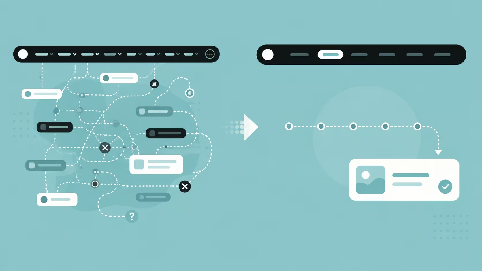
Your navigation menu should be built for customers, not for you. Business owners tend to structure navigation around how they think about their own business: by department, by service line, or by the order the company was built in. Customers do not browse that way. They arrive with a question, such as "do you do X?", and want the fastest path to the answer.
This shows up most on sites with seven or eight navigation items, several of which mean nothing to a first-time visitor, such as "Our Approach," "Ecosystem," or "Solutions Hub." Internally, these labels make sense. To a stranger, they are guesswork, and guesswork before the second click is often where visitors leave.
How to Fix It: Test Your Menu on a Stranger
Hand your navigation menu to someone who has never seen your business. Ask them to find your pricing or contact details, and watch what happens. If they hesitate, the labels are for you, not them. Aim for five to seven navigation items at most, named in language a customer would actually use. Place the item you most want clicked, usually Services or Contact, where the eye naturally lands first: left-most or right-most, not buried in the middle.
Mistake 3: Cramming Every Message Onto the Homepage

A homepage that tries to say everything usually says nothing. Because the homepage feels like the most important page, it is tempting to put everything on it: every service, every testimonial, every award, every certification, the full company history. The result is a page so dense that nothing on it stands out, and visitors scroll past all of it without absorbing a single message. A homepage built this way often has no visual hierarchy left, so a visitor cannot tell what matters most even if they wanted to focus on one thing.
This is especially common on DIY builds, where each new idea gets added as "just one more section," without anyone stepping back to ask whether the page still does its job. A homepage's job is not to say everything. It is to say enough to convince a visitor to go one step deeper, whether that is a services page, a case study, or a contact form.
How to Fix It: Move Detail to a Dedicated Page
Look for content that belongs one click away instead of on the homepage. Full service breakdowns, detailed case studies, and long-form credentials can all live on their own pages. The homepage's job is to build enough trust and clarity to earn that click, not to close the sale on its own.
Mistake 4: Contact Forms That Ask for Too Much, Too Soon
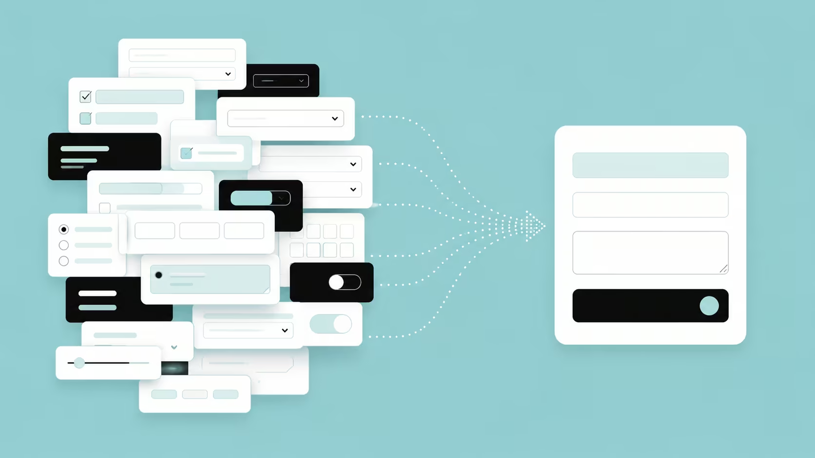
Every extra field on a contact form costs you a visitor. DIY sites often import a generic form template without questioning whether every field earns its place. Company registration number, budget range, how you heard about us, a dropdown of eleven service options: all asked at once, before the business has proven it is worth the visitor's information.
How to Fix It: Cut the Form Down to Three Fields
Keep the first form to what is genuinely needed to start a conversation: name, contact details, and a short free-text message. These fields are not wrong to ask. They are wrong to ask on the first form a stranger fills in. Save the qualifying questions for a follow-up call or a second-stage form instead. Every field you remove from that first form increases how many visitors finish filling it in rather than abandoning halfway.
Mistake 5: A Slow-Loading Site (Especially Common on Template Builders)

Speed is a UX problem before it is a technical one. Page builders make it easy to add high-resolution images, embedded videos, and third-party widgets without checking what that does to load time. On mobile data especially, a few seconds of delay is enough for a visitor to give up and go to a competitor instead. Google's own research found that as page load time increases from one second to three seconds, the probability of a visitor bouncing rises by 32%, and it keeps climbing the slower the page gets.
The most common causes on DIY sites are uncompressed images, such as a 6MB photo doing the work a 200KB one could do, auto-playing background videos, and stacking multiple third-party embeds like chat widgets, booking calendars, and review carousels that each load their own scripts.
How to Fix It: Compress Images and Cut the Clutter
None of these causes require rebuilding the site. Compress every image before uploading it, remove auto-playing video, and take out any third-party widget that is not earning its keep. That alone is usually enough to bring load time back under control.
Mistake 6: Treating Mobile as an Afterthought
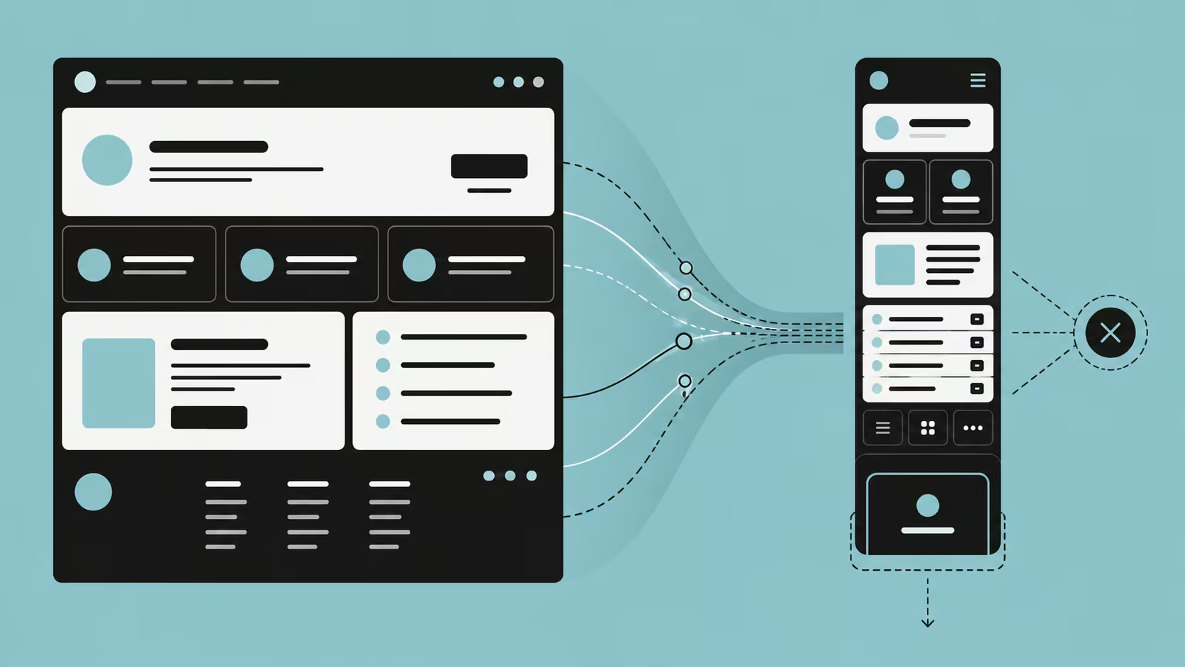
Most Singapore consumers meet your business on a phone first. Yet a lot of DIY sites are still built and reviewed almost entirely on a laptop screen, where everything looks fine. Mobile problems only surface when someone actually opens the site on their phone: tap targets too close together, text that needs zooming, forms where the "submit" button sits below the fold, or menus that cover the whole screen with no obvious way to close them.
Many owners test their own site only on wifi at a desk, which hides exactly the kind of slow, clunky mobile experience most customers will actually have on the go. For a fuller look at what a properly mobile-first, responsive site should look like, beyond just "does it not break," our guide on responsive web design covers the specifics.
How to Fix It: Test on Your Own Phone, on Mobile Data
Open your own site on your phone, using mobile data rather than wifi. Try to complete the exact action you want a customer to take, from finding a service to submitting the contact form. If it is frustrating for you, it is costing you enquiries.
Mistake 7: Publishing the Site and Never Checking Back In

A website that is never revisited slowly goes out of date. Services change, prices move, and a case study may reference a client relationship that has ended, and nobody notices because nobody is looking. On a DIY site, this is especially common, because there is no maintenance plan or design partner prompting a review.
The UX cost here is trust. A visitor who spots an outdated reference, a broken link, or a "2023" copyright notice in 2026 quietly downgrades their confidence in the business, even if nothing else is wrong.
How to Fix It: Set a Quarterly Review Reminder
Set a recurring calendar reminder, quarterly is enough for most small sites. Walk through your own site as a stranger would: click every navigation item, submit a test enquiry, and check that everything you are saying is still true.
How to Catch These Mistakes Before They Cost You Leads
None of the seven mistakes above need a full rebuild. Most are a focused afternoon of edits: consolidating calls to action, renaming navigation items, trimming a bloated homepage, shortening a form, compressing images, and testing on an actual phone. The harder part is not fixing them. It is spotting them in the first place, because by the time a site is live, the person who built it is usually too close to it to see what is confusing. These are exactly the kind of gaps a proper UX design process is built to catch before launch, not after. A second pair of eyes tends to catch in minutes what an owner has scrolled past for months.
If you would rather get a second pair of eyes on it than guess, our free website audit gives you a quick, no-obligation look at where your current site stands. For a deeper, structured pass, a website usability audit works through every one of these mistakes systematically, in the order they cost you the most.
If you are past the point of patching a DIY build and are weighing up what proper web design support would cost, we have laid out realistic numbers for the Singapore market in website design cost in Singapore, worth comparing against the time you have already sunk into fixing things yourself.
For the bigger picture on what good UX looks like across an entire site, not just these seven mistakes, see our guide on improving your website's UX.
Frequently Asked Questions
How do I know if my website has a UX problem if I built it myself?
Watch someone unfamiliar with your business try to use it. Sit a friend, a new employee, or a customer down and ask them to find your pricing, your contact details, or a specific service, without giving them any hints. If they hesitate, click the wrong thing, or ask you where something is, that is a UX problem, not a them problem. Our free website audit can also flag common issues automatically if you would rather start with a quick, no-obligation scan first.
Can I fix these mistakes myself, or do I need to hire someone?
Some of these are genuinely DIY-friendly. Trimming a form, renaming a navigation item, or compressing images can all be done in an afternoon without design experience. Others, like restructuring your entire site architecture or diagnosing why mobile conversions are lower than desktop, benefit from an outside, trained eye, because you are too close to your own business to see it the way a stranger does. If you are unsure which category a problem falls into, our UX design team can walk you through what a professional review typically covers.
Is it worth fixing an existing site's UX, or should I start over completely?
Fixing is almost always worth it over rebuilding. The mistakes covered above are layout, copy, and configuration issues, not fundamental flaws in the platform or codebase, and they can usually be corrected without touching the underlying site structure. A full rebuild only makes sense if the site is on an outdated platform that actively limits what you can fix, or if the business has changed enough that the old structure no longer reflects what you offer. In our experience, a full rebuild rarely fixes UX problems that were really about content, structure, and forms, since those same shortcuts tend to reappear on the new site if nothing else changes.
Does fixing these UX issues actually improve conversions, or is it mostly about looks?
It is about function, not aesthetics. A visitor who cannot find your contact form, is asked eleven questions before they can send an enquiry, or gives up because the site is slow on their phone was never going to convert, regardless of how polished the design looks. Google's research on page speed alone found that bounce probability rises 32% as load time goes from one to three seconds, and that is just one of the mistakes covered above. Fixing UX issues is closer to unblocking a drain than redecorating a room.
My site has been live for a few years. Do these mistakes still apply, or is this only a problem for brand-new DIY sites?
They apply just as much, if not more. Sites that have been live for years tend to accumulate exactly these problems over time: extra calls to action get added, navigation grows past the useful limit, and nobody goes back to prune what is no longer working. If it has been a while since anyone reviewed your site with fresh eyes, that is usually a bigger red flag than the site being new.
Conclusion
None of the mistakes above are a verdict on your business or your instincts. They are simply what happens when the person building a website is too close to it to see it as a first-time visitor would. Fixing them rarely means starting over. It means stepping back, testing your own site the way a stranger would, and correcting the handful of places where clarity got lost along the way. Start with whichever mistake felt most familiar while reading this, fix that one first, and work down the list from there.
{{build-better-experience="/directory"}}
Categories
Written By

Resources
Related Articles
Deep dive into our latest news and insights.

.webp)
