What Is User Interface Design And Why It Matters for Your Business
UI design shapes how your website looks and feels — and why it's not the same as UX design.
Table of contents
Free Website Audit
We'll personally review your website across 6 areas. UX, SEO, performance, mobile, conversion, and send you a detailed, actionable report within 48 hours. No cost. No catch.
User interface design — commonly referred to as UI design — is the visual layer of your website or digital product: the fonts, colours, images, layouts, and interactive elements that your audience sees and interacts with. It is not the same as UX design, though the two are frequently confused. UI is what people see; UX is how it works. For business owners, UI design is one of the most powerful tools available for capturing attention, building trust, and making a lasting first impression. A well-designed UI does not just look good — it communicates your brand, guides your audience, and directly influences whether they stay or leave.
UI Design vs UX Design: The Confusion Most Businesses Have
If you have ever sat in a meeting where someone used the terms “UI” and “UX” interchangeably, you are not alone. It is one of the most common misconceptions we encounter when working with businesses in Singapore across industries ranging from fintech to retail to professional services.
Here is the simplest way to understand the difference:
UI design is what your audience sees. UX design is how it works. Both matter enormously, but they are distinct disciplines that address different questions about your digital presence.
Think of it this way. When you walk into a beautifully designed restaurant, the warm lighting, the carefully chosen furniture, the way the menu is laid out — that is the UI equivalent. Whether the staff are attentive, the ordering process is smooth, and you know where the bathroom is without asking — that is UX. One creates the impression; the other creates the experience.
For a website, UI design governs decisions such as which typeface you use and at what size, the colour palette that reflects your brand, the hero image or video that greets a visitor the moment they land on your page, the layout and spacing of your content, and the visual weight of your call-to-action buttons.
UX design, by contrast, concerns itself with the journey: how easily a user can find what they are looking for, whether your navigation makes sense, how quickly the site loads, and whether the overall flow from arrival to enquiry or purchase feels intuitive. If you want to understand this distinction in more depth, our article on how UX and UI can improve your website’s conversions walks through how the two disciplines work together.
What Does User Interface Design Actually Include?
When we talk about UI design with clients, we deliberately avoid getting too technical. Most business owners do not need to know the difference between a component library and a design system. What they do need to understand is what UI design covers, so they can brief an agency clearly and evaluate the work confidently.
Here are the elements that UI design encompasses in practice:
1. Typography and Readability
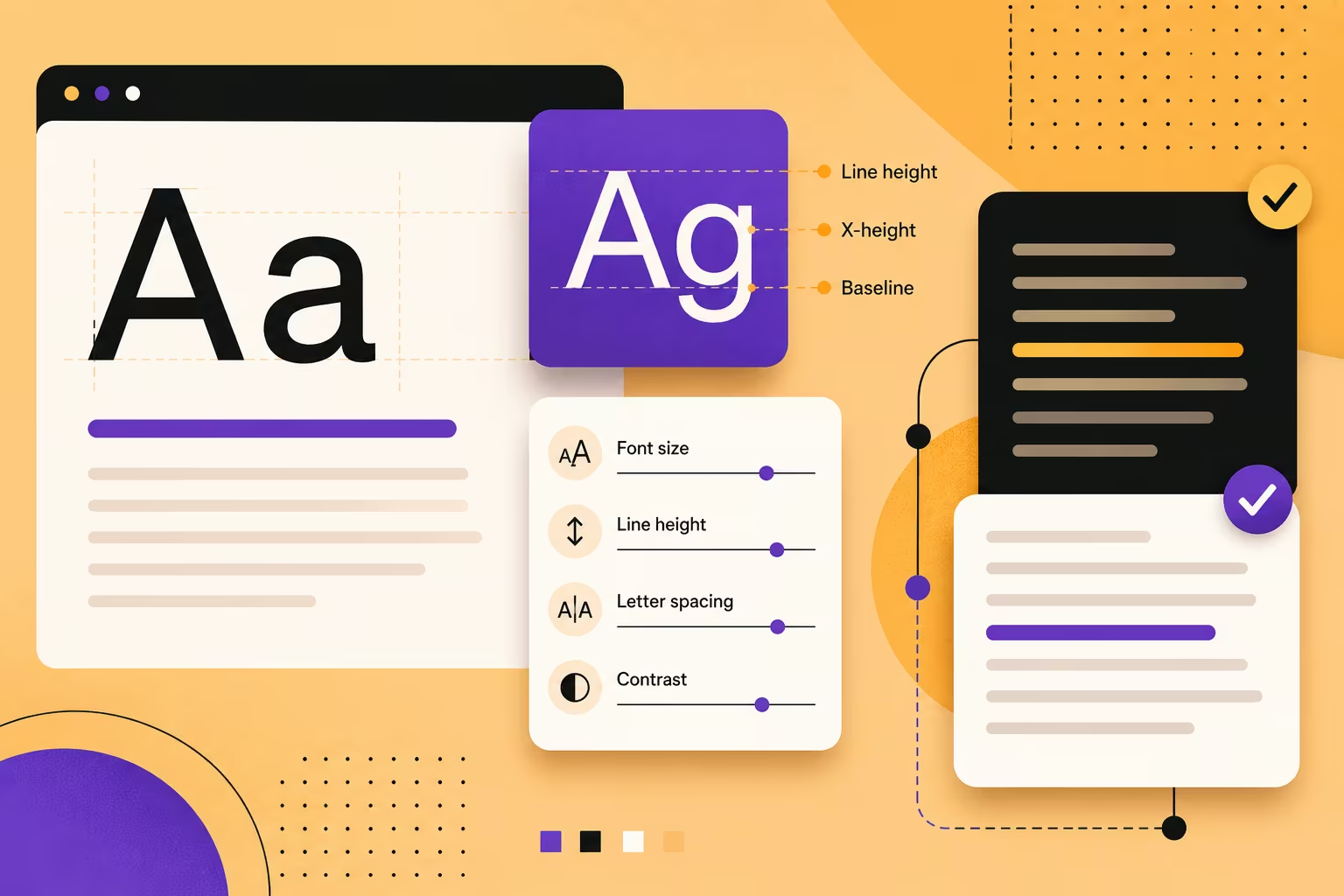
The fonts you choose communicate a great deal before a single word is read. A clean sans-serif suggests modernity and approachability. A refined serif suggests heritage and authority. Beyond the choice of typeface, readability is determined by font size, line height, letter spacing, and contrast against the background. This is often the first thing we assess when reviewing an existing website, because poor typography is one of the fastest ways to lose a reader’s attention.
2. Imagery and Media
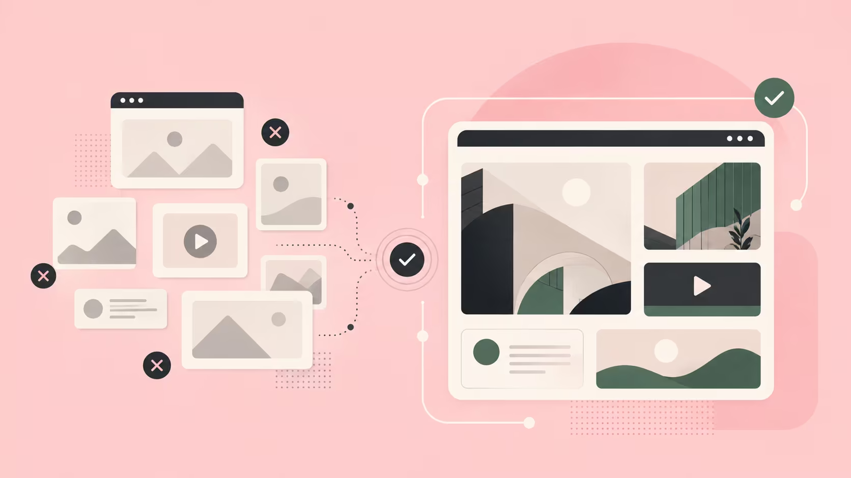
The images and videos you use on your website are not decorative afterthoughts — they are primary UI elements that carry significant weight. One of the most consistent pieces of advice we give to clients is this:
Update your media. Whether it is photography, video, or animation, it cannot be stock imagery or generic templates that provide zero context to your actual business. Your audience has become remarkably good at recognising inauthenticity, and nothing undermines credibility faster than a hero section featuring people who clearly have nothing to do with your company or industry.
We have seen this across project types. A company with strong brand identity might use a behind-the-scenes video in their hero section to great effect. A SaaS business, on the other hand, often connects more authentically with its audience by leading with a clean dashboard screenshot or product interface. The key is contextual relevance, not aesthetic ambition.
3. Colour
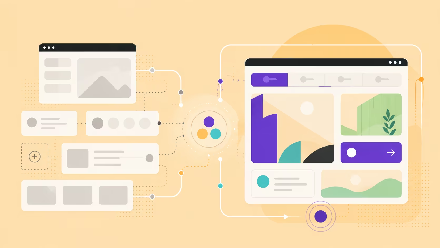
Colour in UI design serves two functions simultaneously: it expresses brand identity and it guides behaviour. The colours you choose tell visitors something about who you are before they read your copy. But colour also directs attention — it tells the eye where to look, highlights important actions, and creates visual hierarchy across a page.
For businesses, the practical implication is that your colour palette should be intentional rather than inherited from a brand guide that was never designed with digital in mind. Colours that work beautifully in print can create accessibility problems or simply look flat on screen.
4. The Hero Section
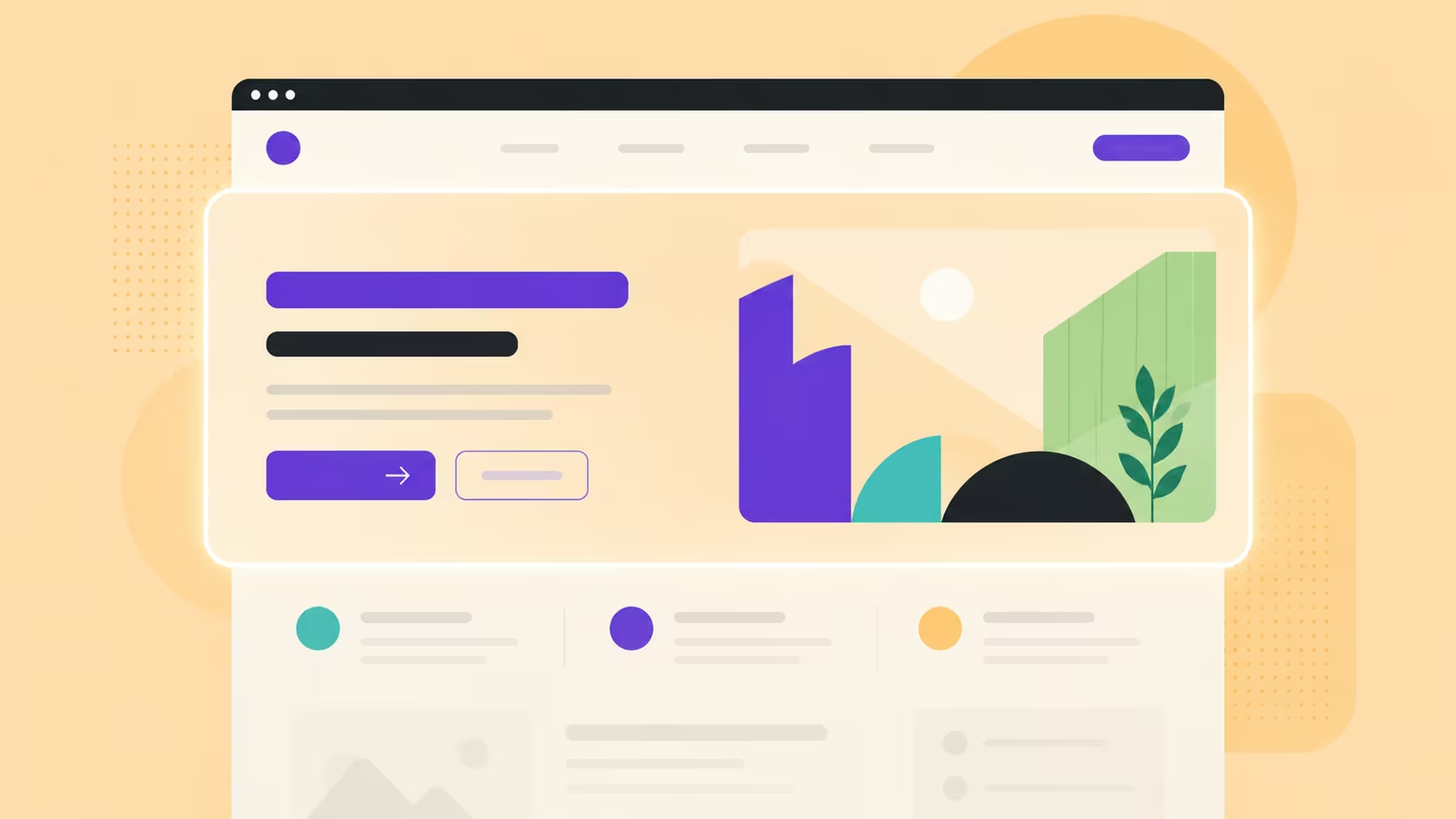
The hero section — the first thing a visitor sees when they land on your website — is, in our view, non-negotiable. It is the single most important piece of UI real estate on your entire site. You have approximately three to five seconds to communicate who you are, what you do, and why someone should stay. A weak hero wastes all of that.
During our strategy sessions with clients, we regularly ask stakeholders to bring examples of websites they admire or find visually compelling. This is not a trivial exercise. The references they choose reveal their audience’s visual sensibility and give us a directional brief for the hero section that is far more useful than a written specification. It also surfaces assumptions that would otherwise only emerge after the first design review.
For more on how to approach this, our article on web design best practices covers the foundational principles that inform every UI decision we make.
UI Design Is Not Just for Apps — It Applies to Every Website
There is a persistent assumption among business owners that UI design is primarily a concern for mobile apps or SaaS products — the kind of digital interfaces that have multiple screens, complex user flows, and dedicated product teams. This assumption underestimates the role of visual design in every digital touchpoint.
Your website is an interface. Every visitor who lands on it is making real-time judgements based on what they see. The visual quality of your website communicates something about the quality of your products or services, whether you intend it to or not.
We live in a visual-first culture. Audiences see something that resonates with them, and they remember it. The websites that people bookmark, share, and return to are almost always the ones that made a strong visual impression on first contact. This is especially true in Singapore’s business environment, where the digital maturity of buyers is high and the bar for professional presentation is correspondingly elevated.
This is closely related to the broader question of why web design matters for your business — an article worth reading if you are still weighing the return on investment of a professional website.
UI Design Differs by Industry — There Is No One-Size-Fits-All Approach
One of the questions we are asked frequently is whether there is a standard formula for UI design that works across industries. There is not, and this is by design.
The core variables that change across industries are the type of media used and the typography. The messaging itself is part of branding and UX writing, but the visual expression of that message — the weight of the headline, the tone of the imagery, the energy of the layout — is determined by the audience being addressed.
Consider the difference between these two website types:
- A boutique branding agency might use a bold, expressive hero with custom typography, a largely monochromatic palette with one strong accent colour, and a strong editorial voice throughout. The UI communicates creative confidence.
- A fintech or financial services company typically requires a UI that signals trust, security, and clarity above all else. Clean layouts, legible type, controlled use of colour, and data visualisations are common. Excessive animation or unconventional layouts can actually undermine credibility in this sector.
Neither approach is right or wrong in isolation. Both are right for their respective audiences. The discipline of UI design is partly about knowing which visual language your audience already trusts, and speaking it fluently.
This is something we explore in detail in our work with financial services clients. If you are in that sector, our article on why UX design matters for Singapore’s finance and investment companies offers relevant context.
What Happens When UI Design Is Poor
The consequences of poor UI design are both immediate and compounding. The most direct outcome is simple: people lose interest and leave.
This is not a metaphor. Modern web analytics consistently show that users make a judgement about a website’s credibility within the first few seconds of arrival. If the visual presentation does not meet their expectation — if it feels dated, cluttered, inconsistent, or simply amateur — they will not stay long enough to read your copy, understand your offer, or make an enquiry.
The compounding effect is more subtle. Poor UI design erodes brand perception over time. Every visitor who leaves with a negative visual impression carries that impression forward. In a market like Singapore, where professional networks are tight and referrals are currency, this matters more than most business owners account for.
The businesses that come to us most often for website redesigns are not those with broken websites. They are businesses whose websites work technically but are simply not performing — not converting, not building trust, not communicating the quality of what they actually offer. In most cases, the gap between what the business delivers and what the website communicates is a UI problem.
If you are trying to diagnose this for your own site, our guide on how to improve your website’s UX is a practical starting point.
UI Design and Business Outcomes: The Connection Business Owners Need to Understand
For business owners who are sceptical about investing in design, the argument for UI design is not aesthetic — it is commercial.
A well-designed website captures attention. That alone is a significant competitive advantage, because attention is the scarcest resource in digital marketing. When someone discovers your website and it makes a positive visual impression, they engage more deeply, spend more time, and are more likely to remember your brand when they are ready to make a buying decision.
We see this play out consistently in how buyers behave in Singapore’s B2B market. Buyers in this market research thoroughly. They visit multiple websites, compare agencies or service providers, and make judgements about credibility and professionalism based heavily on what they see before they read a single line of copy. A website that looks polished and thoughtful shortlists itself; one that does not is rarely given a second look.
There is also a memory component. People who encounter a visually distinctive website — one that made them feel something, that looked genuinely different from the sea of generic templates — remember it. They come back. They mention it to colleagues. In this way, strong UI design functions as both a conversion tool and a brand asset.
This connects directly to how UI and UX together influence conversion rates, which we cover in depth in our article on how UX and UI can improve your website’s conversions.
Webflow and the Delivery of UI Design
At ALF Design Group, we build exclusively on Webflow — and one of the reasons this platform suits our UI design approach is the degree of creative control it offers. We are able to implement custom animations using GSAP or bespoke JavaScript, control every aspect of the visual layout without the constraints of a rigid template system, and produce interactions that genuinely serve the design intent rather than approximating it.
That said, we will be honest: many modern website platforms now offer some level of animation and interaction capability. The platform itself is rarely the limiting factor in UI design. The limiting factor is almost always the quality of the design decisions that precede the build — the clarity of the visual brief, the quality of the media assets, and the depth of understanding of the audience being addressed.
lets Webflow gives us the technical flexibility to execute those decisions without compromise. But the decisions themselves come from a design process, not a platform.
If you are exploring Webflow as the foundation for your website, our article on why businesses prefer Webflow for website design explains the practical advantages in more detail.
What to Do Before You Brief a Designer or Agency on UI
If you are approaching a website build or redesign, there are a few things you can do before the first conversation with an agency that will make the UI design process significantly more productive.
- Gather visual references. Spend an hour visiting websites in and outside your industry that you find visually compelling. Save them. Not because you want your site to look like them, but because your choices will reveal more about your audience’s visual expectations than any written brief could.
- Audit your existing media. Before any design work begins, honestly assess the quality of your photography, video, and other visual assets. Generic stock imagery is one of the fastest ways to undermine good UI design. Investing in authentic, contextually relevant media is often the single highest-return action you can take.
- Be clear about your audience. The most effective UI design is audience-specific. Know who you are designing for — their industry, their level of digital sophistication, their aesthetic sensibility — and communicate this clearly to whoever is designing your site.
- Separate UI from UX in your brief. UI governs what people see; UX governs how things work. These are related but distinct briefs. Conflating them leads to confused feedback and scope creep. If you are unsure where the line sits, ask your designer to walk you through it.
For a broader view of the design process from start to finish, our guide on the steps to designing a website covers the full journey from discovery to launch.
Frequently Asked Questions About User Interface Design
What is the difference between UI design and UX design?
UI design refers to the visual elements of a website or digital product — the fonts, colours, images, layouts, and interactive components that users see. UX design refers to the overall experience of using that product — how intuitive the navigation is, how efficiently a user can complete a task, and how the overall flow feels. UI is what people see; UX is how it works. Both are essential, but they address different questions.
Is UI design only relevant for mobile apps?
No. UI design applies to every digital touchpoint, including websites, web applications, landing pages, and email templates. Any interface that a user sees and interacts with has a UI design — whether it has been thoughtfully designed or not. For business websites in particular, UI design is a primary driver of first impressions, credibility, and conversion.
How does UI design affect business performance?
UI design directly influences whether visitors stay on your site or leave, whether they trust your brand, and whether they take the action you want them to take. A poorly designed UI leads to high bounce rates, low engagement, and lost enquiries. A strong UI captures attention, communicates professionalism, and creates a visual memory that keeps your brand top of mind.
What are the most important UI elements for a business website?
From our experience, the hero section is the single most critical UI element on any business website. After that, the quality of your photography or video, the readability of your typography, and the clarity of your colour palette all play a significant role. These elements work together to form the first impression a visitor receives — and first impressions in digital environments are formed within seconds.
How is UI design different from graphic design or branding?
Graphic design and branding deal primarily with the visual identity of a business — logos, colour systems, typefaces, and brand guidelines. UI design applies that identity within a specific digital context, adapting it to the constraints and behaviours of screens, interactions, and user expectations. UI design takes brand assets as inputs and uses them to build a functional, visually coherent digital interface.
How much does UI design cost for a website in Singapore?
The cost of UI design as part of a website project in Singapore varies considerably depending on the scope, the complexity of the interface, and the agency or designer involved. Our article on website design cost in Singapore covers the full range of investment levels and what you can expect at each tier.
Conclusion
User interface design is not a cosmetic layer applied at the end of a website project. It is a foundational discipline that shapes how your audience perceives your brand, how long they stay on your site, and whether they trust you enough to make contact.
For Singapore businesses operating in a competitive digital landscape, the quality of your UI design is a measurable competitive advantage. Your audience is visually literate and quick to judge. A website that looks considered, authentic, and professionally designed shortlists itself in the minds of buyers before a single word is read.
The place to start is straightforward: update your media, invest in a hero section that genuinely represents your business, and be intentional about every visual decision from typography to colour. These are not design abstractions — they are business decisions with direct commercial consequences.
If you are ready to explore what a UI-led redesign could look like for your business, get in touch with the ALF Design Group team and we can start with a free website audit.
{{build-better-experience="/directory"}}
Categories
Written By

Resources
Related Articles
Deep dive into our latest news and insights.


.webp)