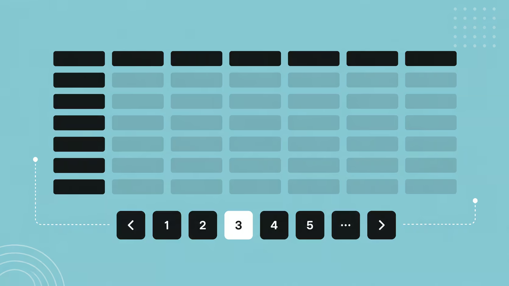
Pagination Design Best Practices for Data Tables
A builder's guide to pagination: navigation, accessibility, mobile patterns, and URL state, per current specs.
Table of contents
Free Website Audit
We'll personally review your website across 6 areas. UX, SEO, performance, mobile, conversion, and send you a detailed, actionable report within 48 hours. No cost. No catch.
Good pagination design comes down to a handful of concrete decisions, not aesthetics. Show users exactly where they are in the dataset, give them complete navigation controls including a way to jump straight to a page, let them choose how many rows to see, and make the current page obvious to sighted and screen reader users alike. On mobile, simplify to Previous and Next. Persist the page number in the URL, not session storage, so pages stay bookmarkable and crawlable. Most default table components already get the basics right; the practices below cover exactly where they tend to fall short.
Before You Build: What This Guide Assumes
This guide assumes you already know why pagination beats infinite scroll for data tables, we're not re-making that case here. What it does cover is the practical decisions that turn a working pagination component into a well-built one, and where they fit into a wider structured UX design process. Eight practices follow, roughly in the order you'd tackle them when building a table from scratch.
What Should a Data Range Indicator Show?
A data range indicator tells users exactly where they are in a dataset, for example "Showing 21-30 of 150 results." It answers four questions at once: where the current view starts, where it ends, how many records exist in total, and how much more there is to review.
This is one of the cheapest, highest-value additions in pagination design. It needs no extra navigation logic, just a label pulled from data you already have, and it removes a surprising amount of user anxiety in transactional or financial interfaces where completeness genuinely matters.
Keep the format consistent across your product. If one table says "Showing 21-30 of 150" and another says "Page 3 of 15," you've made users re-learn the pattern for no reason. Pick one phrasing and reuse it everywhere pagination appears.
What Navigation Controls Does Pagination Actually Need?
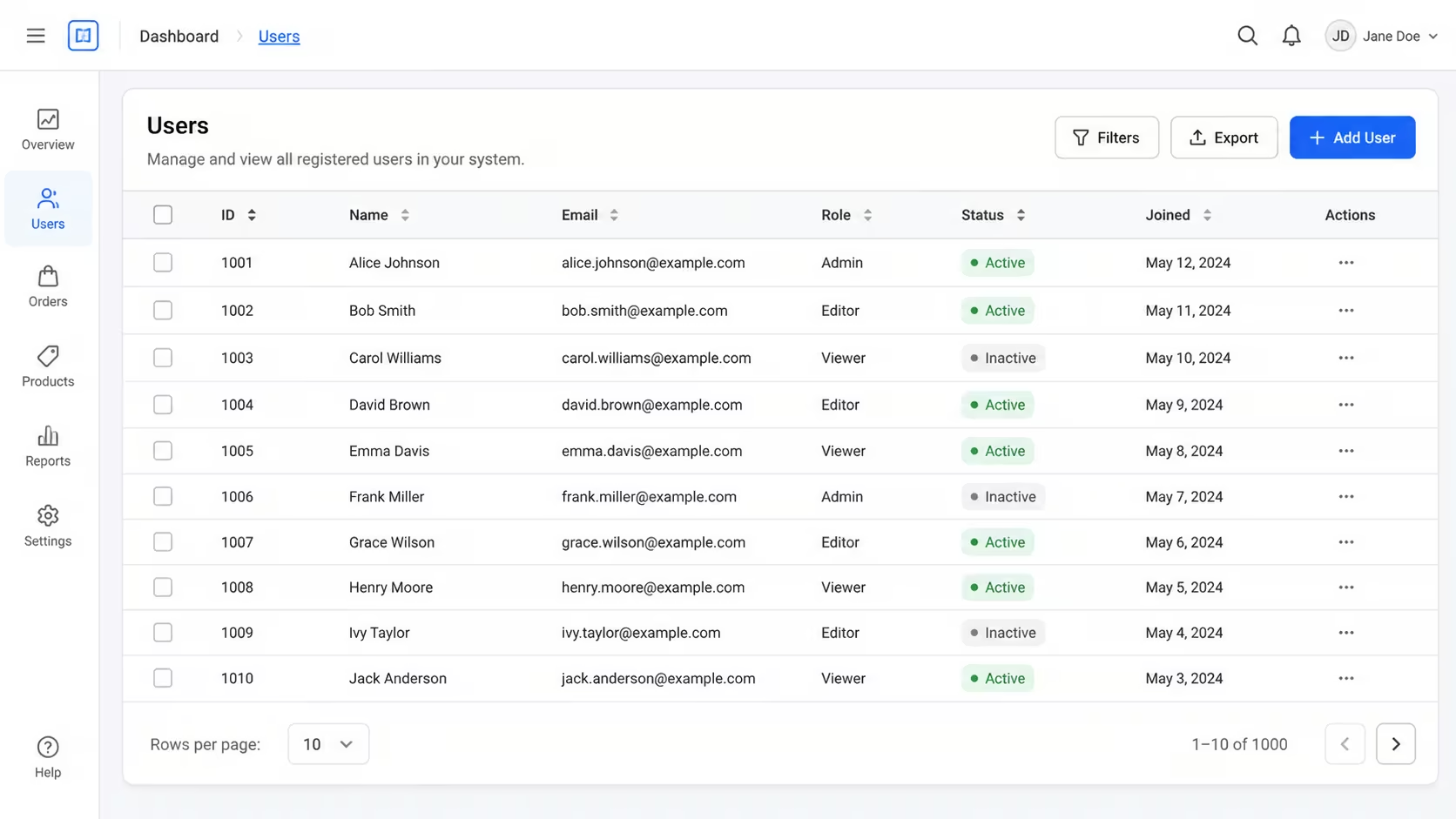
Complete pagination controls give users five ways to move through a dataset: First, Previous, numbered pages, Next, and Last. Disable First and Previous on page one, and Next and Last on the final page, rather than hiding them. A control that vanishes is more disorienting than one that's simply greyed out, since the layout shifts and users lose their bearings.
For numbered pages, show five to seven page numbers at a time with an ellipsis for anything beyond that range, so the control doesn't grow unbounded on a large dataset.
Here's the detail that gets missed even by teams using solid, well-built component libraries: a direct "jump to page" input. Most default pagination components handle First, Previous, numbered buttons, Next, and Last competently. What they almost never include is a plain text field where a user can type "42" and land there immediately, without clicking Next forty-one times or hunting through an ellipsis. On a dataset with hundreds of pages, that single field does more for usability than any amount of button polish.
Add it as a small number input next to the page controls, validated to the actual page range, and it becomes the fastest way to navigate a genuinely large table.
Let Users Control Rows Per Page
A rows-per-page selector lets different users match the view to their own workflow, typically offering 10, 25, 50, or 100 rows at a time. Ten is the default that sticks best in practice: it's the same starting point Google uses in Search Console and Analytics, so most users already have the pattern in muscle memory before they reach your product.
A power user auditing hundreds of transactions might prefer 50 rows at once. A first-time user is usually better served by 10, since a smaller view is less overwhelming while they're still learning the interface.
Whatever default you pick, reset the current page to page one whenever the row count changes. Without that reset, a user on page 8 at 10 rows per page can land on an empty or confusing view the moment they switch to 50 rows.
How Do You Highlight the Current Page for Every User?
The active page number needs to be visually distinct from the inactive ones through more than colour alone: colour, weight, and shape together, so the state reads clearly for every user, including those with low vision or colour blindness.
This is both a design requirement and an accessibility one. Sighted users read the visual contrast; screen reader users need the same information delivered through markup, which is covered in the accessibility section below.
A common shortcut is to rely on a single colour shift for the active page and nothing else. It looks fine to most people testing it themselves, and fails quietly for anyone who can't distinguish that specific colour change. Pair the colour with a bold weight or a filled background shape, and the state holds up regardless of how someone perceives colour.
Why Is Previous/Next Usually Right for Mobile?
On mobile, full numbered pagination collapses badly. Buttons get too small to tap accurately, and a row of seven-plus numbers rarely fits a phone screen without shrinking past a usable size. The fix most teams reach for, and the right one, is to simplify down to just Previous and Next with a compact indicator between them, something like "Page 3 of 12."
This isn't a compromise. Mobile users are rarely trying to sieve through rows and rows of tabular data the way a desktop user might; the task itself is different on a small screen, and it usually calls for a different table design altogether, not just a shrunk version of the desktop one. Simplifying the controls matches the simplified task.
For the direct page-number input described earlier, swap it for a dropdown selector on mobile rather than a free-text field, since typing a specific number is fiddly on a touch keyboard. And respect the platform's own touch target guidance, more on the actual numbers below, since "roughly finger-sized" isn't precise enough to build to.
This mobile-specific thinking connects to a broader point about responsive, mobile-first design: a paginated table isn't something you scale down, it's something you rebuild for the context it's actually used in.
When Should You Switch to a Card Layout Instead?
Some data tables shouldn't be tables at all on mobile. When a row has more than three or four columns worth of information, forcing it into a horizontal scroll or a tiny truncated table usually creates more friction than it solves.
The common alternative is to collapse each row into a card: the most important one or two fields shown prominently, the rest tucked behind a tap or a "show more" toggle. Pagination still applies, the same range indicator, Previous/Next controls, and page state all carry over, just wrapping a set of cards instead of table rows.
This is a genuinely different design problem from resizing a table, closer to card-based UI design than to responsive table CSS. Deciding which approach fits is really a judgement call about how many columns of the data a mobile user actually needs to see at once, not a technical constraint.
What Does the Accessibility Spec Actually Require?
Accessible pagination needs three things: markup that identifies it as navigation, controls a screen reader can operate, and touch targets sized to the current spec, not just whatever feels big enough.
Start with the markup. Wrap the whole component in a nav landmark with aria-label="Pagination", use real button elements rather than styled divs so keyboard and screen reader users get native interactive behaviour for free, mark the active page with aria-current="page", and apply aria-disabled="true" to the First/Previous or Next/Last controls when they're inactive rather than removing them from the page.
There's no single official template to copy for this. Unlike patterns such as Tabs or Dialog, the W3C's ARIA Authoring Practices Guide has no dedicated "Pagination" pattern, so the markup above is composed from its general Landmark, Button, and aria-current guidance rather than one canonical recipe. That's worth knowing before assuming there's a spec page to check against.
On touch target size, the numbers people usually quote, 44 by 44 points on Apple platforms, 48 by 48dp in Material Design, are both still current, but they're platform convention, not the legal accessibility minimum. WCAG 2.2's actual Level AA requirement (Success Criterion 2.5.8) is smaller: 24 by 24 CSS pixels, with a spacing exception that allows even smaller targets if there's enough gap around them. WCAG's own stricter, optional Level AAA figure happens to land on exactly 44 by 44, the same number Apple uses.
In practice, building to Apple's or Google's convention clears WCAG's legal minimum comfortably. Building only to WCAG's minimum won't necessarily satisfy either platform's own guidelines.
This is one piece of a wider website accessibility practice, not a special case. The same care that applies to forms and navigation menus applies here too.
Should You Persist Pagination State in the URL?
Yes. URL query parameters, something like "?page=7&per_page=25", are the standard way to persist pagination state for web apps, and session storage should be the exception rather than the default. It's not really a judgement call in practice: URL params are simply the normal approach for anything a user might want to bookmark, share, or return to via the browser's back button.
Session storage has one real advantage: it survives without cluttering the URL. But it fails the moment a user copies a link to send to a colleague, or hits back expecting to land where they left off and instead gets bounced to page one. For a shared, collaborative dataset, that's a real cost for a small aesthetic gain.
There's a crawlability trap worth knowing about too. Hash-based pagination URLs, "#page=2" rather than a real path or query parameter, aren't treated as separate pages by Google's crawler, so paginated content behind a hash effectively doesn't get indexed on its own. Use the HTML5 History API or genuine server-rendered routes instead.
On the SEO side, the old advice to use rel="next"/rel="prev" tags is out of date. Google confirmed it stopped using them as a ranking signal back in 2019. Current guidance favours a self-referencing canonical tag on each paginated page, rather than canonicalising every page back to page one, alongside unique metadata per page so each one can be understood and indexed on its own terms.
Pair Pagination With Search and Filtering
Pagination works best paired with search and filtering, not as a substitute for either. When a user filters a 500-row dataset down to 40 relevant rows and then paginates through those 40, the combined experience does far more work than pagination alone ever could.
Two details make or break this pairing. First, any filter or sort action must reset the current page back to page one, otherwise a user can land on an empty page three when their filtered result only has one page's worth of data. Second, the data range indicator needs to update to reflect the filtered count, "Showing 1-10 of 40 filtered results," not the original unfiltered total.
Both are easy to get right and easy to miss under deadline pressure, which is exactly why they're worth calling out on their own rather than assuming they'll be handled as a side effect of the filter logic.
Common Mistakes to Avoid
Most of the mistakes below aren't exotic. They're the small omissions that slip through even careful builds, the kind you only notice once you're specifically looking for them.
Forgetting the Jump-to-Page Input
The most common gap isn't broken markup or a missing state, it's simply never adding a way to type in a page number directly. Most component libraries handle First/Previous/Next/Last competently and stop there, leaving users to click through dozens of pages by hand on any dataset of meaningful size. Add the input; it's a small build cost for a real usability win.
Using Hash-Based URLs Instead of Real Routes
A "#page=2"-style hash looks like it's doing the same job as a query parameter, and in the browser it feels identical. To a search engine crawler, it isn't: hash fragments aren't indexed as separate pages, so paginated content behind one effectively disappears from search. Use real URL routes or query parameters instead.
Copying 44px or 48px Touch Targets Without Knowing Why
Apple's 44pt and Material's 48dp figures get copied into design systems constantly, correctly, but usually without anyone checking what the actual accessibility minimum is. WCAG 2.2's Level AA requirement is a smaller 24 by 24 CSS pixels. Knowing that distinction matters when you're making a deliberate trade-off, not just following convention because that's what the last project did.
Where Should You Go From Here?
Most of what's above is a checklist you can run against an existing table today: check the range indicator wording, confirm the jump-to-page input exists, verify the ARIA markup, and make sure pagination state lives in the URL rather than session storage.
If you're building this from scratch, or auditing a table that's clearly missing several of these at once, it's usually faster to get a second pair of eyes on it early than to retrofit accessibility and URL structure after launch. That's the kind of detail our UX design team checks as a matter of course on every build.
Frequently Asked Questions
Should page numbers in the URL start at 0 or 1?
Page 1, not page 0, even though many backends index arrays from zero. A URL parameter is user-facing, and users think in one-based counting. Page=0 as the first page reads as a bug to anyone who notices it, including someone debugging or sharing the link.
What happens if the dataset changes while a user is paginating?
Rows can shift between pages if the underlying data changes mid-session, a new record added, an old one deleted, or a resort. For datasets that change frequently, such as live financial transactions or inventory counts, use a stable sort key like a timestamp or ID rather than row position, so a page reload doesn't show the same record twice or skip one entirely.
Does pagination affect SEO?
Pagination itself doesn't hurt SEO, but poorly configured pagination can create thin or near-duplicate content across dozens of pages if each one lacks unique value. Give each paginated page a clear self-referencing canonical and, where practical, unique supporting content or metadata, rather than treating every page as an identical shell. It's exactly the kind of technical detail our SEO team audits.
Get These Details Right First
Most of what's above is achievable in an afternoon on an existing table: add the jump-to-page input, check the ARIA markup against the current spec, confirm pagination state lives in the URL, and swap hash-based routing for real routes if you find it.
If you're still deciding whether pagination is the right call for a given interface at all, rather than infinite scroll or a "load more" button, that's the question our companion piece on why pagination matters for table design answers directly. This guide picks up from there, once you've already made that call.
{{build-better-experience="/directory"}}
Categories
Written By

Resources
Related Articles
Deep dive into our latest news and insights.

.webp)