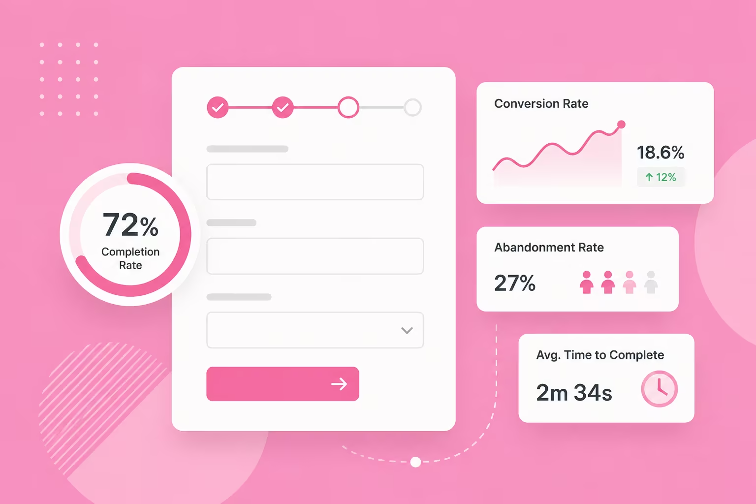
Form UX Metrics to Track: Completion Rate, Time-to-Complete and Field-Level Drop-off
Which form UX metrics matter, and what they actually tell you about your forms.
Table of contents
Free Website Audit
We'll personally review your website across 6 areas. UX, SEO, performance, mobile, conversion, and send you a detailed, actionable report within 48 hours. No cost. No catch.
Three metrics tell you whether a form is actually working: completion rate, time-to-complete, and field-level drop-off. None of them means much on its own. Published benchmarks for form completion rate swing from under 10% to over 90%. It depends on the form type. It also depends on whether the number counts everyone who saw the form, or only those who started it. Comparing your form against a stranger's average rarely helps. What matters more is your own form's trend over time. Where people give up in a multi-step form matters too. So does whether a slow completion time signals hesitation, or simple distraction.
What's a Good Form Completion Rate for Your Business?
There's no single good form completion rate. The number changes with the form type. It also depends on what's counted in the denominator. Application forms complete at around 75%, while contact forms sit closer to 38%, according to Zuko's 2025 benchmarking data. That data is global, not Singapore-specific, since no local dataset exists yet.
Even within one source, the numbers can pull in different directions. Zuko's own site quotes contact-form completion at both 9% and 38%. It depends on whether the figure counts everyone who saw the form, or only those who started filling it in. Baymard Institute's checkout-abandonment average sits even higher, at 70%. That's a different metric again, tracking shopping carts rather than general form completion.
Before I tell a client their completion rate is a problem, I ask one thing first: what kind of form is this? A B2B quote request and a newsletter signup were never going to convert at the same rate. Holding one to the other's benchmark just creates panic over a number that was never comparable in the first place.
That's also why an industry average can be a distraction rather than a useful yardstick. It tells you almost nothing about your own audience or offer. It says nothing about how much trust your brand has already earned before someone reaches the form. We've written separately about the field-level design choices that actually move this number, from label placement to input types. This piece is about which numbers tell you a fix is even needed.
| Form type | Typical completion rate (global) |
|---|---|
| Application forms | ~75% |
| Travel forms | ~60.5% |
| Financial services forms | ~58.4% |
| Contact forms | ~38% |
| Media forms | ~36.3% |
| Property forms | ~34.6% |
Source: Zuko form benchmarking data, via CrazyEgg (2025).
Use this table as a rough sense of scale, not a target. It tells you an application form and a property enquiry form sit in different worlds. It doesn't tell you whether your specific application form, for your specific audience, is doing well or badly this quarter.
Completion Rate: What It Measures and What It Misses
Completion rate is completions divided by starts, or by visitors if that's the denominator a benchmark used. Always check which one you're looking at. It's the easiest of the three metrics to set up, and the first one most businesses track.
For most Singapore SME clients, I set up Google Analytics 4 events for form_start and form_submit. That's usually enough to start, rather than reaching for a specialised platform straight away. It's free, and it's usually already installed on the site. It answers the completion-rate question well before traffic volume justifies anything heavier. We build this kind of tracking in from the start of how we approach UX/UI design for a client's site, rather than bolting it on once a form is already live.
A healthy completion rate doesn't guarantee a healthy pipeline. If your form completes well but leads still aren't converting into paying work, the form usually isn't the problem. I check lead quality first. Then I look at what happens after submission. How fast does someone follow up? Was the lead ever properly qualified? The form is the last thing I touch, not the first.
Why Does Time-to-Complete Matter More Than You Think?
Time-to-complete catches friction before it shows up as a drop in completion rate. That's exactly why it's the metric most businesses under-use. Average form completion runs under three and a half minutes across form types. Checkout forms average around three minutes and twenty-one seconds. Registration forms run closer to one minute thirty-five, according to FormAssembly and Zuko's 2025 data. These are global figures, useful as a reference point rather than a target.
There's no universal 'too slow'. A three-minute checkout is normal. A three-minute newsletter signup is a warning sign. The right benchmark isn't a stopwatch number. It's whether the time feels proportional to what you're actually asking the person to do.
When a short form takes longer than expected, I've found it splits roughly fifty-fifty between two problems. One is genuine hesitation over a specific field. The other is people simply getting distracted partway through. The two need different fixes. Hesitation calls for clearer microcopy explaining why you're asking. Distraction calls for saving progress, so a return visit doesn't mean starting from zero.
On longer, multi-step forms, this often shows up as a specific pattern. There's a clean drop-off partway through, well before the finish line. Sometimes it lands around step three of eight. That's form fatigue, not a broken field. It's a strong argument for shortening the journey, or showing progress clearly so people know how much is left.
Which Form Field Is Actually Losing You Customers?
Field-level drop-off shows the exact point where people give up. It's tracked by logging which field someone last interacted with before leaving. Unlike an overall completion rate, it points straight at a fix rather than just a symptom.
The industry disagrees sharply on what drives it. One 2026 analysis found a 'field cliff'. Completion drops from around 23% at three fields to under 7% at ten or more. That figure comes from Digital Applied's 2026 benchmark report. Zuko's own benchmarking data found close to the opposite: field count on its own barely moved conversion at all.
In my own experience, trimming fields genuinely does help completion, not just picking the right fields to keep. I've watched removing two or three fields lift a form's numbers on its own. That held even when every field that stayed was already well designed.
That said, mandatory fields tend to get filled in anyway. If a business genuinely needs a field, marking it required and explaining why usually gets it completed. An optional field sitting there for no clear reason just adds friction instead. The real question isn't only how many fields there are. It's how necessary each one feels to the person filling it in.
One example from a client project makes this concrete. A mobile number field was causing hesitation. Most Singaporeans are understandably wary of handing a phone number to a business they don't know yet.
The number was needed to send a one-time password for two-factor authentication, so removing the field wasn't the answer. Instead, I added a short line of text next to it explaining exactly why it was being asked for. The field stayed. The hesitation dropped, because the request finally made sense to the person filling it in.
The same logic applies to any field that asks for something sensitive: an NRIC number, a company UEN, a home address. If the reason isn't obvious, say it in one line next to the field. Don't just hope people trust you by default.
Unclear error messages cause a similar kind of drop-off, for much the same reason. The person doesn't understand what's being asked of them, or why their input was rejected. We've written separately about the accessibility side of form design, including clearer error states, which holds up for screen-reader and keyboard users too.
Do You Need to Track Mobile and Desktop Separately?
Yes, if you can. Desktop forms convert at around 47%, against roughly 43% on mobile, according to Zuko's own benchmarking data. The gap widens on some form types. One onboarding-form comparison in the same dataset put desktop completion nearly 15 points ahead of mobile.
A single blended completion rate can hide that gap entirely. Most traffic for a Singapore business arrives on mobile. A mediocre blended number can actually mean a mobile experience that's quietly underperforming, masked by a stronger desktop result.
Segmenting completion rate, time-to-complete, and field-level drop-off by device is a small extra step in GA4. It's usually where the more useful story is hiding.
Tracking These Metrics Without Overbuilding It
You don't need an expensive analytics platform to track these three metrics well. Start with three GA4 events: form_start, an interaction event per field to catch drop-off points, and form_submit. Time-to-complete needs one extra step: timestamping the start and submit events and calculating the difference. It still runs on the same free tooling.
None of this needs to be built perfectly on day one. Start with the three core events and watch a month of data. Add the device split and the extra field-level detail once the basics are in place. A rough tracking setup running today beats a perfect one that never ships.
This is the kind of measurement we build in from the start when we design a client's site as a Singapore UX/UI design agency, rather than adding it after a form's already live and the data's already patchy. A dedicated form-analytics tool is worth paying for once your volume justifies the field-level detail GA4 misses. Not before.
Frequently Asked Questions
What's a good form completion rate?
There's no single good form completion rate. The figure depends heavily on form type and how it's measured. Application forms typically complete at around 75%, while contact forms sit closer to 38% (Zuko, 2025, global data). Rather than chasing an industry average, track whether your own form's completion rate is improving or declining over time.
How do I track field-level drop-off without expensive tools?
Set up GA4 events for form_start, an interaction event per field, and form_submit. Comparing where users start and where they last interact before leaving shows the specific field causing the most trouble. It works without a dedicated form-analytics subscription.
Does reducing the number of form fields actually improve completion?
The published data is genuinely mixed. Some benchmarking finds a sharp drop in completion once forms pass five to seven fields. Other benchmarking data finds field count barely matters at all. In practice, trimming unnecessary fields does tend to help. A field a business genuinely needs, clearly explained, is usually completed anyway.
How long should a form take to complete?
There's no fixed ideal time. A three-minute checkout is normal, but a three-minute newsletter signup usually signals a problem. Judge time-to-complete against what you're asking the person to do. Treat a longer-than-expected time as a clue worth investigating, not a number to hit.
Conclusion
Pick whichever of these three metrics you're not tracking yet, and set it up this month. If nothing is in place, GA4 event tracking is the fastest starting point and costs nothing to add.
Once the data's coming in, resist comparing it to a stranger's benchmark. Watch your own form's trend. Note where people give up in a multi-step form. Treat a slow completion time as a clue, not a verdict.
If your numbers point to a leads problem rather than a form problem, it's worth chasing down why your website isn't converting leads.
The goal was never to match someone else's average. It's understanding what your own form is telling you.
{{build-better-experience="/directory"}}
Categories
Written By
.webp)
Resources
Related Articles
Deep dive into our latest news and insights.