UX Writing: Elevating User Experience Through Words
Learn how UX writing boosts clarity, conversions, and experience on Webflow sites in Singapore.
Table of contents
Content is more than words — it is how users navigate, decide, and take action. UX writing is the practice of crafting the copy inside digital interfaces: button labels, error messages, onboarding instructions, empty states, confirmation messages, and tooltips. Unlike copywriting, which aims to persuade, UX writing aims to guide — it removes friction, builds trust, and ensures users always know what to do next. For Singapore businesses, where users span languages, literacy levels, and digital comfort, every microcopy decision matters. This guide covers what UX writing is, how it differs from copywriting, why it produces measurable conversion improvements, how ALF Design Group applies it in Webflow projects, real Singapore case studies with measurable outcomes, and the best practices and tools that make UX writing a practical skill rather than a theoretical concept.
At ALF Design Group, a Webflow agency based in Singapore, we believe UX writing is a vital tool for creating frictionless user journeys and boosting conversions.
This guide covers what UX writing is, how it connects to UI/UX design, and why it is essential for businesses building intuitive digital experiences — especially on platforms like Webflow. For the broader UX discipline this fits within, see our guide on how to improve your website's UX.
What Is UX Writing?
UX writing refers to the practice of crafting clear, concise, and helpful copy that guides users within a digital interface. Unlike traditional content writing, UX writing is focused on user interactions: button labels, error messages, onboarding instructions, checkout flows, empty states, confirmation messages, and even 404 pages.
According to the Nielsen Norman Group, UX writing is a specialisation within the broader field of content strategy — focused specifically on the words that appear inside a digital interface and directly affect how users accomplish their goals. The discipline emerged as digital products grew complex enough that the words inside them became a primary source of user confusion and frustration — and a significant lever for improvement.
UX writing is not a marketing function. It is a design function. A UX writer works alongside visual designers, UX researchers, and developers — not the marketing team — to ensure that every word in the interface serves the user's needs at the precise moment they encounter it.
The Difference Between UX Writing and Copywriting
The most common misconception about UX writing is that it is just another form of copywriting. The two disciplines share some skills — both require writing clearly and understanding your audience — but they serve fundamentally different purposes and operate in different contexts.
In short: UX writing speaks to users in the moment, guiding them through a product interface. Copywriting speaks to prospects before they are in the product, persuading them to engage. Both matter — but confusing the two leads to interfaces full of marketing language where clear instructions should be, and instruction manuals where emotional connection is needed. For how copy decisions specifically affect landing page performance, see our guide on landing page copywriting tips that boost conversions.
Why UX Writing Matters in Web Design
1. It Builds Trust
When microcopy is predictable, consistent, and easy to understand, users feel confident and supported rather than confused or suspicious. Trust in a digital product is not built by the homepage hero section alone — it is built incrementally, at every interaction point, by copy that does exactly what users expect it to do.
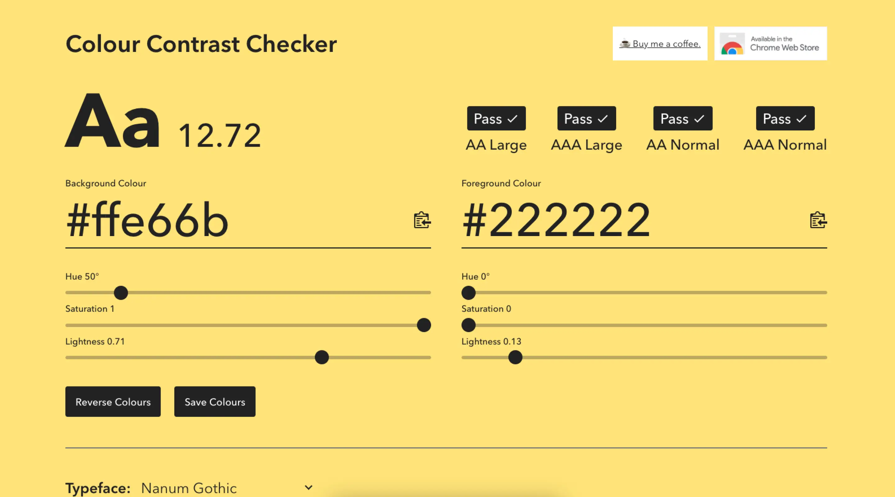
Consider the difference between an error message that says "Invalid input" and one that says "Your phone number should be 8 digits starting with 6, 8, or 9 — for example, 6512 3456." The second message does not just identify the problem — it solves it. That specificity signals that the product was designed by someone who thought carefully about the user's experience. That signal builds trust.
2. It Enhances Conversion Rates
Small words produce large commercial effects. A button that says "Submit" is a missed opportunity — it describes the technical action without communicating the benefit. A button that says "Get My Free Quote" or "Start My Free Trial" communicates what happens next and why it is worth doing. The user's hesitation before clicking is reduced because the copy answers the question they were silently asking.
Microcopy improvements on form fields, error messages, and CTAs consistently produce measurable conversion improvements without any changes to visual design or page structure. For how microcopy decisions connect to the broader form UX framework that drives form completion rates, see that dedicated guide.
3. It Improves Usability
Good UX writing reduces cognitive load — the mental effort required to understand and act on an interface. When users have to interpret unclear labels, decode technical jargon, or re-read an instruction twice before understanding it, cognitive load increases. Higher cognitive load leads to mistakes, abandonment, and frustration. Clear, contextually precise microcopy reduces cognitive load at every interaction point.
This effect is particularly significant in complex products: SaaS dashboards, fintech platforms, government digital services, and e-commerce checkout flows. In Singapore, where many users navigate government and financial services that involve specific local terminology (CPF, NRIC, HDB, MAS), UX writing that uses the language Singapore users actually know — rather than the generic international equivalent — meaningfully reduces friction and error rates.
4. It Complements UI and Visual Design
Beautiful interfaces are incomplete without words that make them work. Visual hierarchy, whitespace, and colour direct users' attention — but it is the words at each attention point that tell users what to do and why. When copy and design are developed in isolation, the result is often a visually polished interface with confusing labels, unhelpful empty states, and error messages that blame the user rather than help them. At ALF Design Group, we ensure copy and design develop in tandem — using Figma with realistic content rather than lorem ipsum from the earliest wireframe stage.
The UX Writing Process at ALF Design Group
As a UX/UI design agency in Singapore, we have refined a structured approach to UX writing across Webflow websites, mobile interfaces, and digital product projects. The process is integrated into our broader UX design workflow — not added as a separate stage at the end.
Step 1: Understand the User
We begin with user research to understand the user's mindset, language, needs, and friction points. User interviews, usability testing observations, and customer support log analysis all reveal the vocabulary users actually use — which is often different from the vocabulary internal teams use to describe the same actions and concepts. Effective UX writing uses the user's language, not the organisation's internal language.
For Singapore projects, this research phase also surfaces the local terminology that should be used: "NRIC" rather than "ID Number", "CPF" rather than "retirement contribution", "HDB" rather than "public housing". These specifics are not cosmetic — they directly affect whether users recognise and understand the content without additional interpretation effort.
Step 2: Collaborate with Designers and Developers
UX writing is not a separate deliverable that is applied to designs after they are complete — it is developed alongside the visual design, embedded in wireframes, and tested as part of the prototype. Our UX writers work in the same Figma files as our UI designers, writing realistic copy for every component from the first wireframe stage. This collaborative approach prevents the most common failure mode: finalised visual designs where the copy does not fit the layout, does not match the interaction pattern, or conflicts with the user journey logic.
Step 3: Draft and Test Microcopy
We write contextual copy for every interface element — keeping it functional, brand-aligned, and appropriately toned for the specific interaction moment. CTAs, form instructions, error messages, confirmation screens, and empty states all receive specific, tested copy rather than generic placeholders. We A/B test high-stakes copy decisions — particularly CTA labels and error message formulations — to validate which versions produce better outcomes with real users.
Step 4: Iterate Based on Feedback
User feedback is the most reliable guide for UX writing quality. Session recordings from Hotjar or Microsoft Clarity reveal where users hesitate, re-read, or make errors — often pointing directly to copy that is ambiguous or confusing. Usability test observations surface the specific moments where users ask "what does this mean?" or click the wrong button because the label did not communicate the right action. Each round of feedback produces specific, targeted copy improvements.
UX Writing for Webflow Websites
Webflow is a powerful visual development platform — but great UX still depends on clear, intentional copy at every interaction point. Here is how UX writing specifically elevates Webflow projects:
Clean Interface, Clear Voice
Webflow gives designers complete visual control, but visual clarity and copy clarity are separate properties. An interface can be beautifully laid out with confusing labels — or visually simple with copy that perfectly matches the user's mental model. Buttons, toggles, navigation labels, and form placeholders all need to speak the user's language. For why Webflow is ALF's platform of choice, the design freedom it offers is the reason UX writing decisions can be implemented precisely as intended — without the copy constraints that template-based platforms impose.
CMS-Integrated Copy Strategy
When using Webflow's CMS for blogs, product catalogues, team directories, or testimonial collections, the copy structure needs to be planned before the CMS schema is built. Field labels, placeholder content, and the copy structure of each collection template need to be defined as part of the UX writing process — not retrofitted after the CMS is built. Getting this right at the planning stage prevents the common problem of CMS pages where the copy structure does not match how the content actually needs to be presented.
Responsive Copy for Responsive Design
Text needs to adapt not just to screen sizes but to user context. A CTA might say 'Get Your Free Consultation' on desktop — where users typically have more reading time and are in a considered browsing mode — but 'Get Started' on mobile, where brevity matters for users in a faster, more task-focused state. Webflow's visibility controls allow different copy to be shown at different breakpoints, enabling genuine copy adaptation rather than just layout adaptation.
A Practical Guide to Microcopy
Microcopy is the smallest unit of UX writing — the precise words at each interface touchpoint. It is also where the most impactful improvements happen. The table below covers the most common microcopy elements and the principles that govern good writing for each.
The most impactful single UX writing improvement on most Singapore SME websites: rewrite every error message from 'Invalid [field]' format to a specific, constructive instruction. This change alone measurably reduces form abandonment on high-friction forms.
Real-World Applications of UX Writing in Singapore
Case Study: BigFundr Website
For BigFundr, a MAS-regulated property-backed investment platform built by ALF Design Group, UX writing was central to resolving the site's core conversion problem: new investors were landing on the page but not taking action. User research identified that the generic, imprecise copy throughout the site — "Explore Our Products", "Contact Us", "Learn More" — was failing to communicate the specific action and the specific benefit at each decision point.
Our UX writing approach on BigFundr addressed this at every interface level. The primary CTA shifted from "Contact Us" — which communicates an administrative action — to "Start Investing" — which communicates the immediate benefit and signals that the action is accessible right now. Investment product descriptions were rewritten from technically precise but jargon-heavy language into plain English that matched how first-time investors think about property-backed notes. Trust signals were reworded to lead with the MAS licensing credential rather than bury it in body copy.
The copy changes were not implemented in isolation — they were developed alongside the visual redesign, tested in Figma prototypes with user participants, and refined based on their verbal reactions and navigation patterns before a single line of Webflow code was written.

Case Study: Lavieloo
Lavieloo, a Singapore-based lifestyle and wellness brand, required a very different UX writing approach than BigFundr — but the underlying principle was the same: the copy needed to match the user's emotional state at each interaction moment rather than the brand's internal description of the product.
Lavieloo's audience approached the platform in a discovery mindset — curious, open, and responding to warmth and directness. The original onboarding flow used formal, instructional language that did not match this mindset. Working alongside the visual design team, we rewrote the onboarding sequence using conversational, progressive language — each step acknowledging where the user was in the journey and what they needed to feel confident moving to the next.
The result: 300 sign-ups within three weeks of launch — a direct outcome of an onboarding flow that felt inviting and simple rather than clinical and demanding. The copy changes were measurable because they were the primary variable: the visual design was well-executed from the start. It was the copy that unlocked the conversion rate.

UX Writing Best Practices for Singapore Brands
Be Local, Not Literal
Singapore audiences have specific linguistic expectations that generic, internationally produced copy does not meet. The most common failure mode: using American English constructions and idioms in contexts where Singapore English phrasing would be more natural and more trusted. "Verify your identity" is correct; "Verify your NRIC" is correct and immediately clear to every Singapore user. "Retirement savings plan" requires interpretation; "CPF savings" does not.
This extends beyond terminology to tone. Singapore's business communication culture generally favours directness and clarity over the warmer, more casual tone that converts well in US consumer markets. In fintech, healthcare, and professional services specifically, users in Singapore tend to respond better to formal, precise copy than to conversational, informal language — even when the brand's overall personality is warm.
Write for the Spectrum of Digital Literacy
Singapore's population includes users ranging from digitally sophisticated millennials to seniors encountering digital interfaces for the first time. Copy that assumes technical familiarity will confuse the latter; copy that over-explains basic concepts will frustrate the former. The solution is layered copy: clear, concise primary labels that work for confident users, with optional tooltips or contextual help links for users who need more explanation. This approach serves the full user spectrum without adding cognitive load for those who do not need the additional context. For how this principle applies specifically to form design, see our guide on sign-up form design best practices.
Eliminate Jargon Ruthlessly
Technical jargon in UX copy is a trust killer. If a term needs explaining, rewrite it in plain English rather than adding a tooltip to define a term that should not exist in the interface at all. Common jargon offenders in Singapore digital products: "authenticate" (use "verify" or "confirm"), "leverage" (use "use"), "utilise" (use "use"), "navigate to" (use "go to"), "input" as a verb (use "enter"). These substitutions make no semantic difference to expert users and significantly reduce friction for less confident ones.
Test Before You Assume
Different contexts produce different copy performance. Formal CTAs sometimes outperform informal ones in Singapore's financial services sector. Short CTAs sometimes outperform descriptive ones on mobile. Error message tone that tests well with younger demographics may perform differently with older users completing government service forms. The only reliable method is testing with representative user samples. A/B testing CTA copy on high-traffic pages is one of the highest-return UX writing investments available — for the testing methodology, see our guide on contact form UX mistakes and how to fix them.
Design for Error Prevention First
The best error message is the one that never appears — because the interface was designed to make the error impossible. Good UX writing at the input design stage (field labels that specify format, placeholder text that demonstrates the expected input, real-time inline validation) prevents errors before they occur. Error messages should be considered a fallback for when prevention fails, not the primary mechanism for communicating input requirements.
Tools We Use for UX Writing
Effective UX writing does not require a sprawling toolkit — it requires the right tools used well. At ALF Design Group, our UX writing workflow is built around three core tools:
Figma — every UX writing decision is made directly in the design file, with realistic copy replacing lorem ipsum from the first wireframe stage. Working in Figma means copy changes are immediately visible in their visual context — a button label that is too long shows up immediately in the layout rather than at the development stage when it is expensive to fix. The collaborative nature of Figma also means designers, clients, and writers are all reviewing the same file simultaneously, eliminating the version control problems that come from managing copy in separate documents.
Webflow — the production environment where copy is implemented and tested in the actual responsive layout. Seeing copy in Webflow at real scale and real breakpoints surfaces issues that Figma mockups sometimes miss — label truncation on mobile, CTA copy that wraps unexpectedly at tablet width, or form instructions that look clear in design but read oddly in context. Webflow's CMS editor also allows content owners to update copy post-launch without developer involvement, which is important for UX writing that evolves based on user feedback over time.
Claude and ChatGPT — for rapid generation of copy variations to A/B test, first-draft error messages across multiple scenarios, and alternative phrasing options during the iteration phase. AI-generated copy always requires expert review and refinement for brand alignment and local context — it accelerates the drafting process without replacing the judgment required to evaluate options.
Frequently Asked Questions
What is UX writing?
UX writing is the practice of crafting the words inside digital interfaces — button labels, error messages, onboarding instructions, empty states, confirmation messages, form labels, and tooltips. It differs from copywriting in that it serves navigation and task completion rather than persuasion or marketing. The goal of UX writing is to help users understand what to do next and feel confident doing it. For the authoritative definition and framework, see the Nielsen Norman Group's guide to UX writing.
What is the cost of UX writing in Singapore?
Depending on scope, UX writing services range from S$1,500 for a targeted microcopy audit and rewrite of specific high-friction pages, to S$8,000–S$10,000 for a full product copy strategy covering all interface states across a complex digital product. At ALF Design Group, UX writing is integrated into our bundled UX/UI design engagements rather than billed as a standalone service — the copy strategy is developed as part of the overall design process, not added after design is finalised. If you need a standalone UX writing review of an existing site, contact us to discuss scope.
Is UX writing only for apps and SaaS products?
Not at all. Any digital interface with user interactions benefits from intentional UX writing. E-commerce websites benefit from clear cart, checkout, and payment confirmation copy. Corporate websites benefit from precise navigation labels and helpful 404 pages. Property platforms benefit from clear search filter labels and result messaging. Government digital services benefit from compliant, plain-English instructions that reduce support calls. Even a simple contact form on a professional services website benefits from a CTA that communicates the benefit of submitting ('Get My Free Consultation') rather than just the action ('Send Message').
Can I use AI tools for UX writing?
AI tools like Claude and ChatGPT are genuinely useful for UX writing — for generating multiple copy variations quickly, drafting error messages for many different scenarios, and exploring alternative phrasing options. The limitation is that AI-generated copy lacks brand tone consistency, Singapore market context, and the nuanced judgment required to choose between options based on how users actually behave. The best approach: use AI to generate a range of options efficiently, then apply human judgment and user testing to identify which option performs best. Expert refinement of AI output is essential — AI accelerates the drafting stage, it does not replace the evaluation stage.
How does UX writing connect to conversion rate optimisation?
Directly and measurably. CTA copy is one of the highest-leverage variables in A/B testing — small copy changes regularly produce 10–30% conversion rate improvements on high-traffic pages. Error message copy directly affects form completion rates: specific, constructive error messages consistently reduce abandonment versus generic 'invalid input' messages. Onboarding copy affects activation rates for SaaS and digital service products. Every interaction where a user reads copy and decides whether to proceed is a conversion micro-moment — and UX writing is the discipline that optimises those moments systematically. For how these improvements connect to the broader conversion optimisation framework, see our guide on how UX/UI can improve your website's conversions.
What makes UX writing different for Singapore audiences?
Singapore's linguistic context introduces specific UX writing considerations that generic, internationally produced copy misses. Local terminology (CPF, NRIC, HDB, PayNow, GrabPay) should be used directly rather than translated into international equivalents. Tone calibration matters differently across sectors — financial services and government digital services tend toward formal precision; F&B, lifestyle, and consumer apps often benefit from warmer, more direct language. Singapore's multilingual context — with a significant Mandarin-speaking population alongside the English-dominant digital user base — raises questions about whether key interface elements should be available in multiple languages and what terminology choices maintain coherence across language versions.
Does ALF Design Group offer UX writing as a standalone service?
UX writing at ALF Design Group is primarily delivered as an integrated component of our full UX/UI design and Webflow development engagements — because the best UX writing is developed in the design file alongside the visual design, not applied after designs are finalised. However, we do offer targeted standalone UX writing services for businesses with an existing website that needs specific interface copy improvements: contact form copy, onboarding flow rewrites, error message audits, or CTA optimisation projects. Contact us to discuss what scope makes sense for your situation.
Conclusion: Words Shape Experiences
In an era where attention spans are short and digital competition is intense, UX writing makes your product usable, trustworthy, and clear. Every word in your interface is either building confidence or creating friction — there is no neutral territory. A button label that takes ten seconds to think about costs you a user. An error message that blames rather than helps costs you a form submission. An onboarding instruction that assumes familiarity costs you an activation.
Whether you are launching a new website or refining an existing one, investing in strategic UX writing pays off in measurable conversion improvements, reduced support volume, and a user experience that reflects the quality of the business behind it. At ALF Design Group, we do not just design beautiful websites — we craft experiences where every word counts.
Ready to elevate your Webflow site with UX writing that converts? Contact us today to discuss how UX writing fits into your web design or UX engagement.
{{build-better-experience="/directory"}}
First Published On
September 24, 2024
Categories
Written By
.webp)
Resources
Related Articles
Deep dive into our latest news and insights.