Best Websites Every Web Designer Should Follow (2026)
Top websites every designer should bookmark — from award-winning inspiration to colour tools, icons, fonts, and AI assistants.
Table of contents
At a Glance — Staying sharp as a web designer means more than mastering your tools — it means continuously absorbing the best work the industry produces. This article rounds up the essential websites that professional web designers should bookmark and revisit regularly. From award-winning design galleries and accessibility checkers to AI writing assistants, icon libraries, and colour palette generators, these resources help you work faster, pitch better, and design with greater confidence. Whether you are a seasoned designer in Singapore or just starting your UX journey, these are the websites that will raise the quality of your output.
Why the Resources You Follow Shape the Designer You Become
Design is a discipline that evolves constantly. New interaction patterns emerge, accessibility standards tighten, browser capabilities expand, and client expectations shift with every passing year. The best designers do not simply react to these changes — they anticipate them by staying close to the work being done at the frontier.
Yet the internet is vast, and not all design content is worth your time. There is a meaningful difference between resources that genuinely deepen your craft and those that recycle the same generic advice. The websites below represent the former: curated, high-quality references that professional designers return to again and again.
At ALF Design Group, our design process is built on continuous reference to the best available work. Whether we are kicking off a Figma-to-Webflow project or conducting a UX/UI design sprint, these are the resources that anchor our thinking.
Quick Reference: The Essential Designer Toolkit
The Websites Every Designer Should Have Bookmarked
1. Awwwards — Your Daily Dose of Design Excellence

If there is one website that has consistently raised the bar for what the web can look like, it is Awwwards. Curated by a panel of design professionals, Awwwards recognises websites that push the boundaries of creativity, usability, and technical execution. The result is a gallery of genuinely exceptional work.
As a working designer, Awwwards serves a purpose beyond inspiration: it is a conversation tool. When beginning a new project, browsing Awwwards and curating a small collection of reference sites helps bridge the gap between client expectations and design vocabulary. Rather than describing what a website will look and feel like in abstract terms, you can show the client real examples — collapsing the feedback loop and reducing revision cycles significantly.
Beyond client communication, Awwwards is an invaluable benchmarking resource. Studying awarded sites in your client's industry reveals what is possible, what patterns are emerging, and what the competition may be working towards. It also sharpens your own critical eye: the ability to articulate why a design works is as valuable as the ability to execute one.
Awwwards is particularly useful when combined with a rigorous UX design process. Inspiration without intent is decoration; inspiration with a clear UX framework becomes purposeful design.
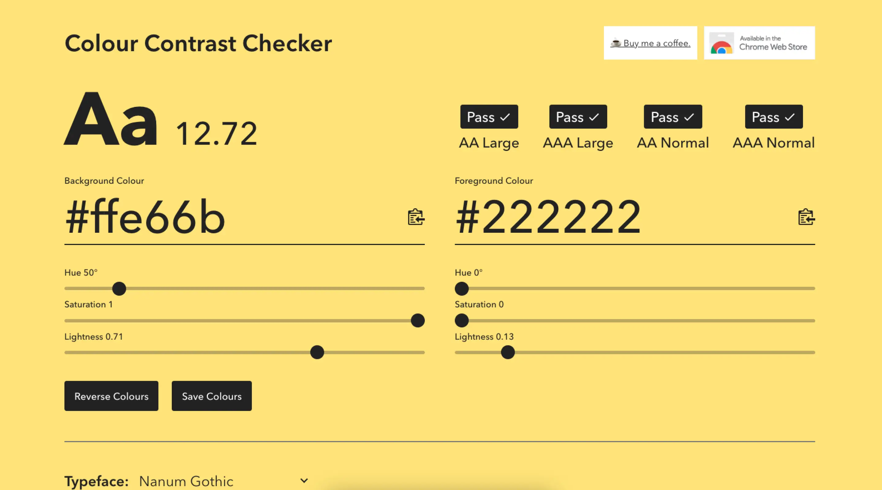
2. Colour Contrast CC — Accessibility Built Into Your Process

Accessibility is not a feature — it is a foundation. Yet it is one of the most commonly overlooked aspects of web design, particularly when working with brand guidelines that were developed without digital contexts in mind. Colour Contrast CC (colourcontrast.cc) addresses one of the most frequent accessibility failures: insufficient contrast between text and background colours.
The Web Content Accessibility Guidelines (WCAG) set specific contrast ratio requirements for readable text. Normal body text requires a minimum ratio of 4.5:1 for AA compliance, whilst large text and interface components require 3:1. These ratios exist because low contrast is a genuine barrier for users with visual impairments, colour blindness, or those reading in bright ambient light.
In practice, this matters more than designers often expect. A client's existing brand palette — developed entirely for print or physical signage — may produce contrast ratios far below these thresholds. Without a tool like Colour Contrast CC, these failures are easy to miss until they surface in an accessibility audit or, worse, a complaint.
This is why accessibility checks are a standard part of ALF's web design and development process. For Singapore businesses working towards government-mandated accessibility compliance, this step is not optional — it is essential.
3. ChatGPT — The AI Writing Partner Designers Didn't Expect to Need

It is a common situation: a client arrives with a beautiful concept, clear brand direction, and almost no content. Copy is either absent, placeholder, or written in language that does not reflect the positioning you are trying to achieve in the design. The design cannot breathe without real words, and waiting for a copywriter delays the entire project.
ChatGPT has become an essential tool for bridging this gap. Used thoughtfully, it helps designers produce realistic placeholder content, draft initial copy for client review, and develop brand voice guidelines that a client's marketing team can build upon. It is not a replacement for a professional copywriter — the output requires editing, strategic shaping, and brand knowledge that AI does not inherently possess — but it is an excellent starting point.
For startups and businesses undergoing a website redesign with limited budget or in-house writing capability, ChatGPT provides a working foundation. It is particularly effective for generating FAQ sections, service descriptions, and about-page content. Combined with a strong brief and a clear sense of the client's value proposition, the output can be surprisingly usable.
If you are exploring how AI tools are reshaping the design industry more broadly, our article on AI tools for web design covers the landscape in more depth.
4. Icons8 — Commercial-Grade Assets Without the Licensing Headache

Icons are everywhere in modern web design — navigation elements, feature sections, UI components, loading states, empty states, illustrations. Sourcing high-quality icons that are consistent in style, available in the right formats, and cleared for commercial use has historically been a significant time cost for designers.
Icons8 solves this comprehensively. With an enormous library of icons in multiple styles — from flat and outlined to hand-drawn and isometric — Icons8 ensures visual consistency across an entire project. The paid subscription unlocks the full library, including illustrations and photos, and removes attribution requirements. For a professional studio billing by project, this is the right approach: licensing uncertainty is a business risk, not just a design inconvenience.
Beyond icons, Icons8's illustration library is particularly strong. For client websites that require custom illustration elements — hero sections, empty states, onboarding screens — Icons8 illustrations provide a polished starting point that can be customised in Figma before integration into the final build.
If you are working in Figma, the Icons8 plugin integrates directly into your workflow. For more Figma productivity resources, our article on useful Figma plugins for every designer is worth reading.
5. Coolors — Colour Palettes in Seconds

Colour is one of the most powerful tools in a designer's arsenal and one of the most difficult to get right intuitively. Coolors (coolors.co) makes palette generation fast, iterative, and surprisingly enjoyable. With a single press of the spacebar, a new five-colour palette is generated. Lock the colours you want to keep, continue exploring, and export the result in a range of formats when you find the right combination.
For web designers, Coolors is particularly useful in two scenarios: when a client does not yet have defined brand colours and needs guidance on palette direction, and when developing secondary colours or illustration palettes to complement an existing brand identity. The tool's contrast checker integration is also a useful reinforcement of accessibility best practices — checking that a chosen palette meets WCAG standards before committing to it in design.
Typography and colour are closely linked in brand perception. If you are selecting typefaces to pair with your colour palette, our guide to the best Google Fonts for web content is a helpful complement to this resource.
Three More Resources Worth Bookmarking
6. Dribbble — Community, Portfolio Research, and UI Micro-Inspiration
Whilst Awwwards showcases complete websites, Dribbble specialises in individual design moments — a button state, a card component, an icon set, an animated transition. This makes it particularly valuable for UI design research, where you need reference for a specific element rather than a full-page layout.
Dribbble also functions as a pulse check on where the design community's aesthetic sensibilities are moving. Trends in colour, typography, illustration style, and micro-interaction patterns surface here before they appear in mainstream production. Following the right designers gives you early visibility into what will feel fresh versus dated in twelve months' time.
7. Mobbin — The Best Reference Library for Mobile UX Patterns
Mobbin is an indispensable resource for any designer working on app interfaces or mobile web experiences. It aggregates real-world mobile UI patterns from hundreds of leading apps — organised by screen type, flow, and industry. Need to see how ten different fintech apps handle their onboarding flow? Mobbin has it.
For Singapore-based agencies working with fintech clients or building mobile-first digital products, Mobbin accelerates the research phase of any UX project. Rather than auditing competitor apps manually, you can identify best-practice patterns from a curated, searchable database.
8. Google Fonts — Web Typography, Free and Open
Typography choices significantly affect both the aesthetic and the performance of a website. Google Fonts provides an extensive library of open-source typefaces that are free to use, load quickly via Google's CDN, and integrate seamlessly with Webflow and Figma. Understanding which fonts perform well at different weights, on different devices, and in combination with each other is a skill that separates competent designers from exceptional ones. Our dedicated guide to selecting the best Google Fonts for web content walks through the decision framework in detail.
Design Resources in the Singapore Context
Singapore's digital ecosystem has its own character. The SME market is maturing rapidly, government digitalisation initiatives have raised baseline digital literacy, and clients increasingly arrive with stronger opinions about what they want their website to achieve. In this environment, design resources that help you communicate quality, justify decisions, and work efficiently have direct business value.
Using Awwwards to build client pitch decks, Colour Contrast CC to demonstrate compliance readiness, and ChatGPT to produce first-draft copy that speeds up approval cycles — these are not just nice-to-have practices. They are workflow advantages that allow smaller design agencies to compete with larger teams on quality and turnaround.
If you are a Singapore business evaluating your current website against modern standards, our web design services page outlines how ALF approaches design and development for local businesses. For those further along in the process, our website design cost guide for Singapore provides a realistic picture of budget expectations.
How to Integrate These Resources Into Your Daily Workflow
Knowing about a resource and actually using it systematically are two different things. Below is a practical framework for embedding these tools into your design process:
- Discovery phase: Open Awwwards and Dribbble at the start of every new project. Spend 20–30 minutes curating 5–10 reference examples relevant to the client's industry and desired aesthetic. Save these to a shared Figma board or Notion page for the client alignment call.
- Colour and typography: Run every proposed colour combination through Colour Contrast CC before presenting it to the client. Use Coolors to explore palette variations. Pair with Google Fonts to test typography combinations early.
- Content gaps: If a client's copy is absent or underdeveloped, use ChatGPT to generate a working draft based on their brief and positioning. Present this alongside the design — not as final copy, but as a realistic content scaffold.
- Asset sourcing: Before reaching for a custom illustration or icon, check Icons8. A commercially licensed asset that is stylistically consistent saves hours of custom work and keeps licensing clean.
- Mobile UX research: For any project with a significant mobile dimension, run a Mobbin search for comparable apps or interfaces in the same sector before beginning wireframing.
Frequently Asked Questions
What is the best website for web design inspiration?
Awwwards is widely considered the gold standard for curated web design inspiration, as it showcases sites evaluated by professional judges for design, usability, creativity, and technical execution. Dribbble is also excellent for UI component-level inspiration.
Are these design resources free to use?
Most are free or offer generous free tiers. Awwwards, Colour Contrast CC, ChatGPT (basic), Dribbble, Mobbin (limited), Coolors, and Google Fonts are all accessible without payment. Icons8 offers a free tier, though a paid subscription is recommended for commercial projects to avoid attribution requirements.
How do I check colour contrast for accessibility compliance?
Use Colour Contrast CC (colourcontrast.cc) or a similar WCAG contrast checking tool. Input your foreground and background colour hex codes and the tool will calculate the contrast ratio and indicate whether it meets AA or AAA WCAG compliance standards.
Can I use ChatGPT-generated copy on a client's website?
Yes, but it should always be reviewed, edited, and shaped by a human — ideally someone with knowledge of the client's brand, audience, and commercial objectives. AI-generated copy is best treated as a first draft or content scaffold, not a final deliverable.
What design resources are particularly useful for Singapore web designers?
The resources listed here are universally applicable, but Singapore designers may find particular value in Mobbin for mobile UX patterns (relevant to Singapore's mobile-first user behaviour), Awwwards for benchmarking against regional and global competitors, and ChatGPT for drafting Singapore-market-appropriate copy quickly.
What tools do professional web designers in Singapore use daily?
Most professional studios use Figma as their primary design tool, alongside Webflow for no-code development. The resources in this article — Awwwards, Colour Contrast CC, Icons8, Coolors, and ChatGPT — complement this core stack as reference, accessibility, and asset tools.
Conclusion
The difference between a good designer and a great one often comes down to the inputs: the quality of work they consume, the rigour of the tools they use, and the discipline with which they apply both. The resources above have earned their place in a professional designer's toolkit because they are genuinely useful at every stage of the design process — from discovering inspiration to validating accessibility to sourcing assets.
Bookmark them. Return to them regularly. Build them into your process rather than reaching for them ad hoc. Over time, the quality of your design output will reflect the quality of your references.
If you would like to see how these tools and workflows translate into real results, explore our case studies or learn more about our approach to web design and development in Singapore.
{{build-better-experience="/directory"}}
First Published On
September 5, 2023
Categories
Written By

Resources
Related Articles
Deep dive into our latest news and insights.

.webp)